All posts by Soup Tyrant

PC (including HTC Vive/HOTAS set up which is a joystick etc) Android (Note 4) / Nvidia Tablet with a Tegra 3DS

ARK Park (PC/HTC Vive) Review

ARK Park

Developer/Publisher: Snail Games || Overall: 2/10

You’d think a Jurassic Park sort of experience would be a shoe-in for a decent VR experience, right? Go to a park, see huge dinosaurs, maybe run away from some. What’s that, you say? “But what about crafting and collecting bullshit“? Sure, why not? “What about terrible voice acting and jerky animations“? I dunno, man. This is starting to sound like a crappy game. “What about spelling errors, wrong dinosaur scale and aimless gameplay“?

ARK Park is a VR game using assets from another game with a similar name, ARK: Survival Evolved, which is a sandbox game where players wake up on an island, harvest resources, build bases and tame and fight dinosaurs. The parent game is a decent title with some kind of annoying DLC practices and constant feature creep; there is very little in common in the ARK Park flavor of digital entertainment, besides dinosaurs and the models used to represent them. Not a problem in itself, but to avoid confusion I think it’s important to point out that this is not ARK: Survival Evolved in VR. Also, be aware: though somewhat standard (though unimpressive) for VR, the game only makes use of teleportation for player movement. There are no free movement options, nor is there comfort options for teleporting, outside of moving around in room-scale.

The tutorial has you battling the ambient loud sounds to hear some robotic dragonfly (with some terribly robotic voice-acting) bark some commands to you. As you step out of some shuttle, you’re asked to get into a tram while dolphin noises, that must have been recorded from a TV, play over the tram’s loudspeakers. Some unnecessary dialog is thrown at you as you watch a mosasaurus jump out of the water. Finally, you get to the park where you’re greeted with a loading screen as you go up the stairs. In the next area, a lobby of sorts, there is holographic stuff you can bore yourself to tears with as the robot forces you to pick up and throw small holographic dinosaurs at a display, or just around a map, before being guided to command and feed some more of them. As an educational experience, there’s minimal here aside from a display that’ll narrate a small selection of descriptions on some choice dinosaurs. Not a lot going on besides that.

Eventually, you make your way to a camp where you grow a dinosaur and feed it, and are given a crash course on the inventory and storage. Before long I was “riding” on top of my triceratops through some section of forest (an “on rails” section) while some bullshit happens to the mind controlling devices that make the dinos slothful and passive. Someone commandeers my annoying robo-dragonfly cohort and tells me I’m an idiot and I should risk my life to save the park by repairing the brain washing devices. Why one exploded isn’t really delved into, nor the fact that dinosaurs are routinely aggressive to each other. I mean, how effective are they if you can see two huge gorillas fighting over a cliffside, or a T-Rex chasing some fat pig thing around? Anyway, I’m instructed to go to another area and use some sort of DNA sequencing gun (Isn’t this a park? Didn’t they make these things? Why don’t they have the DNA on file?) to collect genes in order to make a pistol. For materials, I’m entrusted to use gloves that make my hands monstrous to collect berries and grass, and a pickaxe to collect wood and other materials.

I craft a gun, presumably from the berries, and go to the practice range, where I proceed to bullseye all the targets while the robot follows me around telling me that she hopes I shoot better when my life is on the line (seriously, the tutorial is just crammed so fucking full of bad writing that most of it isn’t even memorable). I warp to some contraption that the robot needs to fix while I shoot dinosaurs. Despite the strange reload mechanics, which is shake to reload or suffer a painfully slow auto reload, I manage to kill everything without an issue. We win, and she pulls out some fuckin’ Leeroy Jenkins line from the mid 2000’s in an attempt to undermine my accomplishment. Someone at Gearbox probably finds this shit funny and engaging, but I’m already looking forward to taking off my Vive.

The main game has much less in terms of guidance or goals. Considering I don’t really give much of a shit about dinosaurs, since I can proudly say that puberty only left “space pirate” behind in my list of interests during the transition to adulthood, those goals are still a mystery to me. I don’t get why I’d want a Triceratops, or why I’d want to spray paint graffiti (no seriously, it’s part of the tutorial) or what I’d want a machete for.

After you’ve created a player with an eclectic assortment of clothing ranging from “generic cowboy” to a ghillie suit, you’re dumped in to the same area of the park where the game began: the tram. These sequences are exactly the same on the second pass in, by the way. I use what I learned from the tutorial to skip all the monotonous parts of the park and go back to the “exploration” areas of the game. These areas are places where you collect resources, scan dinosaurs and sometimes throw a rock at something. The scanning mechanic is really stupid — the gun needs to be aimed at the head of whatever is running past you or whizzing by your face as it flies through trees or over obstacles. Scanning these animals will give you “genes” which are used to unlock things like a machete, a bow, a torch, or other tools. Your guess is as good as mine why they landed on this mechanic.

Now, I know this game’s plot is paper-thin, but for all this talk about making dinosaurs docile using mind control stuff, I think it’s important to note that the dinosaurs sure fucking fight a lot in the wild. It just seems weird to have the tutorial hinge so much on that aspect and have there be no discernible link between that idea and the dinosaur’s behavior when you’re out exploring areas. Maybe it’s because you’re not fixing them, but it’s still odd.

I’m not sure if the hot-air balloon was rideable, but there was a section where I could ride in a jeep with the most canned fuckin’ one-liners hurled at me every few seconds. Dinosaurs of varying sizes and temperaments would block the road while the driver complained each time, as if I had unknowingly signed up for a VR ride-sharing program. A carnotaurus would slap the jeep and he’d whine about how annoying they are, when he should be complaining about how small they were. He’d zip between a bronto’s legs, slicing off mounds of cheese before unloading a jar of cheez-wiz when the gigantosaurus flopped for ten seconds, presumably to give me a spook. Honestly, this shit belongs in Disneyland with all the other crappy, over-acted attractions with no interaction.

I spent some time digging around my inventory and crafting station, and found that because I didn’t have a better copy of the game, there was an item that I couldn’t remove, bitching at me to buy the deluxe version of the game to use it. Thanks. Good to know that ARK is becoming more saturated with this kind of annoying bullshit. Meanwhile, it had no problem promptly accepting the other egg I was given into the trash, rather than my inventory slot that was near it. My fault, sure, but I didn’t pick where the inventory spots spawned over, nor did I think it would just go right through into the trash. You never know, I may have wanted to grow that thing.

I gave a “battle” level a shot, which was much like the tutorial: I guarded a machine while dinosaurs rushed at it. It seems just getting close to the machine is enough to damage it, so I intended to blow everything that moved away the moment I saw it. It was pretty easy until a Megapithecus came, stomped me, and three-shot the tower. This was the “easy” level, by the way. I’m not even entirely sure what I should have done differently, as he jumped down, towering above me, slapped me into submission, and took out the tower while I was out of play. This game has multiplayer, but it wasn’t clear if I’d come back from that or not by myself. VR wave shooters are really, really common. It takes a particular level of polish or ingenuity to get a pass for this, and ARK Park just doesn’t deliver.

The game is rife with spelling and grammar errors at every turn, from frogs that are a “Titanboa’s favorite desert” to an error in some machine that claimed “Species data that can not be loaded.” Even their Tek Package ad calls the Mech T-Rex “Iron steal.” This game’s not very deep, it’s not hard to come across all of these. With added things, like the comically large “gloves” used for harvesting bushes, jerky animations on some dinosaurs and “pulling” vines, strange dinosaur scale and crappy gameplay, I’m convinced this went through a limited QA run and was shoved out to appease the folks that were waiting for this, all four of them at Gearbox that were really waiting for that “.333 repeating chance” of success joke to land. This is what passes for writing these days. Speaking of which: hire me and fire your writers. I could use the dough, and the mess you’ve got here is bordering on needing FEMA relief (side note: unlike FEMA I’ll actually deliver).

Why this is an ARK game eludes me. If anything, they should have dropped all the crafting and pointless stuff and focused on being even remotely educational with some mini games around that. At least then it’d have some merit of its own. This doesn’t really play like an ARK game, it doesn’t have the same goals as one, and it’s much less fun than the game that it is based on, but has shoehorned in crafting and gathering ’cause “that’s what the real one does”. It’s painfully and obviously forced. In fact, if they just added VR support to ARK: Survival Evolved, even as limited as HMD support with mouse/keyboard or controller, there would be something considerably more enjoyable to toy around in.

If you’re looking for a dinosaur game, play ARK: Survival Evolved instead if you can stomach the semi-rough experience. Otherwise, save the $40 you’d waste here and go buy scratchers or something.

Battlecursed (PC) Early Access Preview

Developer/Publisher: Codex Worlds || Outlook: “NOT FUNCTIONAL”
Man, I don’t know how the fuck I get stuck with these things.

…Alright, I kind of do. Dave provides a list, I do a bit of Google or Steam store searching, make a decision off of ten seconds of research and give a thumbs up or down. What a magnificent way to fuck myself.

For this piece of fluff, I’ll be reviewing Battlecursed. Oooh! Spooky name! Battlecursed, like many games, had a review embargo. February 5 at 7:00 AM PST, to be specific. It’s Feb 19th at the time of me writing this, and probably much later in posting, but I bet you Battlecursed will be in the same state as it was the first time I played it about a month ago: shitty. Really, really shitty.

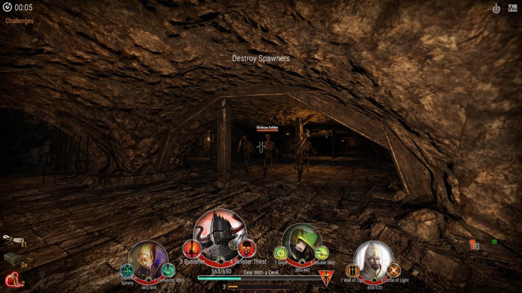
One of several samey dungeons you’ll yawn your way through as you quietly chant to yourself that this is how you spent the last $10 to your name.

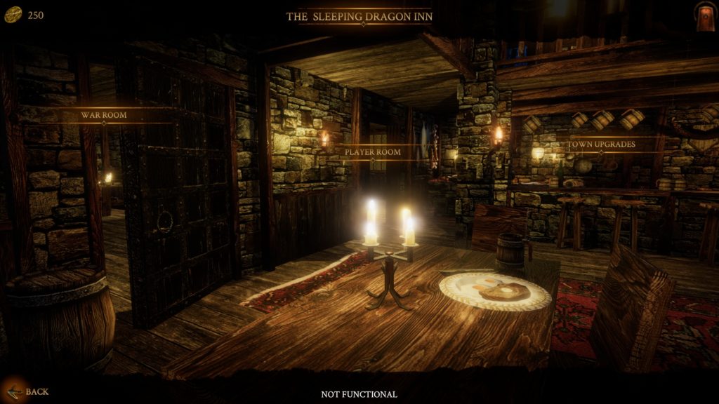
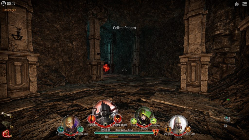
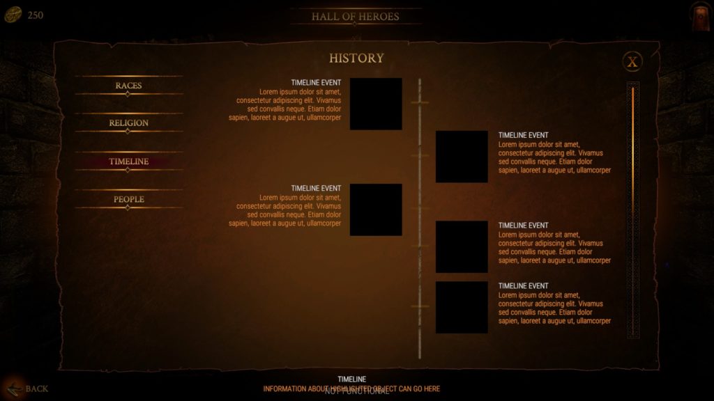
Battlecursed is a “dungeon crawler with roguelike element” where “a single player directs a four-hero party through real-time first-person battles”, which, in text, sounds like Legend of Grimrock “with roguelike element.” Not a terrible idea, but I don’t understand why the fuck they want reviews for this. This thing is obviously not ready, plastered with “NOT FUNCTIONAL” as if I couldn’t tell from the “Lorem ipsum” and lack of response to clicks and key presses. You pick from eight heroes of four classes (using the same portraits) and form a party. Each party member has two passive abilities, two active abilities, and ultimates, which don’t fucking work anyway at this point. You’ll spawn in a dungeon, have some menial task, like destroy all monster spawners, and then a key will spawn which allows you to go to the next dungeon. It plays much like DOOM in the 90’s played, only your weapons are on cooldowns and everything is bland. There’s loot, but it’s not working, so I can’t talk about it. There’s guilds, but they don’t work, either. There’s a bunch of stuff that’s supposed to be here that isn’t here, so all I can comment on is the very bare-bones, lackluster dungeon crawl that has none of the properties of a game I would consider “good” or even “okay.” Abilities have strange hitboxes that sometimes work, sometimes don’t. Enemies are sluggish and can be kited easily. Everything is brown, unless it’s a spider, an enemy portal, an exit portal, or some sort of magic skeleton. Even the fucking menus are brown.

Yeah, yeah. Early access. The “Get out of jail free” card for shovelware that’s trying to make sales based on promises. Sure, not all titles or developers abuse this, but enough do. Battlecursed sure as shit isn’t ready for any kind of sales. There’s nothing redeemable here. What this game is setting out to do isn’t even complicated, I don’t understand why they’d push out the concept in to storefront territory without having even the basics work. Eventually you’ll go through enough floors where you’ve finished your run. There’s no loot to have at this point, no fanfare, not even a comical whistling fart to commemorate your pointless journey into the bowels of brown.

Now, after playing The Forbidden Arts, I felt bad for shitting on someone’s work. They’re trying. To Stingbot Games’ credit, though, their shit actually works. Maybe not well, but it does anything at all. So, there we go. “NOT FUNCTIONAL” out of 10. Review’s over.

Does the fun ever start?

“NOT FUNCTIONAL” /10

Forbidden Arts, The (PC) Early Access Preview

Developer/Publisher: Stingbot Games || Outlook: “.5 /10”

Today we’re reviewing… The Forbidden Arts… which… I don’t know where to start. That’s a lot of ellipses (that’s the plural form, get off my case), but the nicest thing I can say about it is that it runs when you start it. Everything about this is a mess, even conceptually. It was an excuse to make a character anime-ninja-run around getting their shit ruined by wolves and elves.

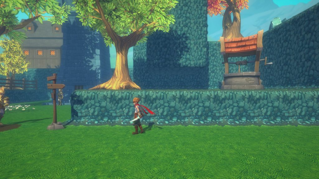
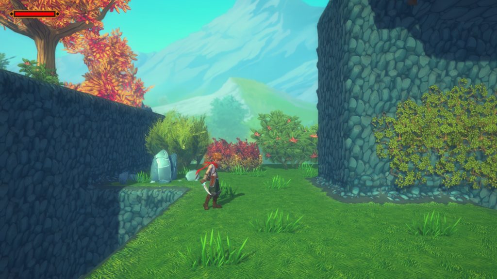
First off, the writing. You’re a young man having a hot-flash-inducing dream where someone says “It’s time” but in a manner that doesn’t convey urgency. I guess you’re supposed to be a guard in town, even though you don’t look anything like the other guards, and being asleep at the job isn’t really kosher. You get kicked awake by a “I have it worse” guard that recommends an ice cold glass of whiskey to beat the heat (what?) and instructs you to see the local druid (what??) because the store is closed for the afternoon. The dumb guard claims that bears and wolves are no match for my pair of daggers (what???) despite my lack of any armor, including bare arms. He was wrong, by the way: wolves in this game will two-shot you and spin on a fucking dime. Before I leave, I get to see the wimsey of the world my character lives in, including blocking outcroppings of rock everywhere you go. Seriously, here’s the first town:

I don’t know why everything is so square, or why the well is in such an inaccessible place for most folk. After you walk out of the town, you’re sent to the overworld map area, a concept that goes as far back to Final Fantasy and Dragon Warrior. In The Forbidden Arts, the overworld map looks like this:

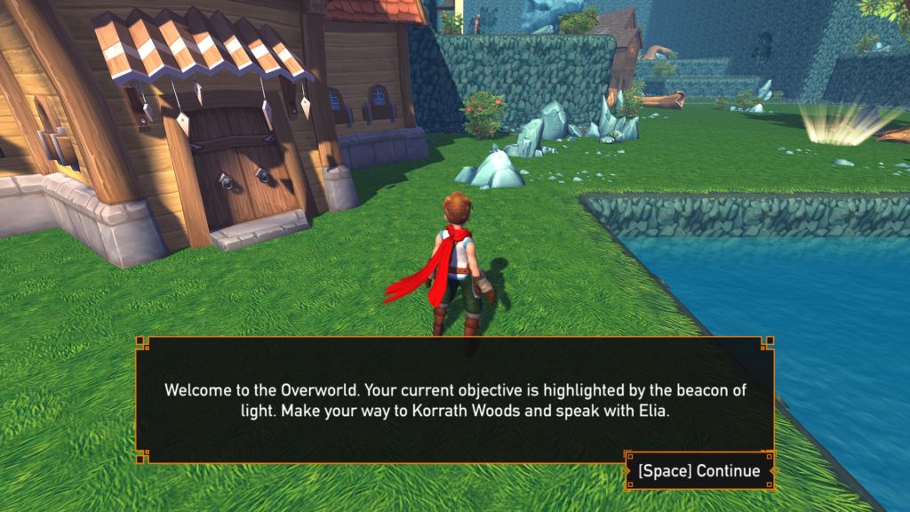
It looks like some sort of half-assed Super Mario 64 level. The town is represented by this huge-ass tavern or shop or something. The forest is a tree. That water in the screenshot will kill you, by the way, and the field of view is all sorts of fish-eye when moving around. It’s not pleasant. This alone needs a revamp, as it doesn’t feel like an overworld. Anyhow, time to go to the forest to talk to this druid, Elia. A forest makes sense for a druid, in that this is what a forest looks like in The Forbidden Arts:


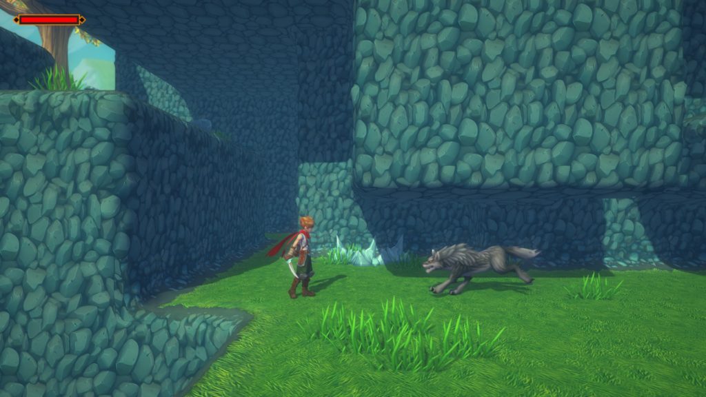
Blocky, square caves? Well, not caves; those tend to not bask in the sun. I don’t know what the hell is going on here. That wolf, by the way, is no joke. I beat Cuphead on fucking expert, and these things make me want to find some expire ipecac to guzzle. Movement is mushy, even after some supposed improvements way after the initial release. Sure, I know this is early access, but even the basics are fucked. There are dozens of examples for “good” side scrolling and platforming mechanics, even outside of the metroidvania genre itself.

Moving on.

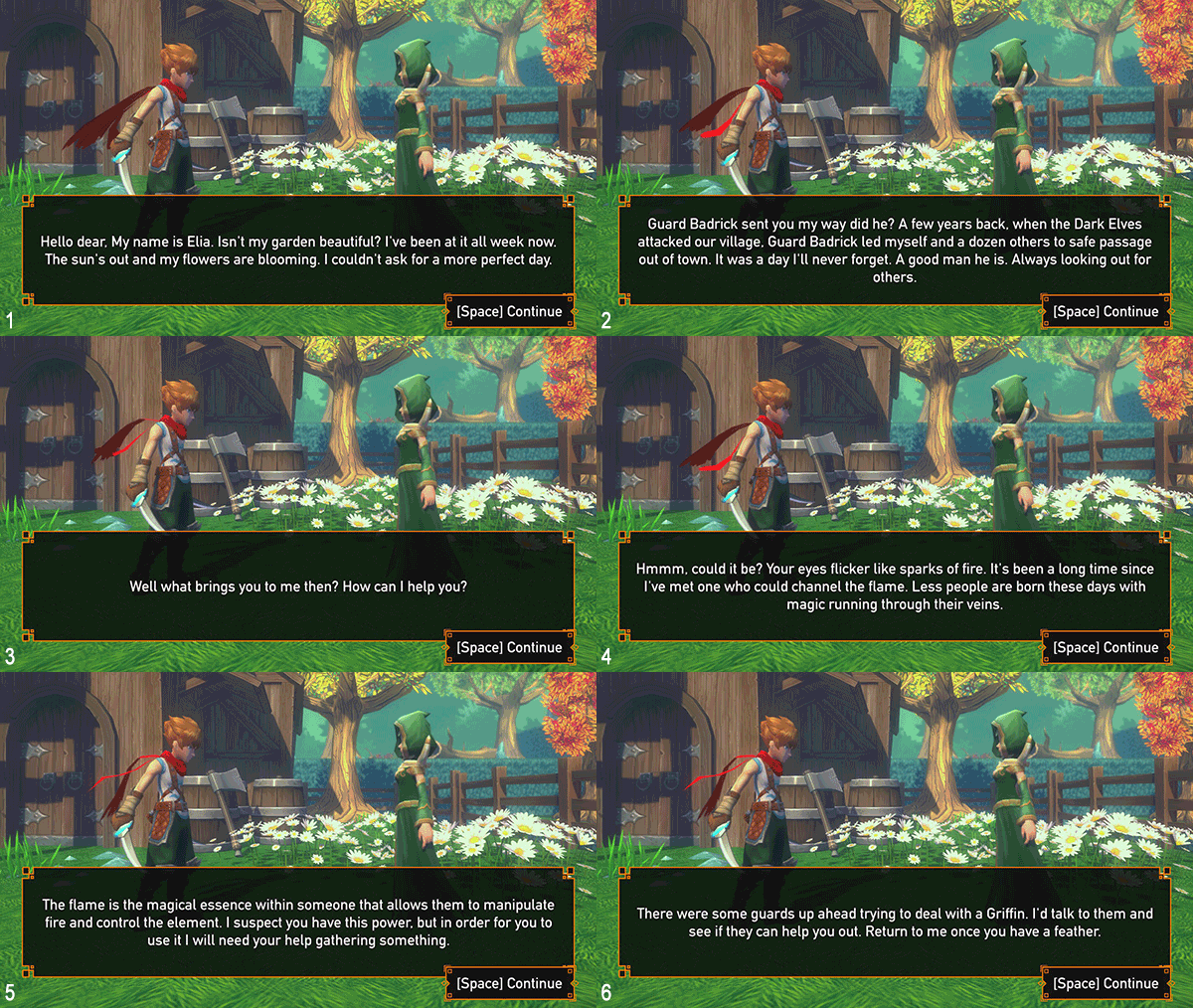
After climbing on some vines I made it to the druid. Now, there’s a way to handle silent protagonists that doesn’t come off hammy or juvenile. Does this exchange pass? I’ll leave it up to you. There are six frames, you can follow the conversation by following the number in the lower corner.

I don’t know how they could make this any more happenstance, even with the injected random flashback for her. You just happen to have a dream, guard just happens to send you to her, she just so happens to know what your thing is, and it just so happens that the guards that spoke to her earlier (Why is she out here? She’s not a part of the village. She’s in the “woods.”) are dealing with the thing that you just so happen to need a feather from. Yeah, I took a stab at this quest, but I didn’t enjoy it. I gained the ability to suck up camp fires to shoot fireballs, which didn’t really seem that handy in practice.

I get it, making your first game is tough. I’ve made a few on my own in BASIC back in the day, I’ve toyed around with a few projects, but as soon as you start selling it you open yourself up to criticism. This game should never have been sold. It lacks the foundations of what make gaming a hobby that’s enjoyable or even addictive for some, and that’s not that hard to do. Set up some rules and don’t change them, give the player a goal, and give the player an avatar with a level of control appropriate for the challenges you’ve set forth. There’s more to it than that, there’s gameplay design, level design, and even, these days, in emergent gameplay design in games like Metal Gear Solid V: The Phantom Pain and The Legend of Zelda: Breath of the Wild. I think, however, that even with the basics down something can be honed into an enjoyable experience. I don’t think this game has a grasp of that.

I don’t want to be too hard on the guy making this. I know it sucks to have someone come and piss on your work, but this needs too much work to be fun, and some of the choices are so bizarre I feel like I’m playing a game version of Birdemic or Sharknado, as in choices so poor that they must have been intentionally poor choices. From the Naruto-run and Sauske stylings of the protagonist to the ho-hum plot and grotesquely cubic levels, all the way down the the mushy jumps, poor voice-acting and interrupted animations. It’s a 3D RPG Maker game with a plot written by SquirrelKing, and it runs. I’ve played thousands of hours of games. I know when something is too flawed to continue pushing through on. This is one of those times.

Blasters of the Universe (PC/HTC Vive) Review

 Developer/Publisher: Secret Location || Overall: 8.75 / 10
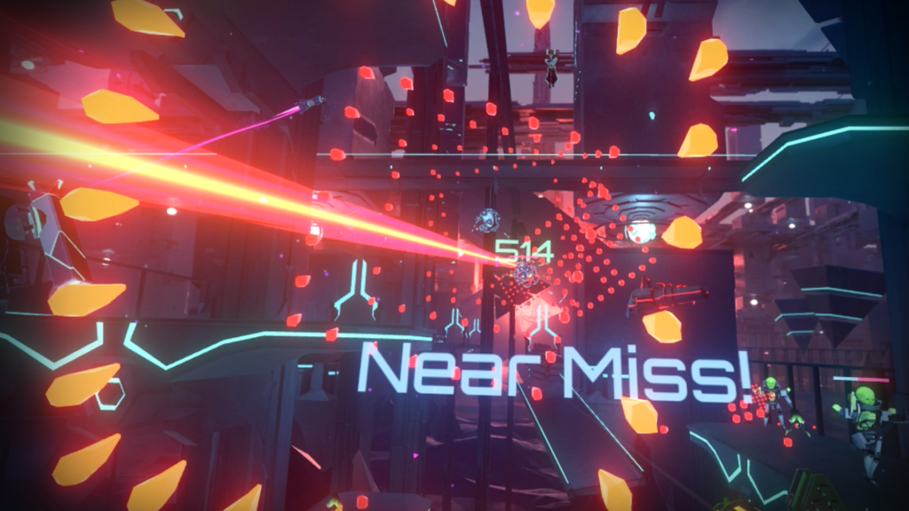
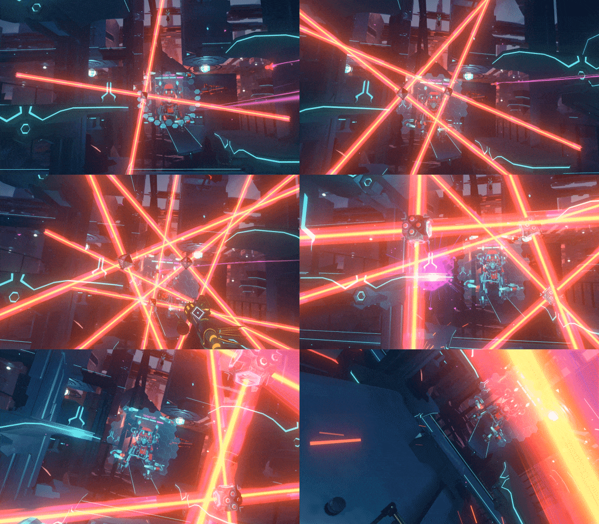
So we’ve got another VR game up to the plate. This one, Blasters of the Universe, by Secret Location, is something of a mashup.

A vast majority of VR games belong to a genre collectively called “wave shooters,” which pit the VR player against wave after wave of enemies. Sometimes there are mechanics for moving around, but most of the time it’s standing or room-scale. Often the player is taking cover behind something, like a shield, and dodging what they can. Sometimes the enemies are zombies, sometimes they are robots, sometimes they are gangsters.

Blasters of the Universe doesn’t break all the molds of the wave shooter, but like some kind of VR Coldstone Creamery it rolls in a heaping cup of “bullet hell” while spectators watch behind the glass counter thinking, “Are these guys insane?! Who wants Ikaruga in their wave shooter?! Gross!”

Turns out: I do! And I don’t think my tastes are that refined, at least when it comes to VR.

The premise is that some unemployed nerd named Allen was really good at arcade games in the 90’s, or maybe late 80’s. He was only good at games, somehow he was able to get into “VR” and has been living there ever since. Despite how very close the antagonist is to me in the game, the story’s not important. The Grand Master Virtual Space Lord Alwyn will be around to mock you, or even awkwardly praise you, but the meat of the game is blastin’ and dodgin’ with a lil’ bit of blockin’, and isn’t at all story driven. The same basic premise for the wave shooter: enemies will appear periodically while you shoot at them. However, their attacks come at you very slowly, often in patterns or huge fields of bullets. In many games, the player’s hitbox is some amalgam of their head, the area beneath, and possibly their hands. Blasters of the Universe does the unthinkable in most by making only the player’s head the hitbox. That allows for some pretty miraculous dodges, but it also allows the bullet hell mechanic to work without being absolutely frustrating. Your are limited by your own movements, which isn’t novel in VR, but it is for a bullet hell.

There are a variety of enemies with their own patterns of attack that, when they are all firing at the player simultaneously, leads to some interesting gameplay. While the player tries to 3D limbo through all the space in between the bullets while trying to counter attack with their own gun. Less enemies means less things shooting, which means the player won’t have to somersault through death-fields. Occasionally there will be a boss that needs spanking, and they will have their own attacks, telegraphs and “puzzles” (if you can call the process of “how do I kill this?” a puzzle). There are four campaign levels with casual and “hell” modes, and each of those has an infinite mode if that’s your thing.

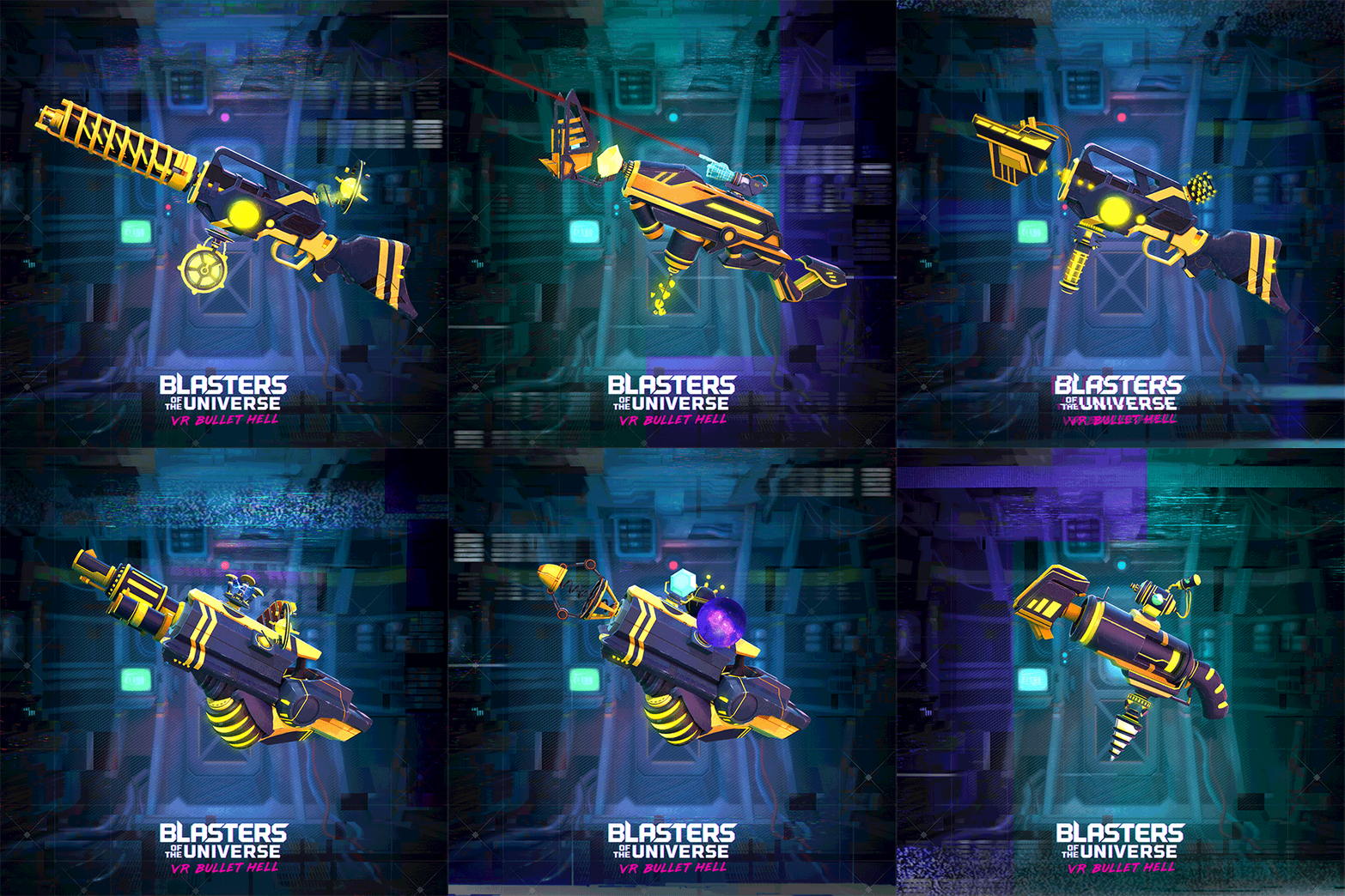
What’s the shooting like, you ask? Well, that’s up to you. There are a bunch of weapon parts to fabricate your own gun out of. Semi-auto or full auto, magazines or recharging ammo pools, precision or spreadfire, you name it. Players pick a weapon frame, barrel, bullet type, magazine and a gadget to make their own weapon of choice. Along with this, they can pick different kinds of shields that, while unable to block everything that comes at the player, they can provide some relief in a pinch. They vary in size, strength and mechanics, with some changing the player’s defensive tactics entirely. The last thing of note is that each weapon frame has a special ability that charges as you shoot n’ dodge your way through waves. Specials like a super-powered laser that sustains for a few seconds, or having two guns for a short time.

Blasters of the Universe performs pretty well on a 3770K processor and a GTX 980ti, and it took quite a lot going on to get any frame drops, which is somewhat admirable considering some of the garbage I’ve played, which is saying quite a bit. The art style might not be everyone’s scene, but it fits the narrative, and it gets the job done just fine.

I like this game quite a bit. I don’t really dislike wave shooters, but there are a ton of them and most of them have their own “twist” that either doesn’t add anything novel, or complicates something that would otherwise be fun. Blasters of the Universe‘s take is one of the better, more unique spins, and in some ways improves on what “classic” (bare with me, the platform’s a baby) VR titles, like Space Pirate Trainer, laid out in the genre. It’s not what I’d call a relaxing game, but if you’re in the mood to move around and shoot at things, this is one of the better choices I’ve come across.

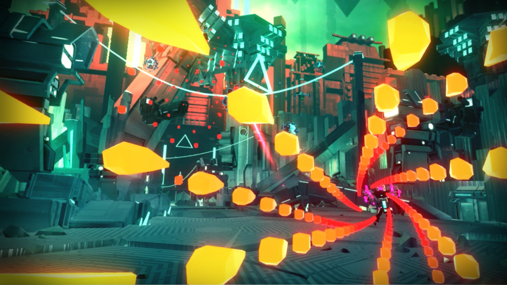
A Robot Named Fight! (PC) Review

Developer/Publisher: Matt Bitner Games || Overall: 8 /10

Often times, nostalgia is controlled by a brand. You get droves of village idiots bickering over Star Wars and the proper way to make a Zelda game. Sometimes, though, you can have a love letter written to you, signed by someone else. In a way, that’s the best way to sum up A Robot Named Fight! in a metaphor.

From the title sequence, to the voice over, A Robot Named Fight! tries really hard to evoke the same feelings Super Metroid first did. This didn’t necessarily put a good taste in my mouth. I prefer tapioca pudding. However, almost immediately it earned the right to try to tug at my nostalgia strings.

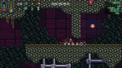
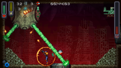
Most folks that know their way around video games have either heard of a “metroidvania,” or have personally played one, but for the sake of being a contained resource I’ll outline that now. A Robot Named Fight! is, at its core, the definition of what a metroidvania typically is: the player controls a character in a 2D-sidescrolling environment, exploring rooms and killing enemies as they collect power-ups, abilities and equipment. Some areas require particular abilities to traverse, or require specific pieces of equipment to get past, such as a door that requires a missile to open, or an area that requires fire-proof armor. Typically, one item will allow the player to backtrack and find another ability in an area that was previously inaccessible, often with the aid of a map in some form or another. Enemies and bosses tend to be common hurdles, but the environment itself often demands a particular level of platforming skill to get around. There are dozens of bread n’ butter titles for this genre, but they tend to share a common trait: the environments aren’t randomized in any manner.

The twist for A Robot Named Fight! is that it’s a roguelike; the “item progression” and map itself is randomized whenever you start a new game, picking out from a pool of items you’ve unlocked from gameplay. Some runs you’ll have to get an upgrade to shoot switches through walls, other runs you’ll need to find their version of the morph ball, which happens to be a tiny spider, or rockets. You start out kind of slow and clunky, but most upgrades augment your walking speed, shooting and bullet speed and damage. In a sense, it’s a Super Metroid clone you can never memorize the map of. Runs, depending on completion of the map that spawns, take about an hour or less depending on the level of exploration, the items given to the player, and the enemies and bosses encountered.

The art style is an homage to titles of the 16-bit and 32-bit eras. The music and sound design is fitting, especially for the B-horror film plot line explored through the game (it’s very much a secondary aspect to the game, not that it’s a problem). There is very little A Robot Named Fight! does that I feel is underexplored or half-assed. The only thing I can even suggest is that I wish the map had colored doors for various progression blocks, but it’s a small grip considering the game’s content and obvious aims. There is little more you could ask for in terms an unofficial successor to Super Metroid.

Geneshift (PC) Review

Developer/Publisher: Nik Nak Studios || Overall: 7.5/10

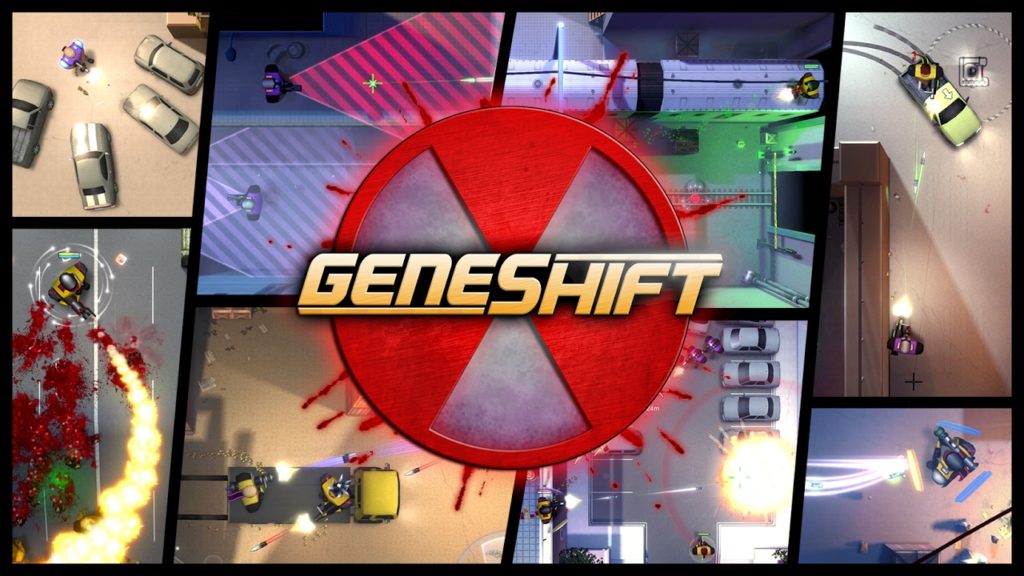
Alright, so here’s a weird one. Geneshift. Noun. A GTA game, circa 1998, with a skill tree and multiplayer. Simple and somewhat shallow in execution, but with a fairly large amount of content.

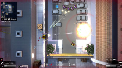
Geneshift is a top-down shooter, much like classic Grand Theft Auto games DMA Designs made before Nintendo got to them (yeah-I said it, bitch) and fucked the company into bankruptcy. You walk, you jump (surprisingly), you shoot. Occasionally you’ll use an ability, or drive a car. On the surface, it’s pretty simple. You’re a mercenary working for some lab, killing rebels or terrorists or something. Nothing particularly amazing, but it gets the job done. I don’t think it’s anything memorable, but it’s not the driving force behind this game.
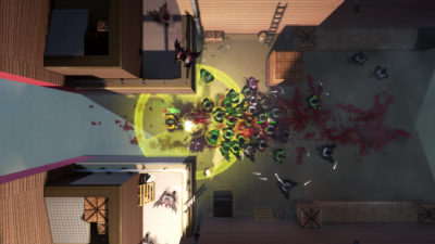
The player’s main tools tend to be guns of various shapes and projectiles. Along with this is: equipment, abilities and vehicles. There’s not a lot to say, unfortunately. In single player, you look where you need to go, try to navigate your way there and shoot folks along the way. Money is earned through killing enemies and occasionally selling stuff you find, which is used to purchase equipment at save points, which are ample. Plot points, some boss guys, some hordes of enemies. There’s a bit of everything in the campaign, which is nice, and there’s even abilities and mechanics that support some limited stealth play. Much like the gameplay, the art direction is rather simple. Everything is clean and not very detailed. Really, everything can be skimmed down to, “it gets the job done,” in most cases.

Now, I know what you’re saying. “Soupy, why the 7.5? Who’s paying you off? Did Squackle get a cut? What was your cut? Do I, as the reader, get a cut? I’ve got a family to feed.” Nobody’s paying, noone’s getting a cut, and your family means nothing to me unless they are clicking on ads.

So, the grade versus the lack of description- what’s a game gotta do to get a “meh” around here? While Geneshift isn’t particularly out of this world, or a “must play” sort of game, it’s not really a bad one, or even one that’s just kind of okay. Simple, clean-looking games have their place. Soldat. Agar.io. LYNE. You could put Geneshift in that sort of group: simple games that are for casual consumption. There’s nothing sloppy about the controls or their implementation, and it can be rather fun at times, but it somehow it doesn’t offer enough to me. It’s got deathmatch, it’s got cooperative campaign options, it’s got a lot of the makings of something I would want to play often. For some reason, though, the perspective doesn’t do it for me like I felt it would when I initially started playing. Guns have variable engaging ranges, but they all end up averaging out once you factor in the perspective you play the game at. While it’s not inherently bad because of the perspective, the gameplay becomes somewhat tedious. Shooting enemies from below still takes cover into account, so sometimes you have to click on a very precise location to shoot someone that appears to be peeking by a ledge. Knowing what you can climb isn’t obvious without jumping up and down, which prompts ledges to highlight. Nothing’s particularly broken, but too often is there a moment where I get caught doing a jump and get stuck, or have to battle a level’s design because it requires perfect timing in jumps (no shit, by the way; I beat all of Cuphead on hard, but Geneshift is the only game in recent memory that managed to piss me off with a section of platforming).
The game is still being worked on, so maybe the problems it has won’t be a problem at some point. However, I’m sure there’s folks out there that would like nothing better than Geneshift morning, noon and night, even with the issues the game currently has. I think I’d probably play something else, though.

Strain Tactics (PC) Review

Developer/Publisher: Touch Dimensions Interactive || Overall: 6.0/10

Hey, you! Yeah, you! Get out a blender. We’re going to play a game. No, you won’t lose an arm or an iPad. It’ll be fin- IT’LL BE FINE, JUST DO IT.

Alright, grab an XCOM. Any one of them will do, we’re just going for basic themes here. Dump that in. Now, scoop up some Alien Swarm (it’s free) and plop that in there, too. Now, and this is important, add a dab of tower defense. Just a bit. Trust me: it’ll make some sense. Hit “blend” and watch those mix up. Take the pitcher of your rather interesting mix of genres and pour that shit into a phone and you’ve got Strain Tactics from Touch Dimensions Interactive.
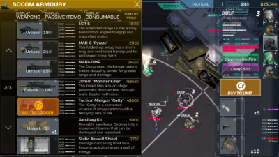
Strain Tactics is a real-time strategy game that has just as many things in common with tactical squad games, like Rainbow 6 and Door Kickers, as it does with a traditional top-down shooter like Alien Breed. The player commands a squad of up to five soldiers of varying classes–each of which have varying skills and attributes–from their mobile helicopter base. Said squads are sent on missions on a campaign against the “strain,” each mission taking place on a contained map, with objectives ranging from “kill everything” to “rescue this guy.” Troops gain skills as they participate in combat, they can find, loot and equip items they find or purchase, and you’ll often lose troops (though not permanently, as they can be revived if you recover their bodies) in chaotic skirmishes with alien-zombie guys. Thus far, this sounds just like any other game where you deploy a group of soldiers to do a mission. However, there’s an extra degree of player interaction that I haven’t seen before for a single-player squad-based game, and that’s having full control over your team’s transport and air support.

Despite most of the game revolving around directly positioning your squad members and marking targets to shoot (though they engage automatically if enemies are in range), the squad’s helicopter is fully controllable at all points of gameplay. The helicopter acts as a storage locker for gear, a transport for players and NPCs, and fire support against visible targets on the ground, which gives the player immense amounts of control about how they deploy, what their troops are armed with and what their exit point will be. Your team begins each mission aboard the heli, and they don’t disembark until you’ve decided to. It’s a refreshing amount of choice in a genre that routinely grants you limited power despite your role as a “commander” or whatever. When was the last time you had the option of landing your squad near your target in XCOM rather than running a fucking marathon from your drop zone? Oh, never? What about using your dropship to blast the shit out of dangerous enemy units before they become a threat to your squad’s objectives? What?! Never?! What a shame! It’s okay, though: Strain Tactics lets you do that. Using a minigun, a small cannon, or even some big ass firebombs, the helicopter can lay waste to outside targets. While it’s not always a viable option, what with interior locations and the occasional heavy foliage area, it’s a rather interactive way to support your squad in a way that makes a ton of sense. Why this hasn’t been done before in mainstream titles is baffling to me, but Strain Tactics delivers this sort of engaging gameplay dynamic in a tight little package. I’d dare to say that it’s something you could make a franchise off of.
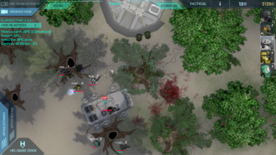
Because of this, even hand-crafted levels can be approached from various angles. You are never really forced to enter or exit the level from a specific point. Characters that aren’t suited for an encounter you’ve come across can be quickly refitted before picking a place to land, or left on the helicopter while the rest deploy. It seems like such a small detail or feature, but in the grand scheme of things it makes the standard gameplay loop really interesting. You can change tactics on the fly, including redistributing your team to split them up.

However, the honeymoon isn’t long. The game has problems, one so heinously rooted that I’m not entirely sure it can be easily fixed with patches: it’s a phone game.
This game was designed for touch interfaces, and it’s painfully obvious from the UI. Everything is rather big, from buttons to text. Item information and character stats are hidden behind an extra button, making quick comparisons between characters a tedious exchange that, in many cases, requires you to pause the game if you’re currently busy with alien-zombies. Inventory management is slow, requiring a click to select and another click to move it to another spot. Using stores or the locker is a tedious process, especially when you’re trying to clean house and organize. Information is usually somewhat vague, if it is even readable (some lower resolutions are just unreadable). I didn’t even realize there was a scroll bar in the mission debriefing, as everything is so huge I figured they were just using up space. While this is probably a really good phone game, it’s missing a lot of quality of life enhancements that I’d expect from a PC game in this day and age. It’s a real gear change compared to how gameplay flows outside of the UI.

It explains why there’s some inconsistencies with the quality of art and the somewhat clunky controls. It’s a great phone game, I’d even go so far to say it’s probably one of the better ones you could play. It’s just okay as a PC port, though. I can’t call it a bad game–it isn’t–but it’s rather disappointing that something so close to being sublime stumble at some rather uncommon problems (as well as some common problems, like mediocre plot and dialogue). I mean… it technically works; it functions as intended when you click around, but it’s far from efficient. It’s like using a spoon to serve soup instead of a ladle.

At this point, I feel like I’m taking a huge dump on this game, and I don’t want to give that impression considering how good of an idea the helicopter base thing is. So, Touch Dimensions Interactive, if you’re actually reading this: keep working at it. Seriously. You are so close to something that is very much worth sinking hours into. You just need some polish, some design changes, and maybe a writer (let’s be honest: you could use one, at least for the dialogue). If Strain Tactics 2 ever gets kicked around, or you plan on fixing the UI, I’ll be back to revisit.

Orange Moon (PC) Review

Orange Moon

Developer: Betelgeuse Zero | Publisher: Meridian4 || Overall: 3.0/10

Often times, the best way to approach reviewing a game is based on how it is advertised, and Orange Moon is no exception. Here’s how Betelgeuse Zero describes their own game on Steam:

Orange Moon is a surreal 2D action-platformer with RPG elements and complex puzzles. Take on the role of an explorer as you discover the mysterious world of Orange Moon – filled with hostile native life forms and harsh, treacherous environments. To increase your chances of survival, choose from a variety of weapons, equipment, and upgrades to aid your dangerous exploration. Can you uncover all of Orange Moon’s secrets?

  • Explore a mysterious world filled with hostile life forms.
  • Survive by acquiring and utilizing an array of unique weapons, equipment, ammunition, and upgrades.
  • Solve complex puzzles to successfully uncover the secrets surrounding you.
  • Fight bizarre enemies – from carnivorous plants to deadly biomechanoids – and defeat fearsome bosses.
  • Overcome harsh and treacherous environments with obstacles such as acid swamps, toxic clouds, and deep craters.

Oooh-eee! Sounds like a good time, huh? Some platforming, some complex puzzles… will I uncover all of Orange Moon’s secrets?
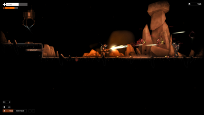
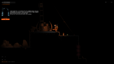
Yeah, very quickly, in fact. Under four hours, including an hour or so I spent with the game paused (which causes some weird bugs, so don’t do that).

Orange Moon is as described when it comes to genre: it’s a 2D platformer. Your character is sent to explore the game’s namesake on behalf of the Moon Resources Corporation in search of what clues of what happened, guided along by a Mr. Anderson. The story is sort of abrupt and rife with spelling and grammar errors, and ends up being somewhere along the lines of a porn’s story: it’s there just to explain why people are doing things in a particular place.

Players will walk a rather bland black and orange landscape whilst shooting at an inordinate amount of turrets, floating blobs and the occasional bipedal enemy whilst burning bushes to the ground and sucking the life out of the roots (literally) to sustain yourself. You walk, you shoot, you jump–standard fare in 2D platformer games. In addition to these, the player is able to use fuel to do rocket jumps in order to traverse the terrain.

The player unlocks a variety of weapons along the way, such as a shotgun and a minigun, all of which require ammo that can be found or purchased from an upgrade store using currency earned from killing enemies. If you’re short on cash and don’t have ammo, a flamethrower can be employed to kill foes using the player’s fuel reserves. Weapons and equipment can be upgraded with upgrade canisters that can be found or purchased. Upgrades include better damage on weapons, more health, larger fuel tank upgrades and the ability to use specific guns.

None of this sounds bad in practice, but none of this is executed in a satisfying way. Weapons that can be aimed aren’t very responsive to changes in aim, and the arc is limited. Most weapons require upgrades to be useful against many enemy types, and some weapons, like the flamethrower, are actually unable to do damage to most enemies even when upgraded. This leaves for some very heavy reliance on specific weapons to defeat some enemies, which isn’t a problem in itself aside from the fact that it means you’ve wasted upgrade points that could have been used on something worthwhile.

Fuel is tied to jumping, which means if you’re out or low you’ll spend a rather long amount of time waiting until you can climb out of a hole or make it through a jumping section, especially if you’re using the flamethrower a lot. This can be offset with upgrades, but the design isn’t really fun, it doesn’t add challenge, and it’s not interesting. Eventually, when upgraded, fuel is trivial and no longer serves a purpose, especially as the flamethrower becomes increasingly less useful. It just never seems to fit in with the rest of the game in a meaningful way that limits the player or forces choices outside of, “Do I want to wait a few minutes before I can climb out of this hole?”
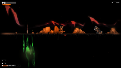
Level design is simplistic at best, and the “complex puzzles” the developer touts as a feature are little more than a series of fetch quests that involve minimal amounts of backtracking. Exploration is also somewhat scant: secrets are usually as simple as falling down a hole, or taking a short detour. Considering the constant pallet of orange outlines on a black background, nothing is particularly interesting the entire journey, aside from the occasional scripted set piece.

While the game isn’t particularly bad, it’s nothing to write home about. It’s buggy, with the player character often getting stuck on flat terrain or getting stuck in a wall. It’s not particularly polished, with features such as the scouting probe being usable in situations that freeze the player character in the air, or mess up the camera afterward. The music’s not bad, but as a highlight it’s also nothing particularly special. Orange Moon is merely just a game that works when you boot it, and ends when you finish it, albeit with some performance problems (at least with an 3770K and a GTX 980ti).

I think Orange Moon‘s most common problem is poor design. Enemies are not particularly difficult to deal with, often blocking a corridor perfectly with their height, acting almost as an aggressive door that needs to be unlocked with a shit load of ammo. Outside of the crappy turrets and plants all over the place, enemies tend to have a lot of hit points and armor that renders many guns useless without a lot of upgrades. All story is conveyed via text in the upper left corner of the screen, but when these kinds of events happen the entire screen darkens, aside from a small circle around your character, even if you’re in the middle of combat. Why do this? To force me to read this uninspiring story? Don’t interrupt the gameplay like that, man. That’s like the missus asking, “Are you done yet?” in the middle of “doin’ it”–it doesn’t really inspire enthusiasm, and it’s an extra unnecessary hurdle in trying to have some fuckin’ fun. Pile those two on top of my other complaints, and you don’t really have much of a reason to hang out in Orange Moon‘s world. Other games that are somewhat similar, even classics like Super Metroid accomplish the same thing without all the egregious errors.

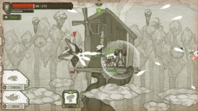
There’s a lot to fix, but even if these things were fixed it wouldn’t be particularly compelling considering many of the design choices.

Original Journey (PC) Review

Developer: Bonfire Entertainment | Publisher: Another Indie || Overall: 2.0/10

What’s up, folks? Ever wanted a game where you play as a yam with guns or some shit? Have I got the fix for you!

Alright, so in Original Journey (“original title do not steal”) you’re a plant thing in an exo suit on a mission with dozens of others to save your planet. For plot device reasons you’re not told why you’re on the planet Shadow (“original name do not steal”) aside from these green crystals, which, incidentally, a vibrant green object in an otherwise monochrome game. These things, you see, heal your folk and planet, or something. I don’t know. Anyway, a bunch more stuff happens that doesn’t even make sense in any context, like you needing to get monster teeth to make a translation program for your droid, or talking to a dude with amnesia that gives you an emerald-looking thing called a Chaos Key (“original concept and name do not steal”) and some schematics only your race could ever utilize. I don’t understand who’s writing this, or if it’s a translation error, but the story really needs, like… a spit shine, at least. It’s rough, and, at points: totally inane.
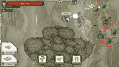
Gameplay flows like this: you’re at base, where you get quests, deal with buying and selling, swap out equipment and prepare for your next run. Then you talk to this TV thing, and from there you pick where to go to start a chain of themed levels. As you complete each level, you’re taken back to decide if you return home or do a special event. Dying on a level means you forfiet all your loot, which stays there, not unlike Dark Souls or Shovel Knight, until you come back to reclaim it or die again. It says “procedurally generated levels”, but each level is more of an arena, and there’s not a lot of randomization in those or enemies. In fact, it’s more of an RPG with some roguelike elements than it is a real roguelike. In the few hours I played the forest section, I saw most of the same levels and elements, sometimes specific ones, over and over again. Anyway, you work toward your next story or side quest, come back home, rinse, repeat. There is some progression, like better equipment or higher character level even with death, yadda yadda, but that’s about it.

Okay, so, gather round. Scout’s honor sort of moment here. Alright, you listening? Here’s the thing: I didn’t finish this game. I couldn’t, even though I feel bad about it and kind of wanted to, and there’s a very, very good reason why.

So, this game’s a roguelike, and if you’re reading random game reviews on a humor website, you probably know what that means: death. Lots of it. Any good roguelike will force you to die. There’s plenty of roguelikes, both good and bad, and there’s lots of traits that can influence an opinion in weighing them against each other. One thing good roguelikes almost universally have in common, though, is good controls. Original Journey does not have good controls.

This title’s a sidescroller, and your character’s armament is limited to a suit (with a chip in it; think socketing items in Diablo or Path of Exile), a left weapon and a right weapon. Most of the weapons are guns, but for some reason you have no ability to aim these fucking things. Your vegetable’s aim sways back and forth at approximately an upward 45 degree angle, making anything with less spread than a shotgun annoying to use. Aiming directly at an enemy involves walking right next to them and fucking pulling the trigger. This means that often times, for air enemies, you’re jumping constantly in the air in order to do any good. Weapons have limited ammo, so often times you’ll be wasting most of your ammo trying to knock some bullshit out of the sky. This gets worse later, with enemies hanging out toward the bottom of the goddamn screen. WHY? WHY DO THIS? WHY THE FUCK CAN’T I AIM AT HIM? I HAVE TWO FUCKING GUNS AND I CA-

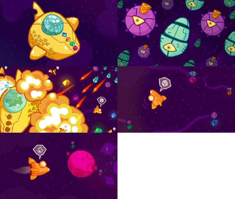
Excuse me.

So, shooting and aiming is already a problem, but it’s exacerbated by the design of the terrain in general. Many levels are oblong asteroid-looking hunks of shit with enemies on them. Considering our aiming problem, often times you will have to jump over enemies that are below your aim and attack from the opposite direction, entirely due to how your character holds a gun. Add on to this random terrain that blocks your shots and you have a REALLY GOOD FUCKING WAY TO GET MY BLOOD PRESSURE UP. FUCK.

They got these turrets that you can place two of each level, but they are just so dumb. The normal ones just sort of shoot randomly in the direction they are facing. The laser ones that you unlock next only seem better because they shoot through targets, including the stupid terrain obstacles.

Technically speaking, the game is fine. I didn’t experience any bugs, only “features” that were intended.

To repeat: I feel bad for not going through the whole game, but it just wasn’t worth the time. I know developing games takes work, but when you charge 11.99 for it, well, you invite criticism. There’s a multitude of better games to play instead, ones with plots that are fun, or gameplay that isn’t frustrating, some of them even being free. Play one of those instead. This one, in some ways, feels more like an inside Sonic the Hedgehog fandom joke attached to a random prototype game.

Graceful Explosion Machine (PC) Review


Graceful Explosion Machine.

Developer/Publisher: Vertex Pop || Overall: 6.5/10

If I’m wrong, tell me – I have no idea what’s going on here.

The title itself almost begs the comparison to Michael Bay’s Transformers movies, a point driven home by the fact that the protagonist is inside of a yellow vehicle. Like Bay’s movies, though, little is added to the genre with GEM.

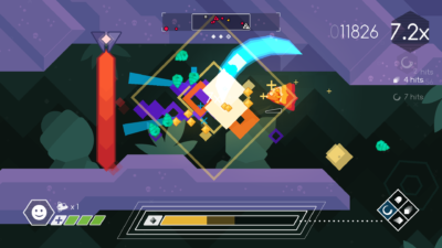
It’s not that Graceful Explosion Machine is a bad game – far from it. It’s just that it doesn’t do anything to keep me coming back after two decades of playing games similar to it. GEM is a 2D ship shooter, much like the classic Defender, right down to needing to hit a button to turn around. The game’s premise being there was, like, this big ship, or something. There was a city in it, maybe? I’m not sure. There were some gems on it, and astro pops, I dunno. Anyway, these googly-eye’d robots spheres and oblong shapes came and blew it up. A ship popped out of the explosion, and the pilot was obviously distressed that the gems they had stolen from Bejeweled had been, in turn, stolen from them. So the ship pursued, intending to set fire to their planets. It’s open to interpretation, obviously, so I’ll just post a .gif of the intro sequence so you can decide. It gets the job done, but honestly, I would have been just as happy with no story, since the stills you see explain nothing aside that you’re killing things for a reason: sweet, buttery revenge on rye, dijon mustard and a side of coleslaw. I’ll take my revenge, hold all the other stuff. Thanks.

Alright, on to gameplay. The Defender comment was a hint here: it plays like Defender. The ship is moved in the cardinal directions, but it always faces left or right, a state that is changed with space (or left trigger if you’re using a controller, and I hope you are). Aside from the dedicated turn button, there is a dash/boost to dodge through enemies. If you’re in your 30’s and 40’s, you probably know what’s up here. It’s just as riveting as before, only by this point you’ve probably played PixelJunk Shooter and stuff. Kind of like when you have a succulent ribeye steak at any point before eating a New Castle burger.

Now, for some reason this ship is unarmed until it picks up conspicuously laid out weapons in the tutorial, which is probably why these yellow guys got their shit ruined in the first place. First you get a pea shooter, which rapidly fires out blasts until it overheats, which is its only constraint. Second weapon, you get an “energy sword” which spins around twice on use, tearing into enemies and destroying enemy bullets. Next is a sniper beam, which is a very powerful beam that does a lot of damage and tears through enemy shields, but forces you to move slowly. The last is a missile barrage that can be directed out of your ship with a directional input before they race off to seek targets. With exception of the regular blaster, all weapons require weapon energy to fire. This is harvested from enemies on death via the yellow crystals they drop. The weapon energy meter doesn’t say what the max is, or how much each crystal is worth, nor is the energy required for attacks displayed anywhere, so it’s more of a fuel meter in that regard. Crystal/weapon power management seems to be the main bottleneck of player skill. Players need to swoop through slain enemies in order to get close enough to collect weapon power, which dictates how often you can use area of effect attacks. Gameplay quickly maxes out as an advanced game of chicken, blowing through enemies to collect weapon power to in turn massacre more enemies. The only real thing that mixes this up is how close enemies spawn, and if there’s an enemy that requires you to use the sniper cannon to kill quickly.
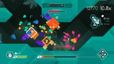
The game is divided into levels on four planets. A few open up for play, unlocking more as you complete them, culminating in a “warp” level to move on to the next planet. Each level has phases, which are this game’s checkpoint system; waves of enemies will spawn throughout an endlessly scrolling cave section as the player kills everything. Points are awarded for each kill, a multiplier in effect for consecutive kills and keeping a spree going. The ship is able to take three hits before dying, but each level has two continues, which can be utilized to restart from the beginning of the last phase that was started. The game isn’t exactly easy, but with tools like these, it’s not difficult either.
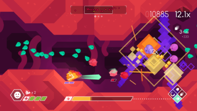
There’s plenty of different enemies, but most of the time, they either require a specific approach or a specific weapon, neither of which is much of a puzzle in the grand scheme of things. The problem is inherently with the focus of the game, which is entirely on score and leaderboards, rather than actual gameplay progression. This, coupled with spawns that don’t randomize, makes for a very stale “replayability” factor. Defender, way back in the day, got away with this by being a fixture in a public place with minimal mechanics and increasingly difficult and unforgiving gameplay, mostly to siphon quarters off kids. Well, that, and Defender is 36 years old. Graceful Explosion Machine has too many mechanics that it doesn’t dole out to keep the player interested, and thus have to use new enemies in lieu of new mechanics, powers or features to keep the player interested. Maybe it’s bad to expect more from games that go for $12.99 without a discount, but competition is stiff; there’s a myriad of games competing for your cash, and unless DeMar’s and Jarvis’ Defender is the model of what you consider an amazing experience, chances are you won’t be whisked away by this without a heaping spoonful of competitive spirit. Other games offer that competitive element too, obviously.

To its credit: the game runs well, and makes use of high refresh rate monitors. The music is benign, but not bad by any means. The controls on keyboard are serviceable, though I recommend controller. What’s more to say about a game that, mechanically, is solid even if there’s no carrot on the stick past score-whoring? There’s nothing particularly wrong with it, but it’s uninspiring, like a joke you’ve heard before, or a monologue on a topic you’re uninterested in.
And, with that: I’d like to talk to you about our Lord, Gabe Newell. Our Father in Seattle, hallowed be your name. Your kingdom come, your will be done, on Earth as it is in heaven. Dot-gif us this day our daily gameplay, and forgive us our unpaid credit cards, as we…

*The droning of a long-winded joke, built on a foundation of memes, hits for 3d6 focus damage: 14 points*
*You roll d20 to save – a one*
*Quietly, you drift off; memories of your homeship and your ill-gotten Bejeweled gems haunt your dreams*

*You wake up, covered in a sticky substance. You’re not sure where you are or what you’ve been doing, but you have a feeling it was spent doing something slightly mediocre.*

That’s what the game is like. Some people might be interested, and may even find some enjoyment out of a Defender game with some extra bells and whistles, but the depth is shallow and the ride is short.

Mighty Monster Mayhem (PC/HTC Vive) Review

Developer/Publisher: Rank17 || Overall: 3.0/10

It’s a Monday night, and I’ve got my Vive on my hip; Soup Tyrant is on the prowl! Reeoww!

Tonight I’m playing… let’s see here… glasses… “Mighty Monster Mayhem” by Rank17. It’s a VR monster game where players get to smash stuff up as a big ol’ hulking brute. Hard to fuck up what’s essentially Rampage in VR, right? Anyway, here’s what the Steam store page says:

As an outcast-scientist-turned-mutated-monster, seek vengeance against those who rejected your research! In Mighty Monster Mayhem, you can tear down buildings, make entire cities crumble, and munch on unsuspecting pedestrians. Choose from a variety of creatures, and battle with (or against) friends, wreaking havoc in multiple campaign modes – unleashing fury on everything to increase your score! How much mayhem can you cause?”

First thing’s first: the unskippable tutorial. You’re not allowed to play the main game or multiplayer without being a big boy and/or girl and playing along with the voiceover’s lesson plan, so I figured I’ll just jump through the hoop. I appear to be a big fishy monster with a big ass watch on my left arm. It’s not super clear from the narration, but from the store page description you can piece together that this annoying dude in your ear is yourself. They teach you how to walk, and then explain some basic monster techniques at your disposal: punching, grabbing, throwing, climbing and jumping.
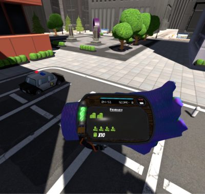
The controls aren’t bad in theory. The locomotion alone is kind of neat. Locomotion is activated by squeezing either controller’s grip button and then swinging your arms. The rate that you swing dictates the rate that you move, from a tiptoe to a sprint. It works pretty well, and it’s one of the better thought-out aspects of the game.

Punching is what you think it is. You ball up your first by holding the trigger on the controller, and then swing around to punch. Swinging your arm around without holding down the trigger doesn’t do dick, so swatting things doesn’t seem to be an option. Grabbing things is done by moving your hand close to something and holding the trigger down. You can grab a bunch of things, but what I’ve found is that if you grab things that are too close together, you destroy the thing you’re holding along with whatever you’ve “collided” with that was next to it. If you’ve managed to pick something up, congrats: you can now throw it at something by doing a throwing motion and releasing the trigger. Throwing has weird physics to it. Either something flies off into the horizon, like shitty Pokemon villains, or it flops a few feet ahead of you straight into the dirt, like my hopes and dreams do. It’s also your only ranged attack. More on that in a bit.

Now for the weirder things. For climbing, you grab a part of a building and pull yourself up, repeating the process with your other arm. Moving around the building isn’t very difficult, but doing things on the building is kind of annoying. Punching the building requires you to move your hand far enough away from the building that you don’t grab it. Otherwise, you can grab and twist the part you’ve grabbed to rip it off, which sometimes happens unintentionally when you’re climbing frantically. Jumping rounds off your skillset, which you control by holding both triggers down, raising your hands in the air, and then throwing your hands toward your feet while releasing the triggers. Jumps are, for the most part, uncontrollable catapults into the air. You can control direction and power, sort of, but most of the time I felt like a fly without wings. There is no method of controlling your descent, so often times you will just have to hope shit works out.

Monsters can interact with the environment, picking up people (and eating them for one hit point), cars, you name it. Most things you can pick up, most things you can smash. Most of them share use, though; you either want to break something, or throw it at a building or enemy. Nothing you can pick up is functionally different from anything else, aside from humans, which you can eat, and powerups, which are used rather than grabbed and thrown.

There are a few monsters in the game, but the change is cosmetic as no monster has a unique ability or function. I unlocked “Toni the Oni” twice in two different levels. I’m not sure why I did, but when I used Toni, the change was of no real significance, at least none that I could find or had any explanation. I’m sure this is more geared toward multiplayer, as the game does offer drop in/drop out four player coop.

“My fitbit says I’m behind on smashing. Excuse me, officer.”

The meat of the game, single player or otherwise, is in a quasi free roam environment. The player’s goal is to look at your watch and figure out how many buildings you have to smash. There’s some side objectives, too, like eating scientists, smashing mailboxes and some other dumb shit, but it only seemed to add to score and ended up being more trouble than it was worth. Buildings are felled by doing damage to them, but for some fucking reason the way you take down a building is via “structural supports”, which are random, unmarked bits of building that have to be destroyed to take the building out. The only way to see them is with a powerup called “x-ray”, which outlines them in red. It ends up being more like a game of “needle in the haystack” once you get to later levels, since players have to take out about 6 or so buildings before the level’s finished. Building chunks are huge, by the way. It’s like the pentagon built all these fucking things. Each building is layered with several feet of concrete, to the point where pulling out chunks obstructs your vision and clutters the damn place.

As the player ruins the city’s shit, things change a bit. At first the city is a vibrant environment, with like 5 guys walking around and a few dozen parked cars, but when players start breaking shit it goes into chaos, with up to 5 guys walking around, some of them soldiers! Soldiers shoot these slow blue shots at you as they clip through buildings out of view, or into the assload of debris on the ground that doesn’t disappear. Out of sight, out of mind, right? Nah, they fire through buildings and debris. If players take out a building or two, they start sending these fucking weird looking cars at you. They have a few miniguns on them and rocket launchers, but only shoot the same blue bullets the little soldiers fire out of the middle of their hoods, rotating perfectly with you as you move around them. This makes more sense with the treaded tanks that come later, but cars? C’mon. It’s not like there’s a lot of detail in anything else. Could it have killed them to at least have the projectiles come out of the guns?

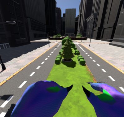
So, on top of all this, the game doesn’t run particularly well. The recommended specs for this game are at (unspecified) i5 and a GTX 980 or better. Even on superior hardware, this game has a bunch of issues rendering buildings without chugging. This is problematic, as it seems some physics and most player movement is tied to it. It becomes harder to eat people or pick them up. Throwing things is a crapshoot. Jumping becomes hopping. It’s just not a very pretty or busy game to be having these many problems.

Mighty Monster Mayhem is still indeed playable, but it’s a frustrating experience that can’t be carried by its novel approach to player locomotion. The game suffers from such a textbook case of, “great idea, terrible execution,” that it would make No Man’s Sky blush. It feels like Early Access, even though it isn’t. It feels like a tech demo, and with a heapin’ helpin’ of polish and some expansion of the “break buildings to win” formula, it could be a great game. Mighty Monster Mayhem may truly, one day, be the VR monster game to beat, the benchmark, defacto “you are a giant monster” game.

As it stands, though, as of June 2017… pass. There are other VR experiences more worthy of your $14.99 right now.

Symphony of the Machine (PC/HTC Vive) Review

Developer/Publisher: Stirfire Studios || Overall: 6.0/10

I met the boss in a dark internet alley. Real cloak and dagger stuff. He slips me a message shortly before he passes along a key. I was tasked with an important mission: review Symphony of the Machine.

My qualifications, you ask? I’m the only one with a VR headset.

Symphony of the Machine is a puzzle game that is something of an atmospheric experience. You start out as a druid of some sort, struggling against a mid-life crisis, waking up after a bender in the desert. Your character comes to, at dusk, precariously close to the fire they had been presumably sleeping next to. At first, you’re unable to do anything, but by picking up a ball on a pedestal and placing it inside of this thingy next to it, the player is able to teleport. It was at this point that the real game began, and I stepped into the projected life I’ve illustrated.

A gold ring appears on the ground, inviting me to teleport to it while my the objects in my hands whine at me to touch them. I touch them, not understanding how to satisfy them. As I look at the mural on the rock near me, I decide to figure out what the deal is with my hands. I rotate in place with a few taps of the touchpad, but the cries persist. The gold ring remains as I move on without understanding what it was trying to convey in the hopes to shut up my damn hands.

I pass through a small trench and make my way to a modest clearing with a tower. As I approach the tower, it appears that a control panel has had a button removed, with the button clearly visible next to it. I picked it up and placed it where it belonged. There was an up arrow and a down arrow, with the up arrow clearly the one to press in this situation. I did so, was rewarded with a nice song while I slowly raised up the tower.

On my way up the tower, I noticed the land was very barren – a desert-like mountainous area – and there was a very purple beam shooting toward the heavens from the tower I was currently ascending. The elevator reached its destination, I was free to walk around the area within the confines of the tower’s traversable platform. In the middle of this platform was a beam coming out of the floor, shooting right out of an opening at the tower’s apex. I moved to the next gold ring on the ground, just next to the beam, as I noticed a bundt cake-looking terminal with a hand floating above it. I placed my hand near it and clicked the trigger, bringing it to life. What happened next was the most surprising thus far.

This noisy thing sprung to life, bobbing around as it floated around. It moved toward a green glyph before looking back toward me and nodding. Then it moved to a purple one, a yellow one, and finally a blue one, repeating its incessant chirping and nodding, pausing before each glyph. It approached me, a big blue oval now pouring out of its head, a silver pane appearing within. Two graphics appeared near the area that was considered its face: a picture of a pane and a hand, and the beam bouncing off of the pane.

My purpose was to bounce this light, so I did. I shot it into a green glyph, basking in my achievement before the robot came to beep at me some more while the clouds began to blow around in the background. A bunch of transparent, green-edged hexagons popped up, obscuring the purple glyph. The robot’s obviously disapproving looks were tinted blue through the obstacle. “I meant the yellow one, asshole,” I imagined him tooting out as the graphics next to its head changed to show the yellow, eye-shaped glyph. I corrected my transgression, aiming at the yellow glyph by adjusting the pane. The green-edged hexagons vanished, yellow ones appearing in front of the blue glyph; dusk rolled back to reveal the sun and blue skies. The floaty bot happily bleep blooped as it moved over to a green pipe at the edge of the tower’s area.

The robot sucked up a bowl of dirt, doing the equivalent of an aerial saunter as it mosied over in front of me. It hovered expectantly in front of me, beckoning me to grab the grubby bowl, some pictures near its head to reinforce the duty. I attempted to outwit it by inaction. When that didn’t work, I picked up the bowl, the robot instantly spiraling back to its pipe to rummage for other things. I attempted to drop the bowl, but it hovered in place to spite me. The little robot returned with a seed, chirp, beep, whatever. You got the picture by now.

My purpose was now clear: it was my duty to place this seed in the bowl I was given. Such a duty was not wasted on me. I grabbed that seed and placed it into the bowl without so much as looking at the graphics that had appeared by my only friend’s head. It plopped in, the robot now implying that I had to grow it. I had been assigned as this tower’s guardian gardener, as decided by the fates and this little fucking noisy robot.

The robot had now become silent. I decided to lose myself in the plant I was now charged with, and to my surprise it had expressed, in the form of a graphic, that it desired something. I had come from a land where plants desired varying amounts of sun and water, but this plant had other needs: wind. “That’s weird,” I thought, “Not sure why a seedling would want to be blown.” I decided to help this budding plant become an adult, regardless of its strange fetishes.

I adjust the beam back to my original target: that stupid green swoosh that originally wasn’t “okay” to shoot at. I move the beam off the yellow glyph, which causes all these yellow hexagons that appeared in front of the blue one to vanish. I once again direct the beam to the green glyph. Hexagons reappeared where they originally had been the first time around, the wind began to blow as before. I had understood several times over at this point that each active glyph blocks clear access to another.

Something new occurred this time, though. Much like those weird stones in The Fifth Element, the thing I didn’t fully understand in my hand moved, ever so slightly. I had progressed in my career, heights unheard of: I was an accessory in the blowing of a vegetable. I had become a hooker at coma ward.

You wouldn’t believe the fucking nerve of this thing, though! This plant now got thirsty – thirsty, of all things! Now it demanded I make it rain, but not like a hooker at a coma ward. I turned around and the robot surprised the shit out of me. “BOOP BEEP??” it blerped as it passed through my corporeal self, violating the space I considered my own. “NO ONE FUCKING ASKED YOU!” I politely replied.

I moved the metal pane and jumped through the hoop, moving the beam from green to blue. More hexagon trading. Wind to light rain. Sprouting. Finished, right? WRONG. The damn plant had more damn demands! Now it wants clouds. CLOUDS. What backwards ass plant wants some clouds? Shade? I’ll give you some shade.

I move the beam from the blue glyph, dragging the beam over the robot and plant to no avail. After a few minutes of that I decided to do as I was told and shoot the purple glyph, fulfilling the cycle and my role as custodian gardener. I’ve done you proud, father.

The plant had evolved into a healthy bowl of grotesque vegan-food. Atypically “salad” and a far cry from the barren dirt bowl it had previously been. I’ll probably never understand why it desired cloud cover, or why my machine was driven by glyphs I had to shoot beams at, rather than a lever or buttons or something. I do know, though, that my journey had ended. I had saved the day, providing this plant with care that it needed for an unknown – probably inordinate – amount of time. The robot, who had be crowding my every goddamn step, booped at me, expressing its desire to become a receptacle for the plant. I grabbed a metal pane and beat it aside, cursing its ancestors before placing the plant into it’s overtly oval and blue head cavity. It was satisfied, and for some reason wanted me to take the plant back.

I took the plant as it directed me to place my life’s work in the corner, across from the green pipe it constantly plumbed for things to fill my time with. I did so, trying to throw the plant on the ground in protest while it dandily floated in place, hovering in front of the cloudy backdrop. “BLEEP,” the robot interjected, ruining my moment.

The robot had some sort of weird t-shaped part. I picked it up out of its head, thinking it was a reward, but I quickly realized it was another tool to do my fucking job. It was a beam splitter, which, when placed in front of a beam, split it at two 90 degree angles. The robot had fucked off during my examination of the object, but it returned, prodding me with another empty dirt bowl. I raised my hands up. “Look, I know where this is heading,” I said, “I’ve done my thing and I’ve helped you. I know I-”

“BLOOP, BLEEP?”

I let out a long, exasperated groan. I took the stupid fucking bowl out of his head. Oh, you’re getting a seed for me to plant again? How surprising! Bring it here then, you stupid fucker! Here it goes, oh, look – a plant. What’s this floppy one need? Windy and sunny? Sure, why not?! I split the beam, overcoming the simple puzzle and bouncing it around the hexagonal obstacles that appeared. It’s now windy and sunny, the tower’s weather reflecting my changes. The plant grows, not unlike the first one.

Thus far, I had done it four times. Seventeen more times and I will have finished the game, along with this narrative. Just imagine that I copy and pasted a bunch of times and changed some words around.

Now, make no mistake, though; Symphony of the Machine gets slightly harder in difficulty despite the repetition. You are given access to another pane and another t-shaped splitter, along with two things that alter the beam to blue, which is cold, and red, which is hot. Using the hot and cold modifiers makes extra hexagons show up that you have to avoid, but they always appear in the same place. If you set up your light path in just the right way, you can avoid all the hexagons that can appear and just slightly move panes and t-shapes to activate and deactivate glyphs as needed.

Presentation wise, I don’t think there’s much to complain about. The music was fitting. Graphically it was fine, and the weather effects were actually pretty good, but there is a minimal amount of content here with very limited replayability. There are only seven plants in the game, with three stages each. After that, you unlock sandbox mode, where you can use the maximum amount of parts (three each, and one of the fire and ice modifiers) and solve all the plants you’ve already completed with no variation in difficulty. This is problematic, considering the high bar to play this game on PC and the distinct lack of replayability for a $20 game.

I think adjustments could be made. Considering all variation is tied to what glyphs are required for the puzzle and where hexagons show up, I figure a randomized mode could really make things difficult, or at least just more puzzles. The included content isn’t even difficult, so the trip is abnormally short. The only thing I didn’t accomplish in about 30 minutes of play time was experience every type of weather, at least according to the achievements.

Now, I’m not saying no one would enjoy a sort of causal laser puzzle game, but there’s already competition in this genre in VR, and I’m not sure if what Symphony of the Machine offers is more deserving of your time than those similar games considering its shortcomings.

#23304: Yonseixryu -> Soup Nazi

Yonseixryu: so it’s like the navy with the dont ask dont tell thinng

Yonseixryu: that’s gay

Soup Nazi: Nope

Yonseixryu: hahaha rofl

Yonseixryu: i just made a funny

Yonseixryu: ]lol rofl rofl rofl

Soup Nazi: Not really.

Yonseixryu: You’r not laughing

Yonseixryu: You’r not laughing

Yonseixryu: join in on the festivity

Yonseixryu: lol

Yonseixryu: lol

Yonseixryu: lol lol lol lol lol lol lol

Yonseixryu: lol with me