Tag Archives: PC game

Trailmakers (PC) Early Access Preview

Developer/Publisher: Flashbulb || Outlook: Seems Promising

My generation, like a couple of other generations, had access to physical toys, such as building blocks or “LEGOS.”  You could build spaceships, castles, cars …or at least something that could pass for them.  In many ways we see that “idea” of creation in many of the most popular games today, but getting back to the basics of “creating a car” with building blocks is what Trailmakers attempts to do.

Now this particular concept isn’t new to gaming, but since I’ve never played Banjo Kazooie: Nuts & Bolts, it’s new to me.  I’ve seen videos and heard awful things about that game.  So, to me, Trailmakers, seems like someone had a part in developing that game, thought they could do a better job in retrospect, and from that comes this Early Access title.  Flashbulb, the developer, is apparently made up of Rare and IO Interactive veterans, so the scenario is entirely plausible.  Obviously at this point, the game doesn’t feel anywhere near complete, but there is plenty of foundation built into it, and is seemingly waiting for the content to make it “fun.”  There have already been a couple of updates that add different modes, so the focus of the game has already changed since I initially began playing.

In Expedition Mode, your character arrives to this “racing planet” full of hazards, ramps, and lots of annoying shit to collect along the way.  The more things you collect, the more things you unlock to customize your vehicle.  You can save as many versions of your creations as you like, modify an existing blueprint, import blueprints, or start from scratch just to get through one hazard.  Once you have more pieces unlocked, your creations will obviously get more complex, with engines, wheels, different size blocks, doohickeys, gizmos, dildos, and an assortment of other random things I don’t know how to use correctly.  This might be fun for some people, but unfortunately if you’re impatient and don’t really find the enjoyment in tinkering around using a mouse/keyboard (or a controller) to build vehicles, it becomes a tedious task.  The builder itself is about as good as it can be, but since you are building in a 3D space, it can get annoying to see where things are being placed without moving your camera multiple times for each piece.  It just isn’t the same as holding blocks in your hand and putting things where you want them to go.

The driving isn’t necessarily that much fun, and the map is full of forks and different paths that lead to the same end point.  There’s also a lot of empty space, but considering you’re meant to drive around, its probably not that big of a deal.  Outside of collecting shit, there’s not a whole lot “to do” other than get past hazards and get to the next zone to collect more things.  More plainly, the gameplay loop is lacking severely; there’s just basically no reason to play unless you really enjoy making new things in the builder.

The driving controls are floaty as hell, but I’m unsure if this is part of the design or not.  The point of collecting better upgrades and designing a vehicle that works well aerodynamically and with the types of engines you are using seems to be part of the challenge, but it isn’t structured very well.  There are no early-on upgrades that can improve your controls very much, and its a constant struggle considering they intentionally make them worse if you aren’t designing your vehicle correctly according to the in-game physics.  Another annoying aspect is that the camera isn’t able to be controlled while driving, at least with a controller.

I think the fact that it is an open world with no other “racers” to race against is a large part of what makes the game feel boring outside of building.  There isn’t any motivation to continue dealing with the crappiness of the controls or tediousness of having to build something to just get through one hazard. Redesigning everything from scratch over and over becomes an exercise in “doing the bare minimum” to get past whatever is stopping you.  You might be able to stumble through hazards with your same vehicle, but you’ll be dying over and over.  There’s a lot of things that will clip your vehicle or make you blow up, so you’ll constantly be respawning at the last checkpoint over and over.

The Race Island mode, which was recently added, allows you to more fully tinker around with the game’s systems as everything will be already unlocked.  You’ll only be doing “time trials” as there are still no other racers to race against, but it is more satisfying to be able to mess around with a large array of items from the beginning — it doesn’t feel like you’re “missing” anything.  However, without proper tutorials you’re going to be building some really wacky things that don’t work the way you think they should, and all of a sudden you have a helicopter that flies upside down and goes directly up.

Trailmakers will probably appeal to a certain set of gamer that really enjoys fiddling around with mechanical engineering concepts.  Seeing what works and what doesn’t work in a real physics-driven world is pretty cool considering the amount of freedom you’re allowed to build things.  I would have really appreciated some sort of generic base blueprint archive of some sort so that I could just click it and go with a new vehicle once I had everything unlocked and then modify it as I saw fit.  As of now, there’s plenty more that needs to be added to the game to make it more appealing to someone like me, but with the existing foundation already included, it seems promising that a worthwhile game could be made out of this.

Battlecursed (PC) Early Access Preview

Developer/Publisher: Codex Worlds || Outlook: “NOT FUNCTIONAL”

Man, I don’t know how the fuck I get stuck with these things.

…Alright, I kind of do. Dave provides a list, I do a bit of Google or Steam store searching, make a decision off of ten seconds of research and give a thumbs up or down. What a magnificent way to fuck myself.

For this piece of fluff, I’ll be reviewing Battlecursed. Oooh! Spooky name! Battlecursed, like many games, had a review embargo. February 5 at 7:00 AM PST, to be specific. It’s Feb 19th at the time of me writing this, and probably much later in posting, but I bet you Battlecursed will be in the same state as it was the first time I played it about a month ago: shitty. Really, really shitty.

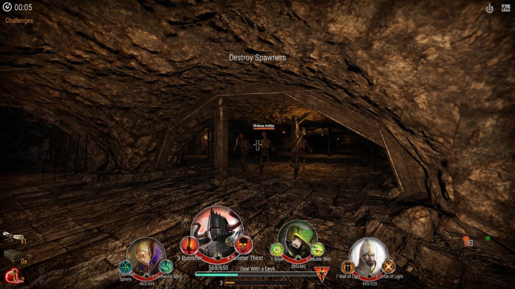
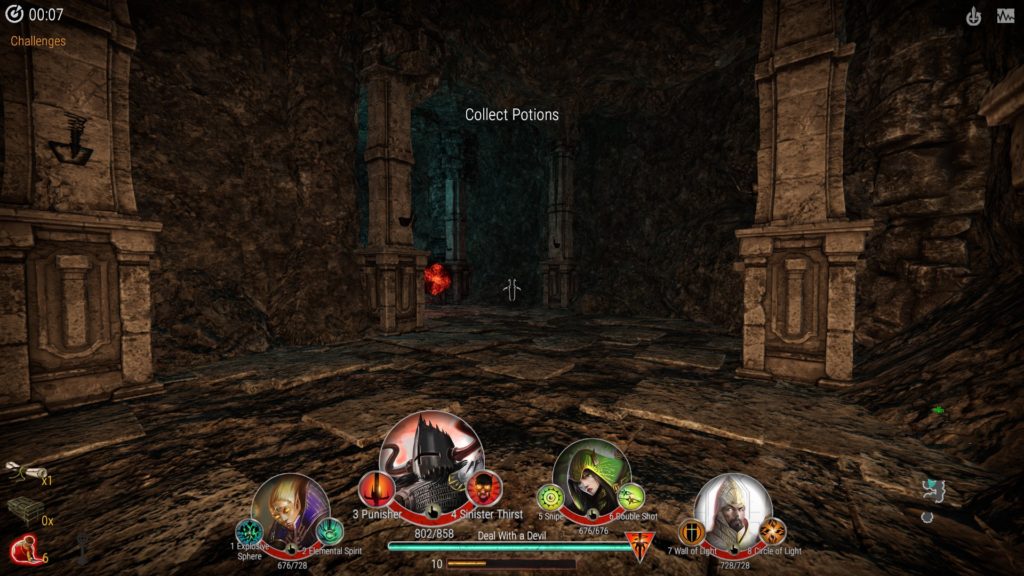
One of several samey dungeons you’ll yawn your way through as you quietly chant to yourself that this is how you spent the last $10 to your name.

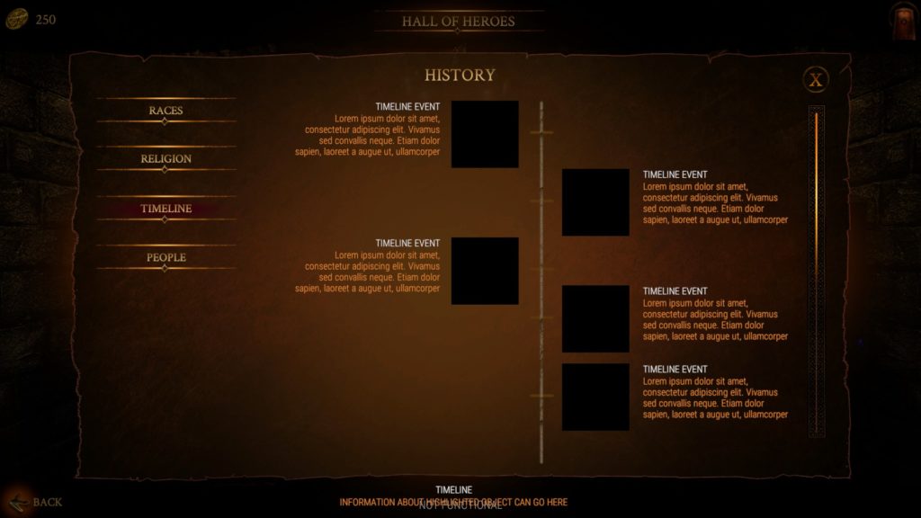
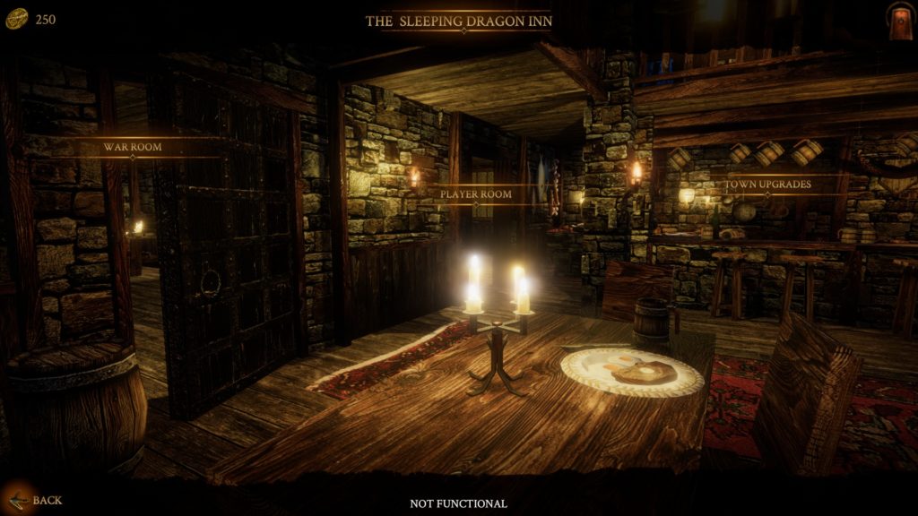
Battlecursed is a “dungeon crawler with roguelike element” where “a single player directs a four-hero party through real-time first-person battles”, which, in text, sounds like Legend of Grimrock “with roguelike element.” Not a terrible idea, but I don’t understand why the fuck they want reviews for this. This thing is obviously not ready, plastered with “NOT FUNCTIONAL” as if I couldn’t tell from the “Lorem ipsum” and lack of response to clicks and key presses. You pick from eight heroes of four classes (using the same portraits) and form a party. Each party member has two passive abilities, two active abilities, and ultimates, which don’t fucking work anyway at this point. You’ll spawn in a dungeon, have some menial task, like destroy all monster spawners, and then a key will spawn which allows you to go to the next dungeon. It plays much like DOOM in the 90’s played, only your weapons are on cooldowns and everything is bland. There’s loot, but it’s not working, so I can’t talk about it. There’s guilds, but they don’t work, either. There’s a bunch of stuff that’s supposed to be here that isn’t here, so all I can comment on is the very bare-bones, lackluster dungeon crawl that has none of the properties of a game I would consider “good” or even “okay.” Abilities have strange hitboxes that sometimes work, sometimes don’t. Enemies are sluggish and can be kited easily. Everything is brown, unless it’s a spider, an enemy portal, an exit portal, or some sort of magic skeleton. Even the fucking menus are brown.

Yeah, yeah. Early access. The “Get out of jail free” card for shovelware that’s trying to make sales based on promises. Sure, not all titles or developers abuse this, but enough do. Battlecursed sure as shit isn’t ready for any kind of sales. There’s nothing redeemable here. What this game is setting out to do isn’t even complicated, I don’t understand why they’d push out the concept in to storefront territory without having even the basics work. Eventually you’ll go through enough floors where you’ve finished your run. There’s no loot to have at this point, no fanfare, not even a comical whistling fart to commemorate your pointless journey into the bowels of brown.

Now, after playing The Forbidden Arts, I felt bad for shitting on someone’s work. They’re trying. To Stingbot Games’ credit, though, their shit actually works. Maybe not well, but it does anything at all. So, there we go. “NOT FUNCTIONAL” out of 10. Review’s over.

Does the fun ever start?

“NOT FUNCTIONAL” /10

Forbidden Arts, The (PC) Early Access Preview

Developer/Publisher: Stingbot Games || Outlook: “.5 /10”

Today we’re reviewing… The Forbidden Arts… which… I don’t know where to start. That’s a lot of ellipses (that’s the plural form, get off my case), but the nicest thing I can say about it is that it runs when you start it. Everything about this is a mess, even conceptually. It was an excuse to make a character anime-ninja-run around getting their shit ruined by wolves and elves.

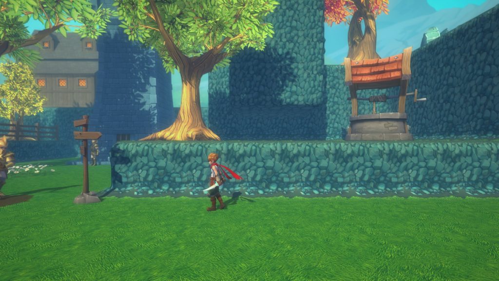
First off, the writing. You’re a young man having a hot-flash-inducing dream where someone says “It’s time” but in a manner that doesn’t convey urgency. I guess you’re supposed to be a guard in town, even though you don’t look anything like the other guards, and being asleep at the job isn’t really kosher. You get kicked awake by a “I have it worse” guard that recommends an ice cold glass of whiskey to beat the heat (what?) and instructs you to see the local druid (what??) because the store is closed for the afternoon. The dumb guard claims that bears and wolves are no match for my pair of daggers (what???) despite my lack of any armor, including bare arms. He was wrong, by the way: wolves in this game will two-shot you and spin on a fucking dime. Before I leave, I get to see the wimsey of the world my character lives in, including blocking outcroppings of rock everywhere you go. Seriously, here’s the first town:

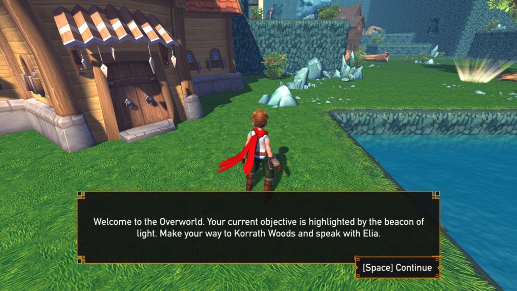
I don’t know why everything is so square, or why the well is in such an inaccessible place for most folk. After you walk out of the town, you’re sent to the overworld map area, a concept that goes as far back to Final Fantasy and Dragon Warrior. In The Forbidden Arts, the overworld map looks like this:

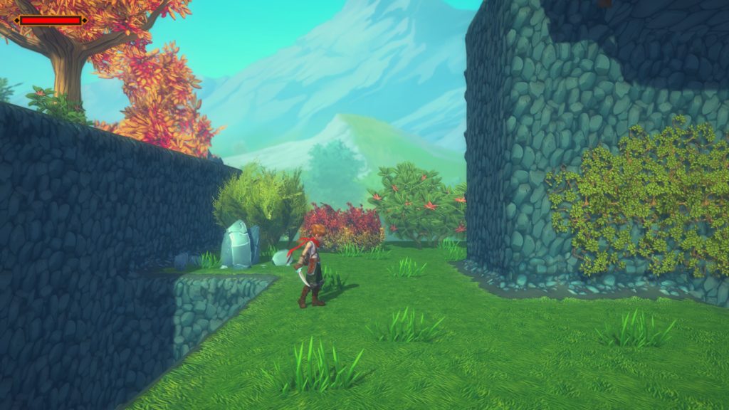
It looks like some sort of half-assed Super Mario 64 level. The town is represented by this huge-ass tavern or shop or something. The forest is a tree. That water in the screenshot will kill you, by the way, and the field of view is all sorts of fish-eye when moving around. It’s not pleasant. This alone needs a revamp, as it doesn’t feel like an overworld. Anyhow, time to go to the forest to talk to this druid, Elia. A forest makes sense for a druid, in that this is what a forest looks like in The Forbidden Arts:


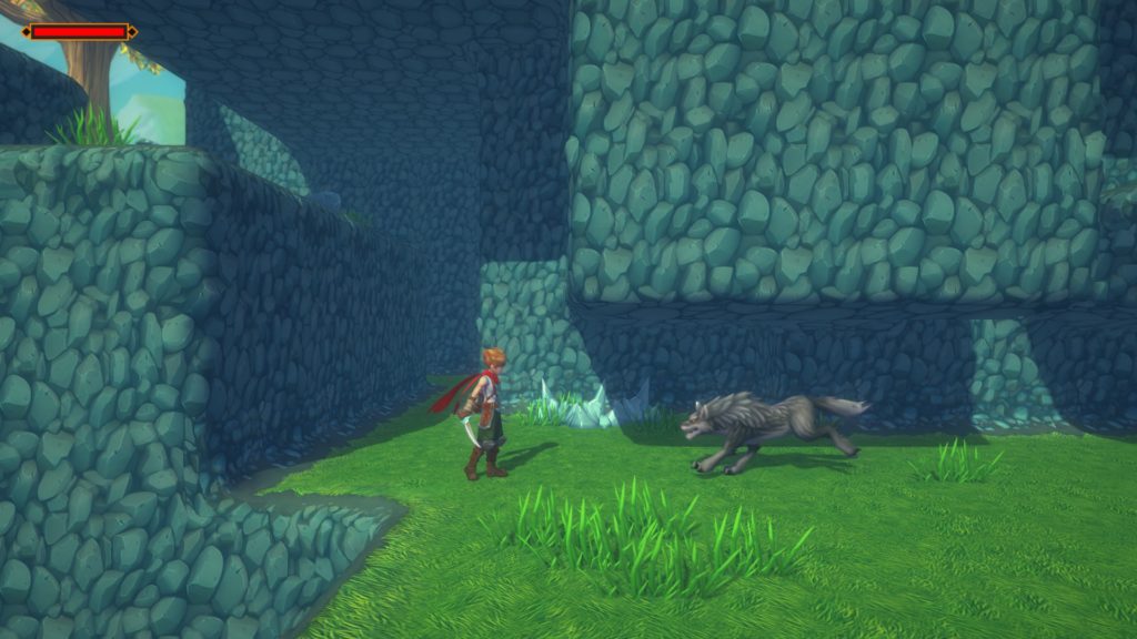
Blocky, square caves? Well, not caves; those tend to not bask in the sun. I don’t know what the hell is going on here. That wolf, by the way, is no joke. I beat Cuphead on fucking expert, and these things make me want to find some expire ipecac to guzzle. Movement is mushy, even after some supposed improvements way after the initial release. Sure, I know this is early access, but even the basics are fucked. There are dozens of examples for “good” side scrolling and platforming mechanics, even outside of the metroidvania genre itself.

Moving on.

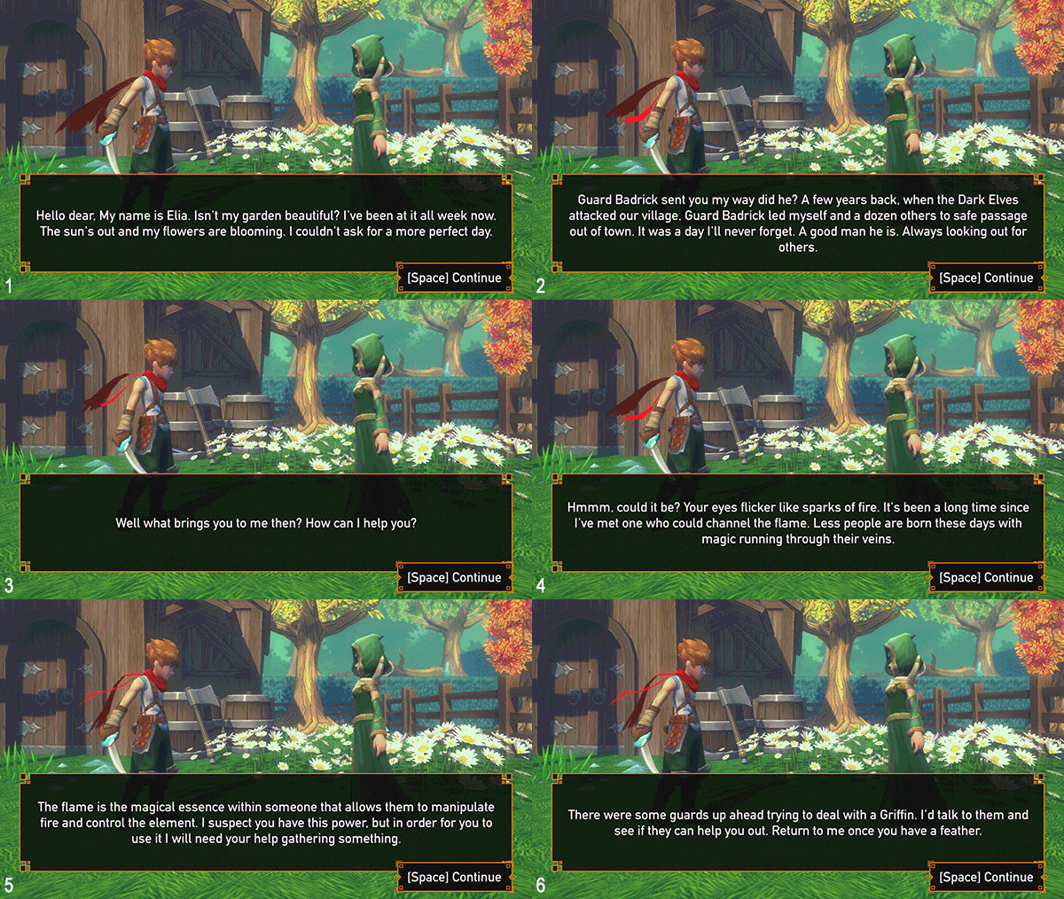
After climbing on some vines I made it to the druid. Now, there’s a way to handle silent protagonists that doesn’t come off hammy or juvenile. Does this exchange pass? I’ll leave it up to you. There are six frames, you can follow the conversation by following the number in the lower corner.

I don’t know how they could make this any more happenstance, even with the injected random flashback for her. You just happen to have a dream, guard just happens to send you to her, she just so happens to know what your thing is, and it just so happens that the guards that spoke to her earlier (Why is she out here? She’s not a part of the village. She’s in the “woods.”) are dealing with the thing that you just so happen to need a feather from. Yeah, I took a stab at this quest, but I didn’t enjoy it. I gained the ability to suck up camp fires to shoot fireballs, which didn’t really seem that handy in practice.

I get it, making your first game is tough. I’ve made a few on my own in BASIC back in the day, I’ve toyed around with a few projects, but as soon as you start selling it you open yourself up to criticism. This game should never have been sold. It lacks the foundations of what make gaming a hobby that’s enjoyable or even addictive for some, and that’s not that hard to do. Set up some rules and don’t change them, give the player a goal, and give the player an avatar with a level of control appropriate for the challenges you’ve set forth. There’s more to it than that, there’s gameplay design, level design, and even, these days, in emergent gameplay design in games like Metal Gear Solid V: The Phantom Pain and The Legend of Zelda: Breath of the Wild. I think, however, that even with the basics down something can be honed into an enjoyable experience. I don’t think this game has a grasp of that.

I don’t want to be too hard on the guy making this. I know it sucks to have someone come and piss on your work, but this needs too much work to be fun, and some of the choices are so bizarre I feel like I’m playing a game version of Birdemic or Sharknado, as in choices so poor that they must have been intentionally poor choices. From the Naruto-run and Sauske stylings of the protagonist to the ho-hum plot and grotesquely cubic levels, all the way down the the mushy jumps, poor voice-acting and interrupted animations. It’s a 3D RPG Maker game with a plot written by SquirrelKing, and it runs. I’ve played thousands of hours of games. I know when something is too flawed to continue pushing through on. This is one of those times.

Blasters of the Universe (PC/HTC Vive) Review

 Developer/Publisher: Secret Location || Overall: 8.75 / 10

So we’ve got another VR game up to the plate. This one, Blasters of the Universe, by Secret Location, is something of a mashup.

A vast majority of VR games belong to a genre collectively called “wave shooters,” which pit the VR player against wave after wave of enemies. Sometimes there are mechanics for moving around, but most of the time it’s standing or room-scale. Often the player is taking cover behind something, like a shield, and dodging what they can. Sometimes the enemies are zombies, sometimes they are robots, sometimes they are gangsters.

Blasters of the Universe doesn’t break all the molds of the wave shooter, but like some kind of VR Coldstone Creamery it rolls in a heaping cup of “bullet hell” while spectators watch behind the glass counter thinking, “Are these guys insane?! Who wants Ikaruga in their wave shooter?! Gross!”

Turns out: I do! And I don’t think my tastes are that refined, at least when it comes to VR.

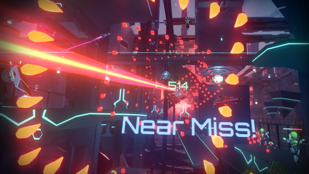
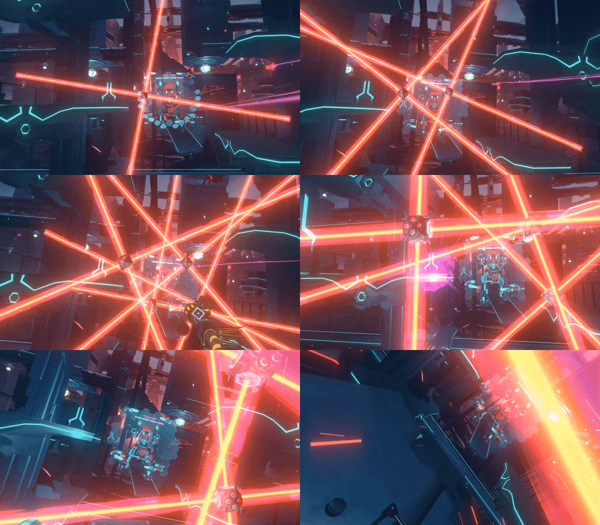
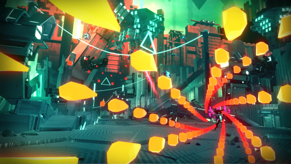
The premise is that some unemployed nerd named Allen was really good at arcade games in the 90’s, or maybe late 80’s. He was only good at games, somehow he was able to get into “VR” and has been living there ever since. Despite how very close the antagonist is to me in the game, the story’s not important. The Grand Master Virtual Space Lord Alwyn will be around to mock you, or even awkwardly praise you, but the meat of the game is blastin’ and dodgin’ with a lil’ bit of blockin’, and isn’t at all story driven. The same basic premise for the wave shooter: enemies will appear periodically while you shoot at them. However, their attacks come at you very slowly, often in patterns or huge fields of bullets. In many games, the player’s hitbox is some amalgam of their head, the area beneath, and possibly their hands. Blasters of the Universe does the unthinkable in most by making only the player’s head the hitbox. That allows for some pretty miraculous dodges, but it also allows the bullet hell mechanic to work without being absolutely frustrating. Your are limited by your own movements, which isn’t novel in VR, but it is for a bullet hell.

There are a variety of enemies with their own patterns of attack that, when they are all firing at the player simultaneously, leads to some interesting gameplay. While the player tries to 3D limbo through all the space in between the bullets while trying to counter attack with their own gun. Less enemies means less things shooting, which means the player won’t have to somersault through death-fields. Occasionally there will be a boss that needs spanking, and they will have their own attacks, telegraphs and “puzzles” (if you can call the process of “how do I kill this?” a puzzle). There are four campaign levels with casual and “hell” modes, and each of those has an infinite mode if that’s your thing.

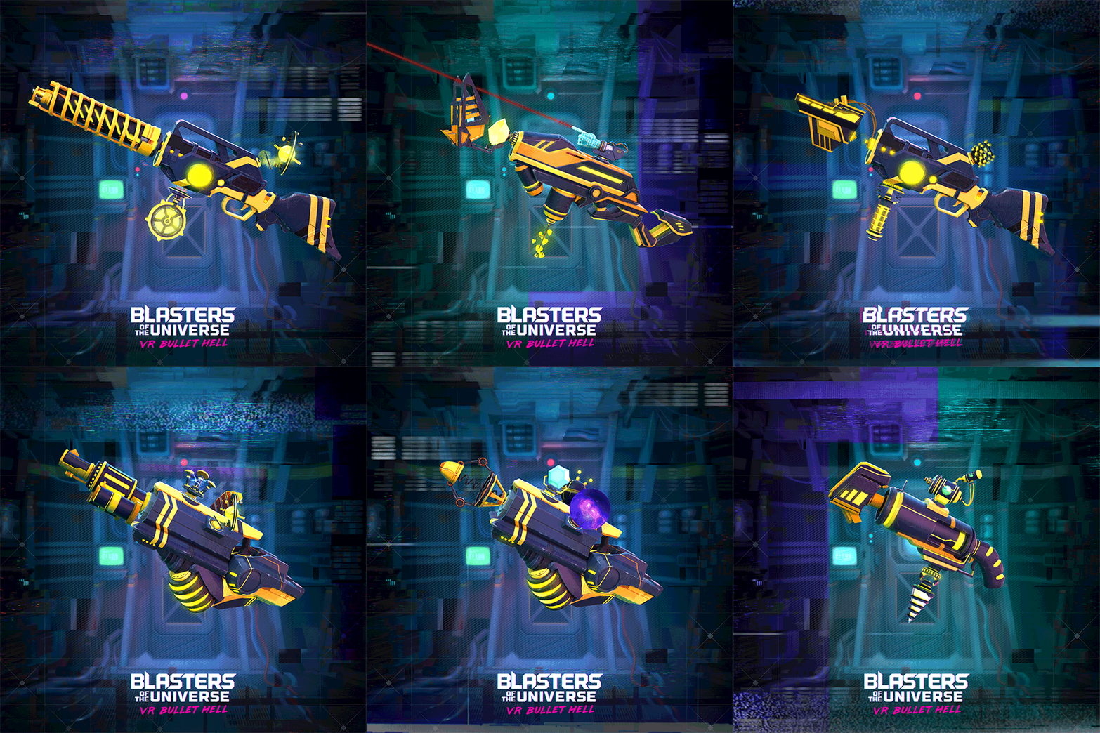
What’s the shooting like, you ask? Well, that’s up to you. There are a bunch of weapon parts to fabricate your own gun out of. Semi-auto or full auto, magazines or recharging ammo pools, precision or spreadfire, you name it. Players pick a weapon frame, barrel, bullet type, magazine and a gadget to make their own weapon of choice. Along with this, they can pick different kinds of shields that, while unable to block everything that comes at the player, they can provide some relief in a pinch. They vary in size, strength and mechanics, with some changing the player’s defensive tactics entirely. The last thing of note is that each weapon frame has a special ability that charges as you shoot n’ dodge your way through waves. Specials like a super-powered laser that sustains for a few seconds, or having two guns for a short time.

Blasters of the Universe performs pretty well on a 3770K processor and a GTX 980ti, and it took quite a lot going on to get any frame drops, which is somewhat admirable considering some of the garbage I’ve played, which is saying quite a bit. The art style might not be everyone’s scene, but it fits the narrative, and it gets the job done just fine.

I like this game quite a bit. I don’t really dislike wave shooters, but there are a ton of them and most of them have their own “twist” that either doesn’t add anything novel, or complicates something that would otherwise be fun. Blasters of the Universe‘s take is one of the better, more unique spins, and in some ways improves on what “classic” (bare with me, the platform’s a baby) VR titles, like Space Pirate Trainer, laid out in the genre. It’s not what I’d call a relaxing game, but if you’re in the mood to move around and shoot at things, this is one of the better choices I’ve come across.

Station, The (PC) Review

Developer/Publisher: The Station || Overall: 6.0/10

The dude that brought you the rare flash game “Cat Attack” and the other dude who made a local pizza restaurant’s online delivery form come together to bring you The Station, from developer The Station.  I can’t tell if the company name is just lazy or if they are the gaming-equivalent of a musical supergroup that makes one album/song and that’s it.  This needs as much explanation as the goop that is left over in the microwave after making Annie’s Macaroni and Cheese.  I NEED TO KNOW!

The premise of The Station is that you are a “recon specialist” on your way to find out what has prevented a large traveling space station from accomplishing its mission.  The original mission is to study and observe the first intelligent civilization that is found in the universe — the ripple being this civilization is in the midst of a “civil war” so the home government is unsure of how to present themselves to this new race, or if they present a threat.  Their plan is to send three idiots stalwart members of society without putting them through a vigorous psychological screening process on this important mission, and of course lo and behold something goes wrong.

As the “recon ‘specialist'” you are not-very-urgently trying to figure out what is going on with the lost crew.  No real attempts to communicate occur, as the recon specialist takes their “recon” occupation to heart.  You will walk around, look at things, read things, fiddle with switches, take things out of boxes, and put things in other things.  You’ll also listen in on “augmented reality” conversations that have been left over by the three staffers on board as you slowly realize that none of them should have been sent on this mission.  Oh, did I mention that three people might be dead or dying and there is no sign of them the whole time?  At the end of it all once you figure out all of the ins and outs of the mystery, it’s the most competently underwhelming game story I’ve experienced in a while.  I saw the twist coming a mile away, but I was holding out hope that it wouldn’t be something so obvious, though it was “disguised” cleverly enough along the way.  At the end, it went even further in the direction of “cliche” and it ended up feeling very pretentious with a blunt political message.  The passive aggressive melodrama playing out in audio-only was not particularly enjoyable nor relevant to the greater “mystery” at hand, making me not particularly care about their fates and even hoping for their deaths.  It also didn’t make sense why people’s dirty laundry would be floating around in augmented reality orbs for others to listen in on.

Technically, the game is competent as a “walking simulator.”  Any of the “lack of gameplay” this title exhibits gets a pass since that’s just the genre it’s in; it achieves what it strives for.  The puzzles are not too complex, but can be challenging if you aren’t good at remembering the differences between similar symbols (which by the way is the worst way to realistically organize/configure anything).  Not every puzzle or room needs to be explored to complete the game, and you can easily miss something on the first go around.  There is one small room that I opened up on my second play through, and I was unable to figure out exactly how to get into one of the character’s lockers due to an incomplete puzzle hint.  There’s also another section I was unable to figure out how to get in at all, and still don’t know how to get in.  It’s also possible I missed more and just didn’t “notice” it was something I was supposed to try to get into.

The graphics are a lot better than they have any right to be.  There were a lot of random doohickeys and items to look at before you threw them away to the side.  “Set design” was interesting and varied and the space station felt like one, though small.  The sound design is very well executed, and brought up tension levels when needed or provided the feeling of the ambience required.  The game lasted only about two hours, which can be a drawback if you are looking to spend at least a little more time utilizing the things you learned during the first thirty minutes to an hour.  I spent about half an hour after the game ended trying to get into places I didn’t see the first time around, but lost interest after that.  There weren’t any technical glitches or issues with frame rate that detracted from the experience.  The only way the game could have been longer was if they forced you into every room somehow, though at the same time the parts of the space station you explore feel a lot smaller than they look from the outside.

Despite being really down on how the story turned out, it was a generally pleasurable experience once my expectations were tempered in the gameplay department.  Observing and soaking in a well-crafted atmosphere has its value if you enjoy doing so.  Though I don’t usually play this genre, it really leans on its writing/presentation for the goods.  The story really needed to be executed well, and while you could say it technically was, it felt more like a prologue to an actual story, and not a complete one.  The muddled political message didn’t exactly elevate the story either.

A Robot Named Fight! (PC) Review

Developer/Publisher: Matt Bitner Games || Overall: 8 /10

Often times, nostalgia is controlled by a brand. You get droves of village idiots bickering over Star Wars and the proper way to make a Zelda game. Sometimes, though, you can have a love letter written to you, signed by someone else. In a way, that’s the best way to sum up A Robot Named Fight! in a metaphor.

From the title sequence, to the voice over, A Robot Named Fight! tries really hard to evoke the same feelings Super Metroid first did. This didn’t necessarily put a good taste in my mouth. I prefer tapioca pudding. However, almost immediately it earned the right to try to tug at my nostalgia strings.

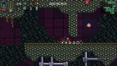
Most folks that know their way around video games have either heard of a “metroidvania,” or have personally played one, but for the sake of being a contained resource I’ll outline that now. A Robot Named Fight! is, at its core, the definition of what a metroidvania typically is: the player controls a character in a 2D-sidescrolling environment, exploring rooms and killing enemies as they collect power-ups, abilities and equipment. Some areas require particular abilities to traverse, or require specific pieces of equipment to get past, such as a door that requires a missile to open, or an area that requires fire-proof armor. Typically, one item will allow the player to backtrack and find another ability in an area that was previously inaccessible, often with the aid of a map in some form or another. Enemies and bosses tend to be common hurdles, but the environment itself often demands a particular level of platforming skill to get around. There are dozens of bread n’ butter titles for this genre, but they tend to share a common trait: the environments aren’t randomized in any manner.

The twist for A Robot Named Fight! is that it’s a roguelike; the “item progression” and map itself is randomized whenever you start a new game, picking out from a pool of items you’ve unlocked from gameplay. Some runs you’ll have to get an upgrade to shoot switches through walls, other runs you’ll need to find their version of the morph ball, which happens to be a tiny spider, or rockets. You start out kind of slow and clunky, but most upgrades augment your walking speed, shooting and bullet speed and damage. In a sense, it’s a Super Metroid clone you can never memorize the map of. Runs, depending on completion of the map that spawns, take about an hour or less depending on the level of exploration, the items given to the player, and the enemies and bosses encountered.

The art style is an homage to titles of the 16-bit and 32-bit eras. The music and sound design is fitting, especially for the B-horror film plot line explored through the game (it’s very much a secondary aspect to the game, not that it’s a problem). There is very little A Robot Named Fight! does that I feel is underexplored or half-assed. The only thing I can even suggest is that I wish the map had colored doors for various progression blocks, but it’s a small grip considering the game’s content and obvious aims. There is little more you could ask for in terms an unofficial successor to Super Metroid.

Legrand Legacy: Tale of the Fatebounds (PC) Review

Developer: SEMISOFT | Publisher: Another Indie || Overall: 8.5/10

If you’ve never thought a developer, naming itself a dick joke, could make a faithful, competent, and actually fun “JRPG” then I’ve got a surprise for you.  And it’s in my pants.  Legrand Legacy: Tale of the Fatebounds coins itself as a “love letter” to JRPGs with a “fresh take” on turn-based combat.  In practice, it’s like jerking off JRPGs of the early PS1 and early PS2 eras and blowing their collective loads all over your PC’s hard drive.

During high school I became quite a big JRPG player and it has persisted until now.  Final Fantasy, Breath of Fire, Xenosaga, Persona, Legend of Dragoon, Chrono Trigger/Cross, Enchanted Arms, Star Ocean, Unlimited SaGa, Lufia, the list goes on.  I’ve kept up with my personal interest of JRPGs, exploring the Wild Arms series more recently, but its been a good four years now since I’ve really stuck with one through the end.

Legrand Legacy: Tale of the Fatebounds takes you back to specific time periods of console JRPG gaming.  Think of all of the titles that are released just as a new console comes out, with developers trying to get their first JRPGs out quickly; they are less about doing something new and exciting, but more about the basics of the genre and telling a fun story.  Legrand Legacy hammers this feeling right on the head, and while it’s admittedly a better-looking game than you might be used to from those time periods, there are so many callbacks baked-in from past titles.  So much so, that you just get a nostalgia overload for gaming mechanics being combined in one place and seeing it all just work out becomes a fun exercise in pointing out what came from where.  Practically every gaming mechanic can be referred back to another game, and while there are some modern sensibilities, such as a quest log for sidequests, nothing particularly “degrades” from making you feel like you’re playing a JRPG from the era it hearkens back to.  And, of course, the characters are also of very attractive design.  They really thought of everything!  Just don’t hump the mattress too hard, friends.

The biggest accomplishment for Legrand Legacy is that it is actually enjoyable, despite not really solving any of the problems JRPGs from that time period have in today’s gaming environment.  Combat is the biggest gameplay aspect; the battles are a bit slow, but you’re not “waiting” as much as you might be used to in this genre.  Turns are more phase-oriented, but a turn-order is not completely ignored.  The biggest efficiency increase is allowing for all melee attacks to execute at the same time, with spells “channeling” and being cast after melee attacks.  Most spells are channeled, while some will cast before melee attacks.  Melee attacks are also allowed to interrupt enemy spells, but you’ll have to use the Formation mechanic to prevent that from happening to your characters too.  Your “front row” is best served for melee characters, while the “back row” is typically better for casters/ranged.  Although enemy spells can still interrupt your back row, you are more reliably able to cast spells there.  There is also a slight stat re-balancing from placing a character in a certain row, reflected in having less attack but more defense in the back row, and the opposite in the front row.

You are allowed three active characters during battle, but are able to switch them out like in Final Fantasy X.  I’ve always sung the high praises of FFX being the best traditional turn-based system since it opens the ability to use all of your characters during a fight rather than only being able to switch out of battle.  It always annoyed me when I’d have so many characters but didn’t have any reason to use them.  Though, in Legrand Legacy, when switching characters from the “Reserve” they are able to act in the same turn as well, but may need to move from the front/back row to properly work for your strategy, which does cost a turn.

The major aspect of defeating enemies is the Persona-like elemental weakness/strength attribute system where using particular attacks/spells deal more or less damage.  Although not as intuitive/fast-paced as Persona is, Legrand Legacy‘s spell-casting system, known as “Grimoire,” is akin to Chrono Cross with no mana cost and assigning the skills to particular slots.  You can use your Grimoire skills as often as you like, with no cooldown or mana cost, and their effectiveness mostly relies on the enemy’s weakness/strengths.  Similarly, items are assigned to slots and you’re not able to use your whole item list, forcing you to strategize about the item spread.  Grimoire heals are not particularly overpowered, actually healing less than items, so the decision between attacking and healing, and how to heal is a thing.  This isn’t typically a dynamic that is present in JRPGs, at least in my experience, since it tends to be an out-of-battle-only mana-management exercise.  In Legrand Legacy, however, the only way to heal out of battle is by using items, which are all percentage-based, giving them longevity in their usefulness.  Learning of new Grimoire spells is reliant on the way you build your characters with stats as they level; while they basically force you to go in a particular direction, how you get there is up to you.  Character builds are intentionally not diverse as a result, but having control over the path allows you to aim for particular spells before others.  I have yet to see a dick-themed spell, but anything is possible late-game.

The combat interface is reminiscent of Xenosaga in a sense, while being as functional as a typical Final Fantasy game.  Unfortunately, that means you menu hunt a bit more than you feel like you should, and it would have been nice to add “shortcuts” to your favorite spells on the main interface layout rather than having to go two levels to repeat the same skill over and over.  Also, for some god-awful reason, they decided to allow for the directional buttons to confirm your choice of spells after highlighting them, which I constantly accidentally hit since the Xbox360 controller’s D-pad is ass.  This made me find out there is no way to customize any controller inputs and stop that from happening.

Most actions require the same QTE game to be played for each character, a call-back to Legend of Dragoon and Final Fantasy VIII to a certain extent.  There is a circular wheel with a quadrant highlighted; if your dial is timed to land inside of the highlighted quadrant then you are good, but getting it in a small sliver allows for a “Perfect” execution of the skill, allowing for bonus damage or a lesser chance of being interrupted if it is a spell.  While it is simple, quick, and not particularly annoying to execute, it does demand that you are actively paying attention during an entire fight.  If you don’t play the QTE game or fail it, your characters will all miss.  One of the niceties of this genre was being able to plug in all of your commands then walk away for a couple seconds and do something, but in this case it’s not something that happens.  Related to your normal attacks, your characters will slowly build up an AP gauge which allows for a special attack that deals devastating damage.  The gauge will only fill up based on offensive attacks, so if your healer is just healing all of the time, she won’t gain anything.  The numbers that fly around for damage are also a bit confusing because there are a variety of colors that can appear, and since many attacks go off at the same time, you don’t know which numbers belong to who.  Considering the weakness system is important to master, this lack of information doesn’t make it easy.

The AP gauge is important to fill up before hitting up a boss, which can be accomplished while you are in the middle of a grind.  Yes, unfortunately, you will have to grind for just about an hour in each dungeon before fighting the end boss, and that’s after figuring out the puzzles.  There is also a bonus boss in each zone, which is usually about equivalent in difficulty to the story boss, but for the sake of convenience you should defeat it first since you may instantly leave a dungeon in the course of the story.  There aren’t any random fights, but it’ll be a challenge running away from the black eyeballs that represent enemy encounters in the dungeon.  They respawn very quickly while you’re in the same zone, so it hardly seems relevant that the fights aren’t random.  It’s also very hard or impossible to avoid them all, so the point of having generic black shadow eyeball enemies on the map seems a bit redundant.  There are also extra sidequests, maybe one or two per town, that will grant you XP after finishing a task, so it can help with bypassing the grind.  I’m not particularly against grinding since you really get into the intricacies of the battle system, so the “about an hour per dungeon” seems just enough to get acquainted with the area and master challenges the enemies present before moving on.  Plus, the bosses will cut your dick off and you’ll get a game over if you don’t grind, so there’s that.

The inventory system takes on a Star Ocean-type crafting system, but for weapons and items rather than cooking.  You’ll collect all sorts of loot from enemies, who never drop actual money, but only items you can sell.  This loot can then be used to craft healing items, offensive items, and weapons.  Encumbrance is an actual thing in this game, so you won’t be able to run around and grind infinitely — you’ll have to visit a town and store away all of your unused items at a vendor.  Unfortunately, the game does not allow you to access your storage for crafting purposes and you have to have it in your actual inventory to use for crafting.  You’re still able to walk really slow while encumbered, so instead of picking and choosing, it’ll be less effort to just take everything out, craft your shit, then throw everything back in.  The same goes for weapons/gear/dildos — you’ll only be crafting these items and nothing will drop in the field.

While the cutscenes look like shit, the in-game art-style is actually quite faithful to late PS2 visuals, most notably Final Fantasy XII.  However, they go for a “pre-rendered background” look like you would have seen in, say, Final Fantasy VIII.  Instead of CG, they exclusively use painted backgrounds with some in-game art/elements overlayed on top.  The painted backgrounds all look very nice, but depending on the perspective it looks way too obvious that the main character, Finn, isn’t actually “touching” the ground; the shadows the character gives are also a dead giveaway on the dungeon/world maps.  The purpose of pre-rendered backgrounds were to supplement the art to make it not look as crappy all of the time, but they seem to have gone too far in that direction and replaced many things you would typically see “in-game” with the paintings.  This is so they didn’t have to spend time modeling things like furniture or barrels.  There is some exploring of towns, but they are segmented into selectable areas, reminiscent of Unlimited SaGa, though I’m sure there might be a more comprehensive analogy to make here.  The areas are physically explored in similar fashion to Final Fantasy VIII, with a static camera.  Music and sound effects are also quite faithful to the genre, with the music being a highlight, in terms of variety, as each zone has its own song.  You’ll also hear voices of the characters during battle.

The main character of the story, Finn, looks like Ryu from Breath of Fire, with blue hair, a “secret past,” and “loss of memory” to boot.  And probably the same 10 inch dick!!!!  DAMN!!!  However, I was surprised he wasn’t a silent protagonist.  Unfortunately, he breaks his character too often to be believed as a memory-less blank slate like they initially pitch him to be, and I wish that they went the silent protagonist route instead.  The script dialogue tends to overstay its welcome a lot more often than I’d like — typically I get the point within two or three dialogue boxes, but then they continue the conversation on the same point for another five, or ten dialogue boxes.  Perhaps it has something to do with the English translation as the game is being developed in Indonesia?  I can’t tell.  There are no voice overs either, which may or may not be good, considering they could have been forced to cut back on the dialogue if they had to actually go through and record all of the extraneous dialogue that seems to happen more often than I’d like.  Most of the other characters are designed to look like anime characters and have “live 2D” reaction pop-ups to signify who is talking.

The story itself feels more like a western fantasy “prophecy” story, with some southeastern Asian designs to enemies, which isn’t completely unheard of in the JRPG genre, but it is a bit of a diversion from what I expected it to be originally.  Generally, the idea is that the female character Aria is some sort of chosen one and has to assemble a group of random people to become the “Fatebound” and stop a Hell-like dimension full of evil Fur Bolgs from invading their world and to stop all wars.  Perhaps this is reminiscent of the first Wild Arms‘ story, but I’m unsure at this point.  Finn, the “player character” is essentially relegated to side-character in the beginning of the story rather than being the main influential character which is perhaps reminiscent of FFX where Tidus is just “along for the ride” but ends up taking a very important role later.  At about 15 hours in, the dynamic is still unchanged, but the story hasn’t delved into Finn’s forgotten past, so it could go any direction at this point.  I suppose as an Easter Egg of sorts, the lead game designer inserted himself as a traveling information guide, telling you about the city you’re in and introducing more lore outside of the confines of the story itself.  I’m not entirely sure if this is vain or not, but I suppose it may as well happen.  He keeps giving Finn some nuts, and I’m pretty sure it’s another cleverly disguised dick joke.  Randomly popping up are plenty of what I assume are Kickstarter name lists/wanted posters/character names or whatever, cause they look like internet names that don’t fit in the universe.

Legrand Legacy: Tale of the Fatebounds is squarely aimed at millennials who grew up on these sorts of games and are willing to dive back into it for one last romp before they go impotent.  I’ve definitely written way more than I ever thought I would for this game, and considering it’s something I actually want to finish, I’ll be putting a lot more time into it.  There will perhaps be a postmortem on the story at a later point if it ends up being something worth talking about.

Space Wars: Interstellar Empires (PC) Early Access Preview

Developer: Desert Owl Games | Publisher: ToHeroes Game Studios || Outlook: Not Good

Space Wars: Interstellar Empires ventures into the bold frontier of slow, turn-based MMO.  Space Wars: Interstellar Something or Other takes the usual issue you have with this genre, speed of gameplay, and doubles the issue by having two phases per turn.  It’s a bit baffling how anyone can have the patience to play when the rule-set is laid out like this, not to mention since this is an MMO where you have to grind to get anywhere.  Uhh… No thanks.

For me, it was easy to make the comparison to Star Trek: Online.  You have warring factions, you get a ship, then you have space battles.  You allocate shields, power, choose which weapons to shoot, yadda yadda.  Except where Star Trek: Online is all real-time, you have a slow and plodding turn-based mechanic in Space Wars.  Don’t get me wrong, I have no qualms with it being turn-based by design, where it becomes an issue is speed and seemingly needless complexity.

As stated, Space Wars has two phases per turn — an Allocation phase and a Combat phase.  Each turn has an Allocation phase where, depending on the stage of the battle, you decide what issues to fix and how to change your combat posture.  Your combat posture includes allocating power to different systems such as shields, movement, weapons, etc.  You can also repair damage if you’ve got any to repair.  This phase lasts until everyone hits “End Turn” but the maximum amount of time is sixty full seconds.  Then, you have the Combat phase where everyone gets their own sixty full seconds to make their moves and attack considering the preparations they made in Allocation mode.  Depending on how many ships are in battle, your turn may not come for another few minutes, and after you’re done with your turn, it could be another few minutes before the Allocation phase starts all over again.  We’re talking about the potential of ten to fifteen minutes per turn at this point, and I already want to open the airlock and get sucked into the emptiness of space.  At least I’d die quicker that way, and wouldn’t have to live knowing how much of a disappointment Star Wars: The Last Jedi was.

The interface isn’t bad, but does feel outdated.  It isn’t really pleasurable to hit the different buttons and modify shields by clicking just the right pixel or clicking multiple times to modify one piece of your Allocation phase’s bells and whistles.  The interface adds to the feeling that there is a layer of needless complexity involved, and many of the numbers/doohickeys don’t feel rewarding considering the gameplay flow.  Each weapon you shoot has a targeting arc meaning you have to be pointing the right direction to shoot.  You can change the direction your ship is facing to shoot with your other weapons in the same Combat phase, so its like why do I have to go through all of those hoops?  Just automate it for me, or simplify it with some other value.  I don’t want to control my weapons through three different mechanics, I just want to control them directly.

On a grander scale the game is based on PVP between factions, which two of the four are currently available during this phase of Early Access.  The map is persistent as each faction vies for more territory and the only way for a faction to expand is to take over another faction’s slice of the galaxy.  Entering on-going fights to help out in this effort is the highlight of this dynamic.  However, if you enter a sector already in the midst of battle, you’ll be stuck in a limbo of sorts until the battle has a “Transit” phase, typically after a full turn has been completed.  I can appreciate that tactics may all of a sudden change when new players enter the battle as existing battles rage on, but it sucks for the person waiting upwards of what could be five or ten minutes before they get to do anything without forewarning.  Also, there is information on what ships are currently fighting, but this can change at any point since players hop in and out all the time.  If you go into the sector looking to fight similar ships to you, you may just end up fighting ships that can one-shot you instead.  Now that’s what I call fun!

There are some PVE missions to take part in.  While the gameplay flow is much less cumbersome, it’s also not as eventful and half of the time you’re searching for the enemy on a large map, hoping you run across them before Alt-F4 becomes a viable plan to defeat them.  There is also an XP system and Leadership Points that you can earn to unlock things and progress your Captain/Crew.  Of course, as a free to play game, there are currencies you can purchase to improve your game and skip all of the grinding and immediately begin to pound asses without knowing what the hell you’re doing.  So there’s, that, too.

Since the game is in Early Access, all of your progress and characters can be reset to scratch at any time, without notice.  Cool!  Granted the game can change drastically from one patch to the next, it doesn’t exactly inspire me to keep playing something coined as an MMO if progress can be reset on whim.  What is the point, especially when it takes a lot of time to get a level or unlock ships?  I don’t even get brownie points for the 10 xp I earned before the reset.

Geneshift (PC) Review

Developer/Publisher: Nik Nak Studios || Overall: 7.5/10

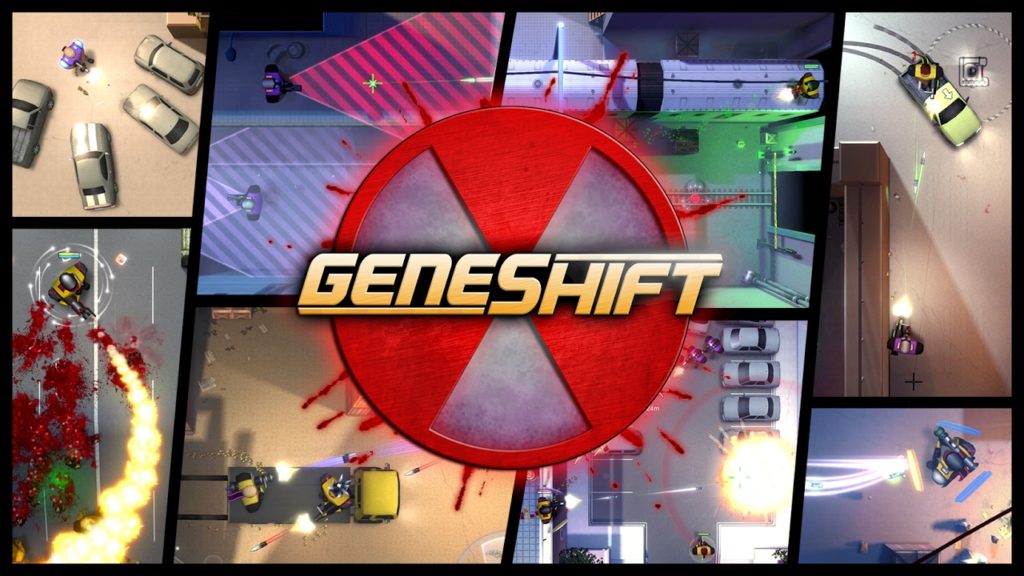
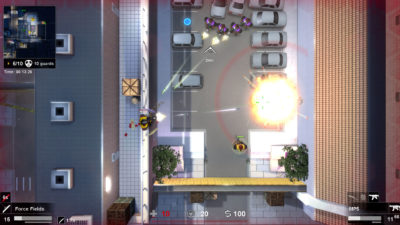
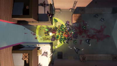
Alright, so here’s a weird one. Geneshift. Noun. A GTA game, circa 1998, with a skill tree and multiplayer. Simple and somewhat shallow in execution, but with a fairly large amount of content.

Geneshift is a top-down shooter, much like classic Grand Theft Auto games DMA Designs made before Nintendo got to them (yeah-I said it, bitch) and fucked the company into bankruptcy. You walk, you jump (surprisingly), you shoot. Occasionally you’ll use an ability, or drive a car. On the surface, it’s pretty simple. You’re a mercenary working for some lab, killing rebels or terrorists or something. Nothing particularly amazing, but it gets the job done. I don’t think it’s anything memorable, but it’s not the driving force behind this game.

The player’s main tools tend to be guns of various shapes and projectiles. Along with this is: equipment, abilities and vehicles. There’s not a lot to say, unfortunately. In single player, you look where you need to go, try to navigate your way there and shoot folks along the way. Money is earned through killing enemies and occasionally selling stuff you find, which is used to purchase equipment at save points, which are ample. Plot points, some boss guys, some hordes of enemies. There’s a bit of everything in the campaign, which is nice, and there’s even abilities and mechanics that support some limited stealth play. Much like the gameplay, the art direction is rather simple. Everything is clean and not very detailed. Really, everything can be skimmed down to, “it gets the job done,” in most cases.

Now, I know what you’re saying. “Soupy, why the 7.5? Who’s paying you off? Did Squackle get a cut? What was your cut? Do I, as the reader, get a cut? I’ve got a family to feed.” Nobody’s paying, noone’s getting a cut, and your family means nothing to me unless they are clicking on ads.

So, the grade versus the lack of description- what’s a game gotta do to get a “meh” around here? While Geneshift isn’t particularly out of this world, or a “must play” sort of game, it’s not really a bad one, or even one that’s just kind of okay. Simple, clean-looking games have their place. Soldat. Agar.io. LYNE. You could put Geneshift in that sort of group: simple games that are for casual consumption. There’s nothing sloppy about the controls or their implementation, and it can be rather fun at times, but it somehow it doesn’t offer enough to me. It’s got deathmatch, it’s got cooperative campaign options, it’s got a lot of the makings of something I would want to play often. For some reason, though, the perspective doesn’t do it for me like I felt it would when I initially started playing. Guns have variable engaging ranges, but they all end up averaging out once you factor in the perspective you play the game at. While it’s not inherently bad because of the perspective, the gameplay becomes somewhat tedious. Shooting enemies from below still takes cover into account, so sometimes you have to click on a very precise location to shoot someone that appears to be peeking by a ledge. Knowing what you can climb isn’t obvious without jumping up and down, which prompts ledges to highlight. Nothing’s particularly broken, but too often is there a moment where I get caught doing a jump and get stuck, or have to battle a level’s design because it requires perfect timing in jumps (no shit, by the way; I beat all of Cuphead on hard, but Geneshift is the only game in recent memory that managed to piss me off with a section of platforming).

The game is still being worked on, so maybe the problems it has won’t be a problem at some point. However, I’m sure there’s folks out there that would like nothing better than Geneshift morning, noon and night, even with the issues the game currently has. I think I’d probably play something else, though.

Hand of Fate 2 (PC) Review

Developer/Publisher: Defiant Development || Overall: 9.5/10

Hand of Fate 2 is Defiant Development’s refinement of one of my favorite games from 2015.  Technically, it’s hard to remember what I play what year, so I just look at the release date and say, “Oh yeah, I played that in 2015, I guess.”  Consequence, destiny, call it what you will; Hand of Fate 2 has made its way to release.  Has two years in the oven, building on what Hand of Fate accomplished, provided a substantially greater experience to recommend as a follow up?  As you might tell with the score, I am quite smitten with the second, just like I was with the first.

Though it’s been a couple years since I’ve actually played the first Hand of Fate, the sequel proves to be an interesting evolution.  The core elements of what makes the game are still there — you have your story scenarios, unlocking cards, games of chance, and combat.  Hand of Fate 2‘s new gambits include Dice Rolling, Pendulums, and Wheels.  Cards are more likely to have multiple ways to solve them, leading to multiple rewards or different gambits, which provides a fresh feeling to accomplishing the new story beats cards provide.

If Hand of Fate 2 is the first time into the series, the introductory challenge lays out the flow of gameplay and how cards work.  Basically, when you move your avatar’s token onto cards laid out on the table by the Dealer, the purpose is to reach the next room or achieve an objective; each card will present a scenario and your goal is to get through with the maximum benefit or the least amount of damage possible.  In addition to cards you pick, the Dealer will shuffle in his own cards tailored to the particular challenge at hand.

Combat is improved considerably and it feels like it is more likely to occur this time around.  Since the combat is much more fleshed out in terms of mechanics, you now have weapon types that actually affect your performance versus enemy types.  You’ll be mashing the X button still, but not as much as before as there are now finishers, as well as special charged attacks which are built up through a combo meter.  The special will change depending on your weapon and is typically a powerful attack that can do double damage; you’ll also “ignore” incoming attacks as you are delivering the special.  Having allies in battle is also a new mechanic, and opens the doors for Companions with their own stories.  Additionally, it seems that the “mazes” from the first title have been completely removed as I hadn’t encountered any of them in about ten hours of playing.

Variety was a huge problem with the original, and is basically solved in the sequel.  There is a much broader range of enemies, enemy types, and locales to fight in.  Equipment is also more varied and less cumbersome to manage with the updated inventory screen.  Many of the powerful pieces of equipment require a new stat called Fame, which you earn by completing certain encounters or cards.  There are also new roguelike features introduced, such as starting supplies or weapons; these are unlocked and improved based on progression/challenge mechanics.  Some cards carry through their rewards through different games which can help you as you retry challenges.  You also have companions with their own respective buffs, and each have their own story to progress through.  Your companions will help you in combat and also provide a special combat ability, such as negating damage from an attack or running through all of your enemies in a straight line.

Nearly all of the cards are new, but there are familiar events/equipment that will call back to the previous title.  Two new tiers of cards, known as Platinum and Brimstone will provide special boosts or challenges which may come at a good or bad time depending on your current progression goal.  The game limits each depending on the challenge at hand.  Challenges for each of the scenarios/bosses also feel a lot more varied and change up the formula significantly as they are more entwined with the story.  Of course, the challenge is still there and you’ll be replaying challenges multiple times, of which there are about twenty to go through.

The meta-story follows the Dealer from the previous entry after his defeat by your previous avatar.  He has all new voice lines, some new animations, and the setting itself is in a caravan traveling to an unknown location.  You can choose your challenges on a pretty top-down world map, where previously you just chose cards in a locker.  The story of your new avatar comes with the cards on the game board itself.  Unlike the previous title where you fought alone, you’ll also fight with and learn about Companions through their own stories and as they interact with your character through text.  Another big change is the ability to customize your avatar, being able to pick male or female, and among many different face/skin types.  Unfortunately, some of the faces look a bit dopey since they have big mouths and some have cross-eyes, so it’s kind of odd that this wasn’t fixed by release.  Some choices are less distracting than others, however.

Though Hand of Fate 2 is a better game than the first, I rated them the same.  While there are plenty of new additions and refinements to be happy about, we’re not talking about a perfect game by any stretch.  Frustration can set in from repeatedly doing the same challenges over and over, as only a few open up at a time, and if you haven’t gotten lucky with unlocking more powerful cards you can feel stagnant.  I found Hand of Fate 2 to be good in small doses where I played something else for a couple hours, switched to Hand of Fate 2 for about thirty minutes to an hour, then went back to playing the previous game again.

Currently the game launched without the Endless Mode, but that is supposed to “come soon.”  The same happened with the first title as the Endless Mode was shipped at a later point.  Over the year I had Hand of Fate installed on my computer I saw a lot of updates download through Steam and I would expect Hand of Fate 2 enjoys the same sort of support with new cards, balance changes, and features.

Like most things, Hand of Fate 2 is available on Steam.

Strain Tactics (PC) Review

Developer/Publisher: Touch Dimensions Interactive || Overall: 6.0/10

Hey, you! Yeah, you! Get out a blender. We’re going to play a game. No, you won’t lose an arm or an iPad. It’ll be fin- IT’LL BE FINE, JUST DO IT.

Alright, grab an XCOM. Any one of them will do, we’re just going for basic themes here. Dump that in. Now, scoop up some Alien Swarm (it’s free) and plop that in there, too. Now, and this is important, add a dab of tower defense. Just a bit. Trust me: it’ll make some sense. Hit “blend” and watch those mix up. Take the pitcher of your rather interesting mix of genres and pour that shit into a phone and you’ve got Strain Tactics from Touch Dimensions Interactive.
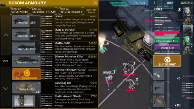
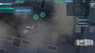
Strain Tactics is a real-time strategy game that has just as many things in common with tactical squad games, like Rainbow 6 and Door Kickers, as it does with a traditional top-down shooter like Alien Breed. The player commands a squad of up to five soldiers of varying classes–each of which have varying skills and attributes–from their mobile helicopter base. Said squads are sent on missions on a campaign against the “strain,” each mission taking place on a contained map, with objectives ranging from “kill everything” to “rescue this guy.” Troops gain skills as they participate in combat, they can find, loot and equip items they find or purchase, and you’ll often lose troops (though not permanently, as they can be revived if you recover their bodies) in chaotic skirmishes with alien-zombie guys. Thus far, this sounds just like any other game where you deploy a group of soldiers to do a mission. However, there’s an extra degree of player interaction that I haven’t seen before for a single-player squad-based game, and that’s having full control over your team’s transport and air support.

Despite most of the game revolving around directly positioning your squad members and marking targets to shoot (though they engage automatically if enemies are in range), the squad’s helicopter is fully controllable at all points of gameplay. The helicopter acts as a storage locker for gear, a transport for players and NPCs, and fire support against visible targets on the ground, which gives the player immense amounts of control about how they deploy, what their troops are armed with and what their exit point will be. Your team begins each mission aboard the heli, and they don’t disembark until you’ve decided to. It’s a refreshing amount of choice in a genre that routinely grants you limited power despite your role as a “commander” or whatever. When was the last time you had the option of landing your squad near your target in XCOM rather than running a fucking marathon from your drop zone? Oh, never? What about using your dropship to blast the shit out of dangerous enemy units before they become a threat to your squad’s objectives? What?! Never?! What a shame! It’s okay, though: Strain Tactics lets you do that. Using a minigun, a small cannon, or even some big ass firebombs, the helicopter can lay waste to outside targets. While it’s not always a viable option, what with interior locations and the occasional heavy foliage area, it’s a rather interactive way to support your squad in a way that makes a ton of sense. Why this hasn’t been done before in mainstream titles is baffling to me, but Strain Tactics delivers this sort of engaging gameplay dynamic in a tight little package. I’d dare to say that it’s something you could make a franchise off of.
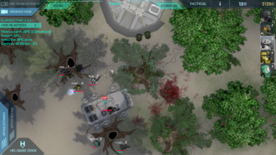
Because of this, even hand-crafted levels can be approached from various angles. You are never really forced to enter or exit the level from a specific point. Characters that aren’t suited for an encounter you’ve come across can be quickly refitted before picking a place to land, or left on the helicopter while the rest deploy. It seems like such a small detail or feature, but in the grand scheme of things it makes the standard gameplay loop really interesting. You can change tactics on the fly, including redistributing your team to split them up.

However, the honeymoon isn’t long. The game has problems, one so heinously rooted that I’m not entirely sure it can be easily fixed with patches: it’s a phone game.

This game was designed for touch interfaces, and it’s painfully obvious from the UI. Everything is rather big, from buttons to text. Item information and character stats are hidden behind an extra button, making quick comparisons between characters a tedious exchange that, in many cases, requires you to pause the game if you’re currently busy with alien-zombies. Inventory management is slow, requiring a click to select and another click to move it to another spot. Using stores or the locker is a tedious process, especially when you’re trying to clean house and organize. Information is usually somewhat vague, if it is even readable (some lower resolutions are just unreadable). I didn’t even realize there was a scroll bar in the mission debriefing, as everything is so huge I figured they were just using up space. While this is probably a really good phone game, it’s missing a lot of quality of life enhancements that I’d expect from a PC game in this day and age. It’s a real gear change compared to how gameplay flows outside of the UI.

It explains why there’s some inconsistencies with the quality of art and the somewhat clunky controls. It’s a great phone game, I’d even go so far to say it’s probably one of the better ones you could play. It’s just okay as a PC port, though. I can’t call it a bad game–it isn’t–but it’s rather disappointing that something so close to being sublime stumble at some rather uncommon problems (as well as some common problems, like mediocre plot and dialogue). I mean… it technically works; it functions as intended when you click around, but it’s far from efficient. It’s like using a spoon to serve soup instead of a ladle.

At this point, I feel like I’m taking a huge dump on this game, and I don’t want to give that impression considering how good of an idea the helicopter base thing is. So, Touch Dimensions Interactive, if you’re actually reading this: keep working at it. Seriously. You are so close to something that is very much worth sinking hours into. You just need some polish, some design changes, and maybe a writer (let’s be honest: you could use one, at least for the dialogue). If Strain Tactics 2 ever gets kicked around, or you plan on fixing the UI, I’ll be back to revisit.

Bear With Me: Episode 3 (PC) Review

Developer/Publisher: Exordium Games || Overall: 4.0/10

Click here for the Bear With Me: Episode 2 review.

I “beared” with this game for nearly ten hours spread out over a year. What we got for a third and final episode was underwhelming at best.  The last throws of the story went in a direction that took me by surprise — in a bad way.  Three banana cookies later, I’m completely in awe of the lack of gameplay Bear With Me: Episode 3 has and how much of the creative capital went towards the boring, sappy, and superficially contrived story.

The story could have gone in a lot of different directions, and perhaps I could have guessed where the story was heading, but we are left with something limp and illogical.  If it had to deal with subject matter that was going on, it might have actually been worthwhile.  I may have even been able to sweep issues with the story under the rug if there had been more gameplay; the entire episode is a cycle of ten minutes of gameplay and then thirty minutes of story, until the last act where it’s about half story and half lazily-designed puzzles and dialogue trees.  Why wasn’t it just a visual novel if they were so uninterested in having a game?  There weren’t as many puzzles or extra objects to click on compared to previous episodes and the jokes were almost completely excised — quite a departure from the “selling points” touted for the title. There are multiple endings, but none of the choices you made throughout really seemed to have mattered, or at least they didn’t make it obvious that something was affected in any particular way.

Most importantly, the conclusion to this long story needed to bring worthwhile closure.  There was no pay off from the creepy imagery portrayed in any of the three episodes.  The antagonist doesn’t get brought to justice.  Nothing really foreshadowed what the “point” of the story was until the last thirty minutes where you could instantly see where it was headed.  There was never anything smart or worthwhile happening.  The story hit a wall and since I couldn’t come to care for Amber’s character or the situation she is in due to the ridiculousness of the plot devices, I was left simply groaning.  Amber still remained as emotionally detached as ever except for a pivotal moment just before the end sequence — I was frankly surprised they even bothered animating something new for her.

In my experience, the audio was buggy and dialogue cut off at the last word often.  The time it took for the next line of dialogue was very short and didn’t sound natural (not exclusive to this episode, I might add).  Oddly, this episode was noticeably littered with weird typos or grammar issues, unlike the first two episodes.  The art is about equal to what has been seen before, and much of it re-used except for the new locales and a couple of new incidental characters.  Only a couple of characters show up more than one time, but the majority of the characters you’ve ever met through the entirety of the three episodes ended up being throwaways; their fates are of no concern because you’re never given a reason to care for them.

There’s really not much more to say about the game without completely spoiling it.

**SPOILERS**

**SPOILERS**

Basically, the story doesn’t matter.  The last thirty minutes of the game is the basis for the entire conflict, and we find the underlying reason we are in this mess is “banana cookies.”

Banana cookies??????????? Yes, that’s right folks.

Here’s the situation: if you are deathly allergic to bananas, yet your parents buy and bake cookies with them then only feed them to your brother, that is considered child endangerment.  Your parents are playing with literal fire keeping bananas in the house to begin with.  But these idiots are cooking them, having the fumes go everywhere, and also have to constantly worry how their ten-year old daughter might eat a banana product because she’s a dumb kid.  Not to mention, feeding supposedly-tasty banana cookies to her brother exclusively while only giving the daughter shitty cookies to eat instead… What the fuck did they think was going to happen?

So, why did banana cookies play a pivotal role in this story?  Amber eats a banana cookie, she’s about to die, choking on the floor, the parents call a cab to take her to the hospital, then decide its a good idea to leave their young son at home, alone, while they are dealing with this easily preventable, yet important issue.  It just so happens while the son is at home, a fire happens in the apartment below and then he dies of carbon monoxide poisoning.  …Banana cookies?????  WHAT THE FUCK IS GOING ON????  Why are they calling a cab to go to the hospital with a choking child?  CALL A DAMN AMBULANCE!  PUT THESE PARENTS IN JAIL, TAKE THEIR CHILDREN AWAY FROM THEM.  Why didn’t they just take their son with them???? I didn’t even know banana cookies existed until now!

So, the brother is dead; I could see that coming.  What I didn’t see is how little any of the story of Bear With Me actually had to do with this seemingly important story point, which they used as the linchpin for our emotion in feeling sorry for Amber.  However, that’s not what the story is about at all.  It’s about her relationship with her teddy bear.  Yet, there are also many other unexplained questions. Why is her imagined world rebelling against her?  Why does Amber forget things?  If this fire played such a big part in Amber’s life, why are fires used so sparingly in events throughout the story? Why does it seem like she has the pop culture knowledge of a 30-something year old?  Most of all, why is she seeing crazy shit?

If the game were brave, it would have addressed these issues in a more serious way.  I thought it was obvious this was all pointing towards some sort of serious domestic child abuse situation or a traumatic event that she actively witnessed which caused her imagination to show fucked up things to her, or something like that.  Instead, we got banana cookies and being told that the antagonist of the game was Amber all along. Whatever the fuck that means.  Also, why did Amber really even care about her brother?  We see and know nothing about their relationship to make us care that this brother even existed.  It would have been more interesting had he NEVER existed.  I suppose the brother being dead could count as the “traumatic event” that I asked for, but again, we don’t see how it could be since we know N-O-T-H-I-N-G about their relationship, not to mention no outright hints or foreshadowing to this fact.  Amber was the focus of the story throughout, and the brother was supposed to be a plot device, not the plot.  We never find out why Amber is looking for her dead brother in the attic, either, when she should have known her brother was dead; this leads back to the question of why she forget things.  There was never a concerted effort of actually finding the brother because we were too sidetracked with pop culture jokes.

The “red cloth” was supposed to be important, I guess, since it was actually colored red, as opposed to everything else that was in grayscale.  Across three episodes, it ended up only taking up inventory space and was barely ever used.  Of course this is an equally contrived plot device as it is ripped from a firefighter’s uniform by Amber on the day of the fire — first, how in the hell can a 10 year old girl rip a firefighter’s uniform, and second, I’ve never even heard of a red firefighter uniform, so that definitely shows a strange cultural divide despite supposedly taking place in America. It would seem to make sense since banana cookies must be more popular elsewhere in the world.  It must also be another cultural thing where you don’t call an ambulance, but call a taxi to take you to the hospital, because we all know those get to your house faster than an ambulance.

I remember they had planned for five episodes, but it seems they cut those plans and dumped the rest of whatever they had in mind into Episode 3.  The mystery fell flat after losing its way, and there was nothing that made me feel like it was worth the time investment when all was said and done.  What really gets me is the lack of gameplay sections and how everything is just so… misplaced.  The never-ending forest thing didn’t make much sense in its inclusion, nor did the trippy horror dungeon located within, since none of the horror-type imagery mattered.  There’s also “gaps” in the story where it felt like I missed an entire act and no one was going to clue me in on any of what happened.  It would seem important to have a complete story, but I guess I’m expecting too much.

So, I’m sad to see how this all ended up.  It took nearly a year to figure out Bear With Me is not worth the time investment.  The biggest pun of the game really was the title itself, after all.

Orange Moon (PC) Review

Orange Moon

Developer: Betelgeuse Zero | Publisher: Meridian4 || Overall: 3.0/10

Often times, the best way to approach reviewing a game is based on how it is advertised, and Orange Moon is no exception. Here’s how Betelgeuse Zero describes their own game on Steam:

Orange Moon is a surreal 2D action-platformer with RPG elements and complex puzzles. Take on the role of an explorer as you discover the mysterious world of Orange Moon – filled with hostile native life forms and harsh, treacherous environments. To increase your chances of survival, choose from a variety of weapons, equipment, and upgrades to aid your dangerous exploration. Can you uncover all of Orange Moon’s secrets?

  • Explore a mysterious world filled with hostile life forms.
  • Survive by acquiring and utilizing an array of unique weapons, equipment, ammunition, and upgrades.
  • Solve complex puzzles to successfully uncover the secrets surrounding you.
  • Fight bizarre enemies – from carnivorous plants to deadly biomechanoids – and defeat fearsome bosses.
  • Overcome harsh and treacherous environments with obstacles such as acid swamps, toxic clouds, and deep craters.

Oooh-eee! Sounds like a good time, huh? Some platforming, some complex puzzles… will I uncover all of Orange Moon’s secrets?
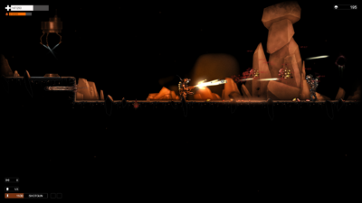
Yeah, very quickly, in fact. Under four hours, including an hour or so I spent with the game paused (which causes some weird bugs, so don’t do that).

Orange Moon is as described when it comes to genre: it’s a 2D platformer. Your character is sent to explore the game’s namesake on behalf of the Moon Resources Corporation in search of what clues of what happened, guided along by a Mr. Anderson. The story is sort of abrupt and rife with spelling and grammar errors, and ends up being somewhere along the lines of a porn’s story: it’s there just to explain why people are doing things in a particular place.

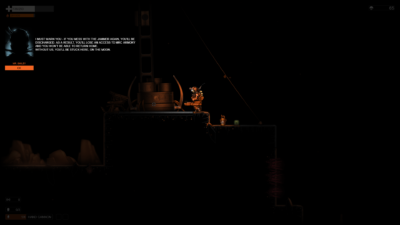
Players will walk a rather bland black and orange landscape whilst shooting at an inordinate amount of turrets, floating blobs and the occasional bipedal enemy whilst burning bushes to the ground and sucking the life out of the roots (literally) to sustain yourself. You walk, you shoot, you jump–standard fare in 2D platformer games. In addition to these, the player is able to use fuel to do rocket jumps in order to traverse the terrain.

The player unlocks a variety of weapons along the way, such as a shotgun and a minigun, all of which require ammo that can be found or purchased from an upgrade store using currency earned from killing enemies. If you’re short on cash and don’t have ammo, a flamethrower can be employed to kill foes using the player’s fuel reserves. Weapons and equipment can be upgraded with upgrade canisters that can be found or purchased. Upgrades include better damage on weapons, more health, larger fuel tank upgrades and the ability to use specific guns.

None of this sounds bad in practice, but none of this is executed in a satisfying way. Weapons that can be aimed aren’t very responsive to changes in aim, and the arc is limited. Most weapons require upgrades to be useful against many enemy types, and some weapons, like the flamethrower, are actually unable to do damage to most enemies even when upgraded. This leaves for some very heavy reliance on specific weapons to defeat some enemies, which isn’t a problem in itself aside from the fact that it means you’ve wasted upgrade points that could have been used on something worthwhile.

Fuel is tied to jumping, which means if you’re out or low you’ll spend a rather long amount of time waiting until you can climb out of a hole or make it through a jumping section, especially if you’re using the flamethrower a lot. This can be offset with upgrades, but the design isn’t really fun, it doesn’t add challenge, and it’s not interesting. Eventually, when upgraded, fuel is trivial and no longer serves a purpose, especially as the flamethrower becomes increasingly less useful. It just never seems to fit in with the rest of the game in a meaningful way that limits the player or forces choices outside of, “Do I want to wait a few minutes before I can climb out of this hole?”
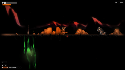
Level design is simplistic at best, and the “complex puzzles” the developer touts as a feature are little more than a series of fetch quests that involve minimal amounts of backtracking. Exploration is also somewhat scant: secrets are usually as simple as falling down a hole, or taking a short detour. Considering the constant pallet of orange outlines on a black background, nothing is particularly interesting the entire journey, aside from the occasional scripted set piece.

While the game isn’t particularly bad, it’s nothing to write home about. It’s buggy, with the player character often getting stuck on flat terrain or getting stuck in a wall. It’s not particularly polished, with features such as the scouting probe being usable in situations that freeze the player character in the air, or mess up the camera afterward. The music’s not bad, but as a highlight it’s also nothing particularly special. Orange Moon is merely just a game that works when you boot it, and ends when you finish it, albeit with some performance problems (at least with an 3770K and a GTX 980ti).

I think Orange Moon‘s most common problem is poor design. Enemies are not particularly difficult to deal with, often blocking a corridor perfectly with their height, acting almost as an aggressive door that needs to be unlocked with a shit load of ammo. Outside of the crappy turrets and plants all over the place, enemies tend to have a lot of hit points and armor that renders many guns useless without a lot of upgrades. All story is conveyed via text in the upper left corner of the screen, but when these kinds of events happen the entire screen darkens, aside from a small circle around your character, even if you’re in the middle of combat. Why do this? To force me to read this uninspiring story? Don’t interrupt the gameplay like that, man. That’s like the missus asking, “Are you done yet?” in the middle of “doin’ it”–it doesn’t really inspire enthusiasm, and it’s an extra unnecessary hurdle in trying to have some fuckin’ fun. Pile those two on top of my other complaints, and you don’t really have much of a reason to hang out in Orange Moon‘s world. Other games that are somewhat similar, even classics like Super Metroid accomplish the same thing without all the egregious errors.

There’s a lot to fix, but even if these things were fixed it wouldn’t be particularly compelling considering many of the design choices.

Pylon: Rogue (PC) Review

Developer/Publisher: QuantumSquid Interactive || Overall: 3/10

Yeah, a 3/10.  I don’t usually have to go that low because I have the good luck of playing games I can enjoy.  Pylon: Rogue is probably one of the more frustrating experiences I’ve had this year.  When the potential for fun is there, but you are cockblocked by unrelenting difficulty, it’s impossible to enjoy anything.  I can’t enjoy it.  There’s no way.  I’ve spent almost three hours wiping; most runs only last about five minutes, and one or two lasted maybe fifteen minutes.  I suppose Pylon: Rogue isn’t really that shitty, but it’s just a victim of its own balance issues and an extremely stingy reward system.

As a 3D roguelike action game, at first glance it might seem Diablo-esque.  However, it’s a single-button-combo beat-em-up game where you might sometimes come across some buffs before you die.  There’s no overworld, either, as you start out on a level selection board with no free-roaming — often you’re forced to only go one way.  Once you select a level, you’ll trudge through a number of rooms, ranging from about three to nine, and hopefully the “Exit” will spawn after clearing one, at which point you can go back to the level selection board.  If the Exit pops and you take it, you forfeit your chance to go through the rest of the rooms and potentially pick up more money/gear, though you’re more likely to just die.  Each “Room” can have up to three waves of enemies and depending on how well you can smash buttons and dodge enemy attacks, you’ll take damage and die or succeed and go to the next level.  If you stick around in a level after the Exit pops, you can clear all of the rooms and unlock a final bonus chest.  In the end, the overall goal here is to beat four levels, reach the boss of the area and defeat them.  Unlike your typical roguelike, there doesn’t seem to be any procedural generation, so after a number of wipes you’ll see all of the different level layouts.

Technically this all sounds fine, but the reward system is completely fucked.  They throw you into the fire as soon as you start out — forget having any tools to prepare you.  They don’t start you with seed money to allow modification of your spec in a different way at the shop, nor do they give you many opportunities to heal damage you will inevitably take tons of.  Three of the four classes are melee and each have three different weapon specs.  From there, you’ll gain your roguelike buffs, though they are curiously very scarce.  Since most of the classes are melee, you will always take damage as you get up close to enemies; this exposes a significant flaw in the game design: there is a lack of healing mechanics to make any of this a fair fight.  If you get lucky, a health drop will appear, though usually only for 50 points, at most 25% of your health bar depending on your class.  Considering you can lose that much in two hits, they don’t drop nearly often enough and you’ll almost always come out behind after clearing a room.  There is no guarantee a health drop will ever appear, as it is random.

Clearing rooms often gets you a very low amount of the “Gem” currency.  By the time you leave a level you could have around 200 or 300 Gems, but you’ll probably just waste all of it on buying health at the shop.  Most gear costs anywhere from 200 to 400 by itself, so good luck using that new piece of equipment to any effective order when you have 10% health left.  There’s plenty of other issues, all revolving around “balance.”  At the onset of a new run, your character feels much too weak, or in other words, the enemies take too long to kill.  Early on in a run we should be able to defeat most monsters with one or two hits, except it takes upwards of three to five.  Your enemies also hit like a truck and you’ll lose 15 to 20% of your health for one unavoidable hit.  There should have been some sort of stagger mechanic where if you hit an enemy it resets their attack swing and avoid potential damage — Hand of Fate does this and the action sequences between the two titles are generally very similar.  Spells that your enemies cast are nearly all instant and you often aren’t allowed the opportunity to move out.  For example, there is a lightning spell which will cast as a circle on the ground, and the only way to avoid damage is moving out within the first second.  Projectile spells are a bit easier to avoid, but if you are in melee range there’s not much you can do to avoid it other than constantly run around.  Defensive spells either are cooldown or charge-based, and often take time to actually react to any incoming damage, so it can often be more fruitful to run around like an idiot.

There are a few things the game gets right.  There are four classes with three different specs each, and they all play appreciably different.  You do have to unlock a majority of the extra specs depending on certain conditions so there is some longevity in what they offer you at first.  The single-button-combo system is fine and has some depth to it, though I prefer multi-button combo systems.  You can hold X after any number of button presses, allowing you to perform one of the four special “charge attacks.”  Finally, each character has a unique special ability that can only be used as many times as you have “scrolls,” at a maximum of four.  If a scroll drops and you’re at four, it’s basically wasted.  This isn’t awful in and of itself, in fact it could be nice to be able to make the decision to use your fourth scroll more liberally so you don’t lose out on a charge.

In the end, I think the biggest killer for Pylon: Rogue is that the rewards suck.  Most of the rewards you are earning aren’t even gear/powerups, it’s currency.  Currency you can’t even use until you exit the level; most of the time you’re going to die before getting the opportunity to visit the shop, or in the event you do get out of a level, you’ll waste it on health.  There should have been way more gear/powerups dropping from chests that spawn.  Chests will only spawn once you clear a room, and currently it feels about 10% of the chests will have gear in it.  The rest of the time you’ll get a pittance of gems which will not help you get through the level you are currently stuck in.  The percentage should feel at minimum around 50% for your first level so that you can gain a footing in a new run and make more interesting decisions at at a later point in the gameplay loop rather than having most of your wipes in the less than ten minute range.

So, Pylon: Rogue is a game that will boot up and responds to your controller commands.  It works, you can play it, but unless you’re some savant in the genre you aren’t getting anything out of this game farther than a couple of levels, if that.  There was some hope of a balance patch but the time frame for that came and went and the patch that did drop didn’t make anything easier.  The balance is so off here that we’ve sunk into the ocean.  I’ve already succumbed to the sweetness of death, filling my lungs with water, and air costs more Gems than what I have to spend.  Why are they selling air at the bottom of the ocean?  You got me.

Morphite (PC) Review

Developer: We’re Five Games/Blowfish Studios/Crescent Moon Games | Publisher: Crescent Moon Games || Overall: 8/10

Morphite is more than a game.  It’s about finding your purpose in life.  What is the meaning of your existence?  What is the point of anything?  Moreover, what is the point of Morphite‘s procedurally generated universe full of random planets?  I don’t know.

In a nutshell, Morphite is like a less ambitious version of No Man’s Sky.  You have plenty to “do” but there’s not really any motivation or purpose in doing “it.”  Outside of a single player story that has you finding out about the main character’s past and how it relates to the mysterious element morphite, there isn’t much impetus to “explore.”  You’ll want to find resources to upgrade your armor and ship, but the resources aren’t plentiful enough on planets to want to go grind for them.

Morphite has a full universe to explore with procedural planets, which is appealing to hear on its surface.  However, it would be hard to qualify these as actual “planets” considering their size and access, and its best to refer to them as “levels” instead.  In addition, the procedural planets aren’t anywhere near interesting or rewarding enough to warrant the effort of repeatedly visiting new ones.  I only ever wanted to run in one direction, hit a dead end, then leave.  The fauna is quite interesting and I hadn’t run over too many duplicates of creature models as I progressed through the storyline and visited a few of the random planets.

The story itself has hand-designed planets and boss battles, and they are usually way more fun to play on than the procedural levels.  The story takes about ten hours to complete, and there isn’t a point where the game says “ok, now explore” until you finish the story; outside of the random side missions you might come across until then, there honestly isn’t any point to exploration.  On the bright side, if you did want to explore every planet in the game, it will take you 5.9 x 103932349029302909530490394 hours, give or take a few exponents.  When you complete the game you’ll gain a significant buff to your ship’s capabilities, so if you are interested in experiencing more of the random levels, its probably better to wait until then.  Though, I haven’t seen much of a difference in levels the further you fly away from your origin point where all the story takes place.  So, your mileage will definitely vary, as once the story is over there’s nothing left to do but to visit these randomized levels.  On a more meta level, the long-term goal is to increase your character’s power by upgrading.  You are able to unlock new abilities by scanning plants and animals that pop up as rare, and have a special ability; using this scan in tandem with your other resources unlocks your potential.  With more upgrades, more planets become available for exploration, where you’ll continue scanning more and more.

Gameplay is your run of the mill first person shooter with different guns and explosives.  As you find more of the “elusive” morphite, you’ll get more weapons, as they morph into your new equipment.  Platforming and light puzzles will be the main activity other than shooting, but nothing usually on the scale of frustrating; some of the later story missions have interesting puzzle design.  You’ll occasionally run across items that will buff your character in small ways, such as a bracelet that gives you more health.  Ammo randomly spawns in boxes and you’ll probably be hurting for ammo at the beginning of the game when you only have a couple of weapons to use.  Later on there will be a lot more boxes to shoot open and more weapons to use, so this problem goes away eventually.  You can restock a moderate amount of ammo at the pod you used to land on the planet, but you’re usually going to be far away from the pod by the time you need it.  When you run out of ammo completely, your weapons will recharge up to a certain point, but anything over that number will require extra ammo drops.  Considering your ammo doesn’t recharge very quickly, this hinders your gameplay experience in the shooter department as you’ll have to run away a lot as there are no permanent melee weapons.  Relying on Puggles, who is a dog with a laser cannon on his back, to do most of your dirty work is the best way to conserve ammo.

Collecting resources to upgrade your stuff can be a grind, but the resources are so scarce its forced to become an afterthought usually.  Its also hard to monitor how much you have if you have the opportunity to buy more resources or the time to upgrade comes around.  No numbers fly up telling you what you’re currently at — you’ll have to menu hunt to see your current stock.  There’s also some story encounters while traveling from system to system where you’ll either get lucky or unlucky.  You may fly into an asteroid field where you actually get to control your ship for a bit, or lose resources due to pirates, or run across a trader from whom you can spend “Chunks” at to buy resources.  Chunks are the currency in this universe, and the primary way of earning Chunks is through selling “Common Scans” of plants and animals, whereas “Rare Scans” are used to upgrade yourself (or you can sell for a much higher price).  Unfortunately, scanning is pretty fucking awful until you upgrade it a bunch of times, and even then its sad that this is the only way to really make money in this game.  Resources are not found nearly as often to want to ever sell them, and the amount of Chunks you get from ammo boxes and the like is usually very low.

When traveling from system to system, you’ll also have to wait for your fuel to recharge.  This forces you to go space stations (which are available in every system) to refuel, or you can waste time and wait for it to refill automatically. You can use this time to explore a random planet, or do your laundry.  It’s your choice what you think is more productive.  The side missions I came across were also not appealing to try and complete as the rewards they offered were usually not that exciting.  I only ran across one side mission that I could complete then and there; most seem to want to send you out into another part of the universe to complete and I’m not about that life.

The standouts here are the art style and the music.  The art is actually quite fun and reminds me of old 3D DOS games, but obviously this title is much more detailed in certain aspects than that.  Low Poly definitely has its benefit when it comes to space as detail can often be left to the imagination.  The ambient music also fits the space theme accordingly and I was really digging everything I was listening to, which seemed to be at least ten different tracks.  The variety of music is done well and each song sounded was good in its own right, I would probably listen to this soundtrack on its own.  There was also weird sound mixing with the voice overs, sometimes the music would overtake the voice over and you could only understand what they were saying by reading the subtitles.

User interface is another story, however.  The space navigation screens, typography, and the menus all seemed like afterthoughts.  The spaceship cockpit distracted me in a way that felt as if it looked unfinished and they forgot to put some more polish into making it look good.  It’s quite odd, because you arguably spend the most time seeing your spaceship and the menus, but everything else about the game looks great.  Besides that, the usability of the user interface is much more clunky than I’d like and its a pain to use a controller to navigate it.  Considering this title is meant to be released on a phone, you can see some of the design decisions were not built for a controller, and too spread out for mouse/keyboard.  Its also a huge pain to switch weapons — how you can screw this up in a first person shooter is beyond me, but there’s no easy and quick way to switch to your weapons with a controller, and you are relegated to another menu hunt to switch logically.  This becomes increasingly exacerbated as there will be puzzles that require you to switch between three different weapons over and over.  Keyboard/Mouse isn’t much better and you’ll have to remember which weapon is assigned to the numbers on the keyboard.  You can also use the scroll wheel to go one by one, or menu hunt then click “equip” once you find what you want — there are N64 games that are easier to switch weapons in.

Admittedly, it’s hard to get too excited about Morphite, but it is fun while your interest holds.  The story isn’t too long and I don’t think it overstays its welcome.  The ending is anticlimactic and the boss battles tend to be a bit on the easy side.  The mystery of the story is good while it lasts, and it never takes itself too seriously, not to mention it takes a dark turn towards the end that I wouldn’t have guessed would be part of the story.  Coming into Morphite thinking you’re going to be playing an indie sci-fi shooter is a better way to go about it than thinking its anything related to No Man’s Sky.