Tag Archives: PC game

Blood of War 3: Operation Snow (PC) Review

Developer: JCS Games

  Blood of War 3: Operation Snow (1.5 MiB, 1,907 hits)

Game by JCS Games, made with GameMaker.

Overview:

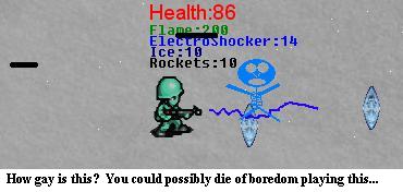
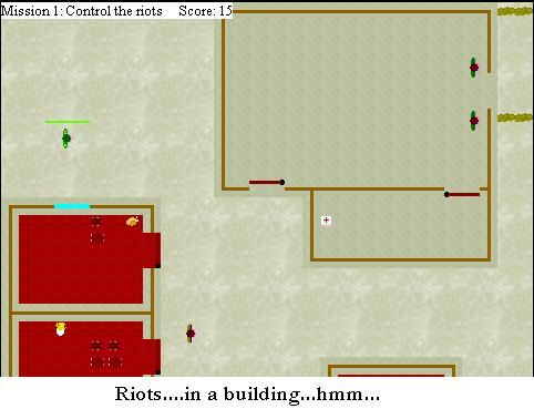
Blood of War 3 Operation Snow only has one thing going for it. Its name. Now that makes you think. At first sight, Blood of War 3 Operation Snow seems like its a good name, right? Or does it? Its actually really fucking stupid, because there is no fucking snow. Not even yellow snow. And there’s no blood. And there’s no war. And this seems like its a “3rd in the series” kind of game because of the 3. The truth is, I don’t see how this could be the 3rd game of anything, because usually games get better as they get sequels. This game is like a prime cut piece of ass. I think the 3 was just tossed on there for the hell of it, to make it seem like this game was a part of a popular series. But it isn’t. Its all ass, and this ass tastes bad. Very bad.

Graphics:

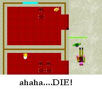
Bad. The sprites don’t even move. They just slide around. Bullets are big black lines, and there’s a stupid assortment of shitty weapons that don’t even look good when they’re used. This stupid war is being fought in Cement World where everything and everyone is made out of cement. People are colored, so you know they’re people and not walls. When people get shot, they disintegrate into a pile of mush. If they get electrocuted, they change different colors and then disappear. If they get burned with the flamethrower, they fall into a pile of mush. There are these weird crystal things floating out of nowhere, that seem to give you more ammo for your electrocuter…

Sound:

Horrible. The only semi-good sound effect is the gun shot sound. There’s an annoying screaming sound for a soldier when they die by electrocution.

Gameplay:

This game is so fucking boring. There’s nothing to do in this game. All you do is shoot the enemy, or get hit by as many bullets as you can before the game decides to randomly restart the level so you’re back to what you originally had for your health and ammo. This game is bullshit. I don’t see how anyone can have fun playing a game that lets you slide around in a Cement World filled with stupid blue soldiers shooting each other’s dicks off and then shooting them at you so you can eat them.

The flamethrower doesn’t even work right, because when you press Alt, it pauses the game because the game thinks you want to do something with the actual window.

Crappiest Part:

I hate this game. Its 11:30 pm right now, and I’m tired as fuck. This is not the greatest game to play at any time of day, especially this late at night, but nothing can impair my decision about this game sucking the balls of every man (or woman?) within a 5 mile radius of each computer this stupid fucking game is on.

Overall Score:

I’ll tell you something about how this game is good. Getting an extremely low review score.

1/10

  Blood of War 3: Operation Snow (1.5 MiB, 1,907 hits)

Game by JCS Games, made with GameMaker.

Battlefield 1942 (PC) Review

Developer: DICE / Publisher: EA Games

Overview:

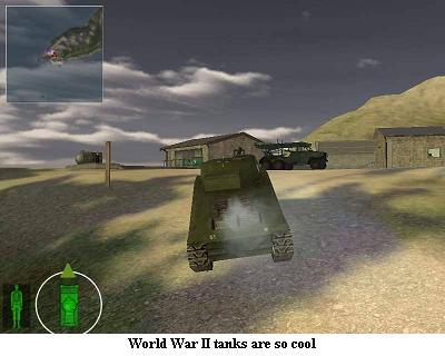
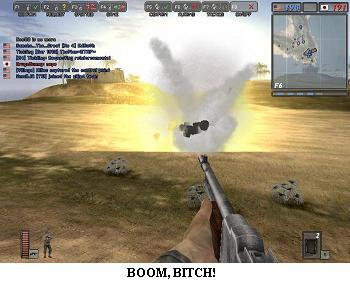
The War might be over, but not the slew of games based on it. Don’t get me wrong, I like World War II games that aren’t shitty. Battlefield 1942 definitely isn’t a shitty game. Its actually one of the best games I’ve played. And one of the only PC games I have. I don’t have too many, and this is definitely a must-have for first-person shooter games. And it seems to all be historically accurate. It has the same sort of “realistic” gameplay as Counterstrike, while still making it fun.

Graphics:

The graphics are great. You really can’t get much better right now with these graphics. Of course there’s some exceptions right now, but this is good enough for me. The graphics could get better, but I wouldn’t really care for it too much, unless it was made a little more realistic.

Sound:

The sounds of all the different guns and vehicles are good enough for me. They’re not really that annoying either because when you’re gunning down an enemy, all you care about is killing them.

Gameplay:

The gameplay is just like a regular first-person shooter. There is a single player mode, but I usually play online. The online mode is exactly the same as the single player mode except its not a career, and your computer doesn’t have to do all the work of computing the actions of the dozen or so other guys on the map. Its also a lot more fun online, because you can play with your friends, or you can just play with other people who are usually smarter than the computer.

Crappiest Part:

The crappiest part about the game is the long load times. The maps are huge, so I understand why it takes so long. It just takes away from the game to have long load times.

Overall Score:

This game is loads of fun, and with mods you can install, the replay value of this game is very high. The best mod out right now is called Desert Combat, and I am actually playing it more than Battlefield 1942.

10/10

Battle Bees (PC) Review

Developer: Urisoft

  Battle Bees (1.7 MiB, 2,019 hits)

Game by Urisoft, made with GameMaker.

Overview:

Battle Bees is a mediocre Real Time Strategy game, set in a mediocre world with mediocre missions. But don’t let that stop you from playing this game. This is actually a fairly involving game that takes a little too much clicking to do what you want to do.

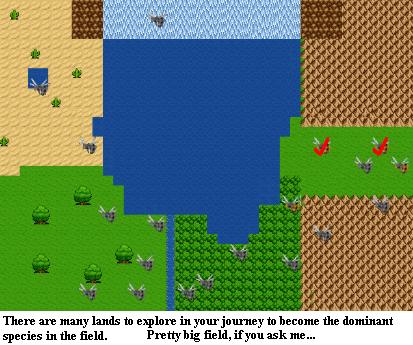
You are the commander of some survivor bees fleeing from their home after a mysterious plague destroyed their livelihood. All the bees that were survivors wandered the world for years, and finally came upon a grand field, that seemed to stretch for miles and miles. It looked like the perfect place to settle down, other than the fact that there was a huge war between all the other insects in the field. As an external force, you’re going to have to destroy all the insect factions in your way and claim the field as your own, for future generations to come.

Graphics:

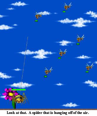
The graphics are ok. They could have definitely been polished up a bit, and some of them seem to be rushed or not even made by the game creator, like the spider.

Sound:

The sound is alright, and there isn’t anything annoying. When you get into a battle, battle music starts playing. Sometimes this can lag the game though, because a swinging spider can keep going in and out of your “battle zone” (I guess you would call it a battle zone). This really started to show in the 3rd level.

Gameplay:

The gameplay is pretty good. You can direct where units can go, and highlight a big group of units and then tell them where to go. When you have a young bee that becomes an age 3 bee, they are able to become one of 2 bee classes, worker and fighter. When you choose which each one will become, a little box opens with your choices. The box would have been better if it appeared near the bees, and in the same place, but instead it jumps around the screen, and you’d be really lucky if it appeared close to where the previous one was. Supposedly a worker bee is able to get honey, but I didn’t see any real use for it because there weren’t any “base” missions I played so far. They may be used just to get the honey from the flowers, and then right on the spot some bees would pop up. It didn’t really explain that part too well.

Crappiest Part:

The crappiest part of the game is how the game wasn’t polished enough. There’s a huge amount of spelling and grammar errors that make it so you can just barely understand it when reading. The drawings as well could have been polished a little bit too.

Overall Score:

There aren’t too many games that are RTS games made in Gamemaker. Partly because they probably go a little slow, but this game is pretty good for what it is. It’s worth playing through if you have the patience to read bad grammar. There’s also a lot of levels, so you can play with your bees for a while, and find out what actually happens to the colony.

8/10

  Battle Bees (1.7 MiB, 2,019 hits)

Game by Urisoft, made with GameMaker.

Arena (PC) Review

Developer: Delta9 Games

  Arena (PC) (2.5 MiB, 1,901 hits)

Game by Delta9 Games, made with Game Maker.

Overview:

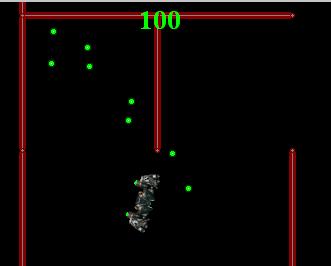
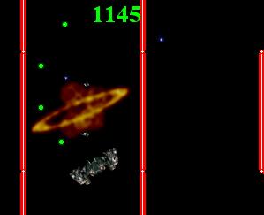
A space shooter-type game, where you have a ship that looks like a bat, and you go around trying to kill another person (that is playing too, on your keyboard)

Graphics:

The graphics are nothing great, I have no idea what the hell the ship is really supposed to be…are there fangs on it?

Sound:

The title screen music is annoying. But the in-game music is better, and sets “a mood” that you would want to have.

Gameplay:

The control scheme is a bit weird to get the hang of at first, since you go kinda fast for the little amount of space you really have to go in before you have to make a turn, and you bounce off walls, so it might take you about 4 minutes to get out of a dead end corner….

Crappiest Part:

How you have to have someone with you when playing this game. If the other ship had an AI or something, it’d be fun to play…or some random enemies flying around. There should be a one player mode, i guess is what i’m trying to say.

Overall Score:

This game does have a little fun to it, even if you do play alone. I give it a:

7/10

  Arena (PC) (2.5 MiB, 1,901 hits)

Game by Delta9 Games, made with Game Maker.

Annihilation (PC) Review

Developer: Liberty Freak

  Annihilation (PC) (1,008.2 KiB, 1,993 hits)

Annihilation by Liberty Freak. Made with Game Maker.

Overview:

You are supposed to shoot people or something. I don’t read “story screens”.

Graphics:

ok.. It’s all birds eye perspective, so i guess you can’t expect that much, but infiltrator looks much better.

Sound:

Not that great. Kinda sucks. Actually the menu sounds ok… alright i don’t really remember the sound and i don’t want to play it again.

Gameplay:

Arg! i hate it! it was a good effort but it plays really bad.i hate the RE style controls (rotate, walk forward,backward) i could think of some better schemes… in fact i might just make a game like that to prove it!…anyway it’s hard to shoot anyone and they see you no matter what direction you’re facing… I couldn’t get past the first mission. some doors dont open… i’m not sure what you’re sposed to do with those. if you hit a wall, you stick to it… you walk too fast.. rotate at the wrong speed, i’d say… just not very enjoyable.

Crappiest part:

The sticking to walls thing. And the title. i hate it when people make these stupid titles to hype up their games. arg! also you get all these training missions for the different weapons, then on the first level all you can buy is a pistol. since i coulnt beat that level…. i never really got to “annihilate” everyone!! HAHAHAHA!!!! there’s your stupid review dave. hey evryone, go look at my “AMIGOS” flash movie.

Overall Score:

I give this a 4/10 for effort. there’s probably more levels… so yeah.

  Annihilation (PC) (1,008.2 KiB, 1,993 hits)

Annihilation by Liberty Freak. Made with Game Maker.

5 Finger Fillet (Web) Review

Developer: 13th Street Games.

Overview:

Five Finger Fillet is a Flash game in which you have a knife and you have to time your space bar hits so that it goes into the area between your fingers. If you’re not careful, you might cut off a finger…or five..

Graphics:

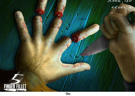
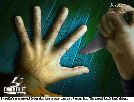
The graphics are pretty good. There aren’t any animations though, just a hand going back and forth. The red “x” that appears when you hit the space bar is kind of out of place, too.

Sound:

Pretty god damn annoying, that’s for sure. There’s a breathing noise all the time, like the guy is nervous about playing knife-hand. Everytime the knife is put down onto the wood, you hear a thump sound. When its put into the guy’s finger, he screams…like anybody should. But even while he screams, the breathing sound is there…yeah…

Gameplay:

Not that interesting. You press space bar…and try not to cut your fingers off. You have to time them right, as the hand that has the knife goes faster until its not possible for a human’s hand to go.

Crappiest Part:

The crappiest part is the boring-ness of it. This game is not fun. Sure, I’ll give them points for the fact that they can draw a severed finger bleeding on a nicely colored piece of blue and green wood, but its worth shit if the game isn’t good. You could make a Barbie game look nice graphically, but you know its going to suck.

Overall Score:

Ok, I’ll be straight and to the point. Don’t play the game. Its not good, and the highlights of the game are shown in the 2 screenshots above.

2/10

Micro Machines V4 (PC) Review

Developer/Publisher: Codemasters || Overall: 7.0/10

Micro Machines V4 from Codemasters is a follow-up to the somewhat popular mini-car racer Micro Machines V3. In a Micro Machines game, one races through courses that are a little bit unconventional to your regular racer, for the fact that you’re actually racing around on things like pool tables, kitchen counters, sand pits, gutters, and other locations of the sort. Quite simply being the best part about Micro Machines V4 itself, the courses are very interesting and arcade-like. However, an arcade racer wouldn’t be complete without power-ups and weapons, and Micro Machines V4 is no exception. There’s plenty of fun to be had with the game, but where it lacks is depth in the gameplay that will motivate you to keep playing the game. Not to mention it can get very frustrating.

Micro Machines V4 is a typical racing game in that you dive right in. Much of the game is focused on three different types of modes that can be played: Race, Checkpoint, and Battle. Race mode is your typical racing game; quite simply you beat your opponents doing whatever you can as you make it to the finish line after three laps. Checkpoint is more like a time-trial mode in that you try and get the best time you can going around a certain race track twice, except you have to make it to the next checkpoint before counter runs out. Battle is by far the most fun part about the game, and the goal is to simply beat the crap out of your opponents, laying traps, shooting missiles, and leaving them in your dust – you have to either eliminate your enemies or get far enough ahead of them in your race around the track to get a point. Once you get enough points in Battle mode, you’ll win. By playing through the game in a Tournament, you can unlock new modes, tracks, and collect more cars for your garage. The cars you keep in your garage can be used for trading with other people online so that you can get other kinds of cars. You can also play the game in an online multiplayer mode.

The graphics in the game aren’t too bad. In fact, the frame rate is almost a solid 60 FPS with very little slowdown. As you make your way through the track, the camera follows your car from far away and makes very smooth reframes, creating a cinematic sort of feel to the game. For some reason, the steady frame rate makes the game a lot more bearable than it probably should be, considering the gameplay itself is very unbalanced (even during the “Rookie” division!) and can be horribly frustrating, making the early stages of a race vital and requiring that you execute each race flawlessly. Though the game is on the PC, it’s clearly made for use with a controller, and can make things a lot easier, if not, more fun in the very least. Sound effects are quite annoying, there is always the high motor whine of the little Micro Machines as they zoom along the edge of the kitchen sink and get stuck in the blender, but with the sound off this problem will simply disappear. Music in the game isn’t very impressionable either.

There aren’t any “extras” that are actually included in the game right out of the box, the reason being that “microtransactions” do take their place in the game – at least in the PC version. To unlock certain bonuses in the PC version, you must go online and register your copy of the game with Codemasters, and proceed to pay a fee for the codes that are used to unlock the extras and different modes. Obviously, it’s kind of ridiculous to have to pay extra for things that are already on the disc, and clearly a way to squeeze the consumer’s wallet on this one. However, the extras that are available to be bought aren’t exactly vital, even though it would be nice to have them…hence their “extra” status.

Micro Machines V4 is a fun game to waste a few hours with every once in a while, but past that, there’s not much to enjoy. Balance issues make the game as a whole very disconcerting, giving a slant towards only wanting to play the Battle mode, as it is the more overly balanced mode in the game. Fans of the series might be a little bit disappointed, since not much in the formula was actually improved between each game. What MMV4 boils down to is your average arcade racer that has the unique status of being a game with miniature cars racing through everyday environments.

Red Jets (PC) Review

Developer: InterActive Vision | Publisher: Graffiti Entertainment || Overall: 2.6/10

Editor’s Note: the following article is our reviewer’s account of his attempts to install and play Red Jets. At the request of the publisher, GamersMark would like to clarify that at no point was our reviewer actually able to play Red Jets.

The least satisfying part of white-water rafting down the Nukutaku rapids 12,000 feet above sea level is when the guy right behind you in the raft gets sick to his stomach and vomits on you, and it drips down your life jacket and you can feel it every time you move. At least, that’s what I’ve been told, because I’m terrified of flying anywhere, and if I did manage to walk (not over any bridges) to white-water rapids, I’d be too afraid to hop in the raft for fear of drowning/vomiting on someone.

I’m much more the armchair type. I sit in a comfortable armchair, install Microsoft White Water Rafting Simulator ’98 (the apex of the genre, in my expert opinion), and hit the “vomit” button over and over again until my character passes out from dehydration. As an aside, I’m fairly sure that there are entire fetish magazines devoted to this very scenario in Amsterdam. Of course, why shouldn’t there be? Sometimes, a man just wants to vomit his way into unconsciousness.

And this is precisely what happens when he installs Red Jets, the hip new combat flight simulator (which, for my money is no MS WWRS ’98) from developer InterActive Vision. Now, don’t misunderstand me – I haven’t played this game. It might be great fun. The idea of pulling massive Gs and doing a barrel roll shortly before screaming “GOOOOOOOOSE!” and shooting down like thirty tangos with a slingshot is pretty thrilling. But installing Red Jets is an exercise in vomiting on the guy in front of you while simultaneously being vomited on by the guy behind you.

You see, upon inserting the CD into my computer, the autoplay mechanism started the install process. This is normal. The setup.exe file hard-locked my computer and I was forced to reboot. This is not normal. When I restarted and double-clicked on the setup.exe file, my computer locked up again. My third attempt was to copy the file onto my hard drive and try the setup file from a different location, because perhaps I had incurred some vile “bad mojo” (the technical term) that had secured itself in my CD-ROM tray.

Finally, I was able to run the installer, and I was greeted with the traditional EULA screen. For one reason or another, I skimmed the first paragraph, which I can only assume was written by a Nigerian scam artist, as it was of dubious grammar and unending capital letters. “MOST WISE PURCHASER,” it began, “WE WILL LICENSE THIS GAME TO YOUR PERSON ONLY UNDER ALL THESE TERMS.” It went on to say that if I did not accept all the terms of the agreement, I should return the unopened CD at once.

When my “oh god I’m surrounded by idiots” laugh subsided, I had enough presence of mind to check the manual: perhaps this was just making sure I had a chance to read the terms. Sadly, my first impression was correct. I had to insert the CD into my computer to find out the license terms, and if I did not accept those terms, I was to return the unopened CD. Of course, everyone ignores those terms, but after my problems just trying to run the installer, I felt like I had wandered into an episode of Rocko’s Modern Life.

The game was finally successfully installed; exhausted, I walked off to do something more entertaining than attempting to outwit a game into letting me install it, like hammering nails into my thighbone and seeing how many I could do before I passed out. When I awoke in a pool of my own blood, I went back to Red Jets like a beaten spouse who desperately wants children and says to herself “maybe he hits me because he really loves me; maybe when we have children, he’ll stop.” Maybe, just maybe, I would find happiness instead of an unwanted cameo on Cops, sobbing on my front lawn with mascara running down my face as Officer Moustache asks me over and over if I want to press charges.

I sat down at my chair, again, and double-clicked the Red Jets icon. SecuROM, the game’s copy protection tool, informed me that I was using a duplicate CD, and that I ought to insert the real CD into my drive if I wanted to play. I contemplated burning my apartment to the ground and painting pagan symbols of ancient woe on my body with the ashes of my computer, but then I decided it might violate my lease. So, I followed SecuROM’s instructions for making sure my drive wasn’t malfunctioning.

Sadly, the instructions were written for a different version of Windows, as my version of Device Manager had none of the options or tabs listed by SecuROM’s walkthrough. That’s okay – I was fourteen six months ago once, and I know where to find what are referred to as “crackz” and “warez.” Yes, that’s right, dear reader. Such is my devotion to reviewing this game for you that I ventured into that unseemly corner of the internet to hack my way into this goddamn game for you.

Of course, the crack was for version 1.0 of the game, and I have, well, not version 1.0. So I never did play Red Jets, but I did look at the box art and skim the instruction manual. What follows is my review for Red Jets.

Do you like to fly around and shoot down enemy planes in an adrenaline-fueled dogfight with tracers lighting up your plane like a piñata on Christmas Eve? Dodging missiles like they were phone calls from one-night stands and pulling so many Gs that your testicles touch your toes more authoritatively than you have since you were 8? Well, for the love of all that is good and holy in this world, buy something else, because this game is not for you.

The graphics in this game are probably pretty good, but the screenshots on the back of the box look kind of muddy, like someone didn’t know how to resize a JPG file or something. That’s a pretty easy concept, so I wouldn’t trust InterActive Vision to be able to do the complicated stuff like vertex shaders or volumetric smoke or installation. There were a lot of things the manual had to explain about the HUD, and I think the game would probably have been a little more fun if it were easier to pick up and start flying, but fighter jets are kind of complicated, so it’s forgivable. Still, the screenshots in the manual were even more fuzzy than the ones on the box, so that didn’t help their case.

There were a lot of files in the “sound” folder, so I’m going to assume that they put a lot of effort into the music and sound effects of missiles screeching by you. It was probably pretty exciting. As for the controls, well, those were just laughable. I mean, I kept hitting the “eject” button, but I still had to reach down and hit the button on my drive. I think I kept dropping F-bombs, which seemed to do a lot of environmental damage, because my dog keeps running away from me now. Overall, the game is a pretty lousy value, because installing games is the least fun part of actually playing them, even if that is the big challenge.

In conclusion, thanks for wasting my time, InterActive Vision. Your game makes a fine coaster, and your manual kept me and my family warm during the first cold snap of the new year – the cheap ink used on the pages burns long and brightly.

(Note: this game, while a triumph of incompetence, still receives a higher score than The Star and The Crescent, purely out of spite.)

Star and the Crescent, The (PC) Review

Developer: ProSIM Company | Publisher: Shrapnel Games || Overall: 2.5/10

Some guy in some movie with guns and really handsome actors pretending to be ordinary soldiers once said “war is hell.” Which, as I’ve been told, is pretty accurate. I mean, sure, it looks good when Matt Damon shoots some guy in the face, but any soldier who has been there will tell you that war is long stretches of boredom broken up by brief moments of sheer terror. Kinda like spending Thanksgiving with your girlfriend’s family: you can’t really remember why you signed up to be there, the person next to you won’t stop yelling, and some morbid part of your brain hopes that a lunatic in a fighter jet will drop napalm on your location and end your misery.

But I digress.

The Star and The Crescent is ProSIM Company’s newest tactical simulation for the die-hard war-game aficionado. Published by Shrapnel Games, it comes with the brazen proclamation that the realism of their game is such that both a helmet and flak jacket ought to be included in the package – fortunately for my local postal carrier, there’s just the manual and the installation CD. It zeros its sights, compensates for windage and bullet drop, leads it target, and shoots for realism: is The Star and The Crescent a hit?

Set in the Middle East, The Star and The Crescent offers players the chance to step into the boots of an officer in the Israeli army, commanding platoons, companies, and brigades of tanks and infantry in epic battles against a variety of foes. When you first start the game, you can begin one of the four campaigns ranging from the historic (like the Yom Kippur War) to the future (now try to imagine that there might be a war in the Middle East sometime this century). In keeping with the other Armored Task Force-engine games, when you’ve completed all the missions the game comes with, you can import new scenarios and continue the carnage; similarly, the included mission builder gives the game virtually unlimited re-playability.

The actual game boasts unparalleled realism. Before you even move your tanks, you have the option to set no fewer than eleven different formations, nine different ammunition types, and commit each of your units to ten different varieties of fire mission from “company attack to breach” to “platoon breach.” Your troops are arranged quite authentically in heirarchies denoted with real military abbreviation like “2/3 Bde / 11th Ugda,” and instead of graphics for any of the tanks or jeeps or soldiers, the actual N.A.T.O. symbols are used.

Cartographically speaking, you get your choice between a topographical or geographical map. You have your pick of eight different Standard Operation Procedures, governing how your units react to enemy contact. You can control each platoon separately, plotting out assigned paths down to the individual tank if you choose, or create custom hierarchies among your companies with brigades of units hand-picked to compliment one another, taking into consideration seemingly obscure factors like the reverse speed of a T72 Main Battle Tank, or the turning radius of a jeep when affixed with a 104mm rocket launcher.

Now, this next part is important. I have absolutely no idea what I said in those last two paragraphs. None. I spent hours trying to decipher the manual enough to follow along with the tutorial, but there’s a certain level of knowledge that is presupposed by the game designers. For instance, I had no idea which was bigger, a platoon or a company. The manual doesn’t bring it up at all. Further, that whole military abbreviation stuff, like “2/2 Bde / 12th Ugda” – I haven’t a clue what any of those numbers mean. I’m pretty sure that Bde stands for “brigade,” but the rest of it’s a mystery.

And while Wikipedia can be of some use for simple questions like whether a platoon is made of companies or vice versa, and while I don’t mind a game that’s going to teach me new things about stuff I’m not knowledgeable about (hello Gran Turismo), there’s only so much you can excuse from being absent in the manual. In a game that touts the ability to devise your own companies out of platoons and units from other companies, please, guys: don’t skimp on the explanation. Some of us didn’t go through boot camp. Now it’s not like these are all arcane concepts that are beyond comprehension: no military designs a command structure to be incomprehensible to those within it. The manual is, to put it bluntly, woefully inadequate.

If you’ve ever played one of ProSIM’s games on the ATF engine, you’ll be pretty well-prepared. For one, you may have already called your local armed forces recruiting office for some much needed explication. Or, if you’re halfway through a furious email to me, explaining the difference between an all-out enfilade and an entrenched defilade, you’re probably sleeping with a loaded AK-47 under your pillow more than ready to play this game. And hell, the manual isn’t completely useless – like the Rosetta Stone, someone of a keener intellect and sharper wit than myself could probably make use of it. But a game of this magnitude and complexity absolutely needs to have a much better helping hand for new players.

But really, you don’t play a game with your nose in the manual forever, so let’s move on to the other travesties of The Star and The Crescent. The next sentence is one that all the die-hard fans and the designers and the publishers and my grandmother who can’t even turn on a computer will see coming. The graphics are horrible. Now, I spent the better part of my afternoon today playing Final Fantasy for the original NES. I prefer the original X-COM to any other title in the series. I prefer an obscure and graphically sub-par boxing game to any Fight Night on any console. My last review was a glowing endorsement of a 2D side-scroller without a polygon in sight. I am not a 16x AA/AS diva, nor do I thump my chest and cry for HDR and the omnipresent Bloom in today’s titles. My point is that I firmly believe in gameplay superseding graphics. But oh. My. God. These graphics are horrible.

ProSIM has always focused their effort on creating sophisticated AI (more on this later), a ridiculously robust damage modeling system, and simply the deepest military sim I’ve ever seen. It was a monumental task, and all Armored Task Force-engine games bear the proud heritage of the process. But the graphics are unbelievably dated and present a further challenge in surmounting the already steep learning curve that poor documentation creates.

Blue boxes are the good guys, and red boxes are the bad guys. Got it. How do I tell all my blue guys apart? Some of them have ovals, some of them have ovals with dots, or ovals with a slash, or ovals with two slashes. Some other ones have three dots above the box, which probably means they’re captains or corporals or commanders or something. I dunno. To add to the realism, and so that the player may further appreciate the skill of the commanders in the actual historical battles represented in The Star and The Crescent, the icons you’ll use are the real N.A.T.O. symbols. This means they don’t make any sense.

Eventually, I got it down, but I’m a gamer. Call me a prima donna, but ever since 1988 or so, I’ve been spoiled by software that tries to represent an object’s function with its appearance. The Star and The Crescent thumbs its nose at this convention, and the learning curve suffers for it. That’s okay, right? Just remember that you’re the blue guys and you want the red guys to die, right? Sadly, no. Because the unit/formation icons, as unwieldy as they are, actually look good compared to interface. Graphically, the interface is a series of all but unintelligible 16x16px buttons lined up in a single bar that grows and shrinks when you press certain buttons. Confused? Wait till you actually try using it.

Firstly, as I said, the buttons are too small. The minimum requirements for this game are a 700 Mhz processor, 64 MB of RAM, and Windows 95. On a computer that old, the screen resolution would be adequate for 16x16px buttons. But on a computer built in this millennium, you’ll want to turn down your resolution while playing so you can actually see the buttons. Of course, you’d probably do about as well squinting like Great Aunt Gertrude doing needlepoint at the buttons: they suffer from the same sort of graphical malaise that your unit icons do. When you can see them, however, the buttons do a good job of representing functions for the most part. And really, I can’t blame ProSIM for not knowing how to express “defilade” in 256 pixels. Hell, I didn’t even know what it means, so even if they could represent it in a tiny little icon, it’d be lost on me.

This brings me to the least excusable facet of The Star and The Crescent yet: the interface. Say for the sake of argument, that you actually figure out which blue boxes are which, and you’re the world’s greatest tactical genius, who could actually pull off a land war in Asia. None of that matters, because the interface to this game feels like an afterthought. It’s a brilliant piece of work, really: there’s a whole hell of a lot going on behind the scenes, and I’d love to take a peak at the source code and see what this tactical orchestra of precision calculation is doing while it’s busy destroying my tanks over and over. But when you play this game, you get the sense that all the programmers signed up to design the game engine, and afterwards, they realized that one of them might actually have to design and interface and they all drew straws to determine the unlucky sod.

Simply put, I have never played a game with more than sixteen colors that has a less intuitive interface, full stop. At some point, it’s probably true that I’ve played a game with an even more incomprehensible means of controlling the action, but I find it hard to believe it was in either of the last two decades. Here we are in the year 2006, I have 104 keys on my keyboard, I have 8 buttons on my mouse, and I have almost two million pixels of screen real estate at your disposal, gentlemen. Please, please, please spend more than an afternoon designing and implementing an interface.

I love the idea of being able to custom-craft missions for my units, and the ability to copy-paste unit paths amongst all your units is mercifully well thought-out, but the actual implementation feels like a cold, uncaring spouse that has slowly grown apart from you over the years; she no longer cares about what you want, because fifteen years ago you forgot to call before you were going to be late coming home from the office, and now she’s convinced you’ve been cheating on her, so she goes out of her way to “forget” that you asked her for whole milk, and not this skim milk bullshit every week for the last decade.

If it seems like I’m harboring a grudge, I am. The interface is beyond counter-intuitive, the manual was crafted in an alien tongue, and the graphics looked bad when I was still in puberty. If you’ve been paying attention, all of these are not problems for real generals experienced players. But if you’re new, by now the learning “curve” is about as curvy as Lindsay Lohan on a coke binge running the Boston Marathon (i.e. not), and you’re banging your head against your monitor, screaming “Why?! Why didn’t you shoot? Why did you just drive up to them? Oh god the agony!” And the game has one last brick through your living room window for you.

The A.I. is vicious. While you’re trying to learn how to actually play (not how to win, how to actually play), the computer is going to make the strongest possible case that you should never be drafted and put in command of anything more complex than a dishwasher. And a damn fine case it is. Remember that “land war in Asia” crack? I think the computer could do just fine where Napoleon and Hitler failed: there is an absolutely savage beatdown that it’ll place on your units. Get ready to write thousands of letters home to some very distraught ladies, and tell them why Little Johnny is coming home in a box, because this game is hard. Having defeated poor gameplay design, lackadaisical (at best) graphics, a manual that’s little more help than a solar-powered umbrella, and the toughest A.I. this side of Deep Blue, the satisfaction you get from beating even the tutorial is unparalleled.

The bottom line? This game is not for you unless you have never played a strategy game worthy of your clearly superhuman tactical forebrain. This game is not for you if you’ve ever put down a strategy game for having too many damage tables to remember. This game is not for you if you do not seriously entertain notions of enlisting for the armed forces and studying four hundred years of tactical theory and practice. But if you’ve played ProSIM’s games before, and you know what you’re getting into, this is more of the same (unpolished) gem that you know and love, with an authentic historical vibe that can’t be beat. Of course, if this is your first foray into the world of ruthless military sims by ProSIM, don’t say I didn’t warn you.

Defcon (PC) Hands-On Preview

Developer/Publisher: Introversion Software ||

Defcon is the newest game from UK developer Introversion Software. Introversion has already established a great reputation with Darwinia making Defcon a game to look forward to. Defcon is nuclear war on a global scale – you pick your country and your alliance with the intent of defeating those who aren’t aligned with you.

Defcon takes place on the world stage. While the game is real-time, it looks like it also integrates some aspects of traditional turn-based games to give the game a different flavor. The thing that instantaneously sets this game apart from other strategy games is the unique graphical style. Anyone who has played Darwinia, will instantly see the relation between the two games’ visual styles – which look like enhanced “retro” graphics.

The game itself takes place in a time where the world’s super powers are entrenched in all-out thermonuclear war. For those who have seen the movie WarGames with Matthew Broderick, this game is basically based off of the idea in the movie in which Broderick’s character hacks into a military computer and initiates a “war game” simulation. When I saw that movie for the first time, I thought the prospect of being able to actually play a game that looks like what happened in WarGames would be an exciting experience – an experience that has become a reality with Defcon. Multiplayer gaming is pretty much the key to the game, though you can play the game against bots. A tutorial mode is included as well. The game promises to be easy to learn yet hard to win.

One of the main aspects of the game is that it is very minimal by nature. Your units, countries, missile silos and all other components of the game are represented by simple shapes. There are barely any real sound effects except for slight rumblings when nuclear bombs go off, all taking place while ambient music plays. The game feels like its quiet when it actually isn’t.

Defcon is currently scheduled to release in September 2006.

Rush for Berlin (PC) Review

Developer: Stormregion / Publisher: Paradox Interactive || Overall: 7.0/10

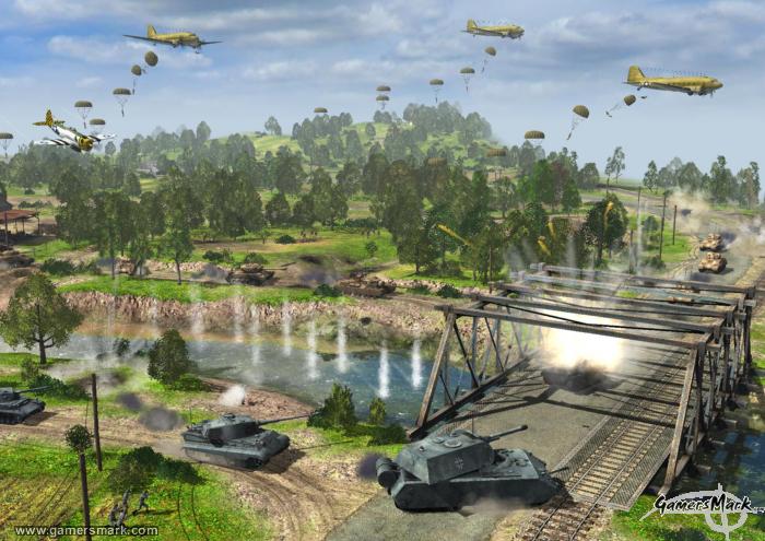
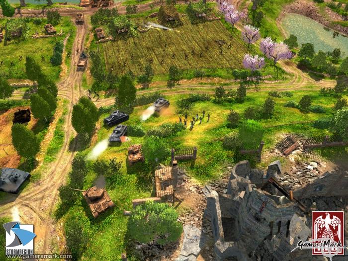
It’s not often we see a World War II game that is something other than a first person shooter. Rush for Berlin, developed by Stormregion, is a real-time-strategy game that strives to be a historically accurate and realistic rendition of World War II. Unfortunately for Rush for Berlin, it falls short of being totally enjoyable. Rush for Berlin will not be a game that makes waves through the genre; the game fails to be worthwhile, not only because of the extremely weak gameplay in the single player mode, but the absolutely non-existent multiplayer community. It’s incredibly important for a real-time-strategy game to have these basic values in place, even before any kind of innovation is attempted.

The thoroughly unimpressive single player mode in Rush for Berlin struggles to prove any kind of worth whatsoever. Unfortunately for the actual real-time-strategy elements of the game, they are not utilized properly to show the strengths of what the gameplay actually has to offer. The single player mode is based on World War II, obviously, but there is absolutely no revolving story to connect any of the missions you go on. After a cheesy cutscene to set up a certain scenario, you’ll begin your mission with a set amount of units and go on your way doing what needs to be done. What needs to be done usually consists of killing your enemies until there are none left, or capturing certain points of interest. Each mission is like a snapshot of history, and you jump around from time period to time period.

What brings down the experience of the single player mode the most is that there is little to no traditional base vs. base gameplay. Most of the missions are what I like to call “limited force” missions – you’re given a set amount of units and you’re on your way. Occasionally you are able to capture a factory to create more units, but you’re not going to be building factories or barracks like in traditional RTS games. Any and all buildings or structures you own have to be captured and can be recaptured by the enemy if you let your guard down.

The multiplayer mode is by far the biggest disappointment in Rush for Berlin. I was disenchanted when I found absolutely no one on the servers. Since the game used Gamespy, it was very easy to log in, but that was where the pleasant experience stopped. To give you an idea of how desolate the multiplayer community is, there are more people playing the demo of the game than the full game. And since you have to have the same version as who you’re playing against, it doesn’t even let you play with the two or three people that just happen to be online, if you’re able to catch them on at the same time as you are. I almost downloaded the demo just so I could play against someone. This is a serious devaluation of the game, especially since the single player mode is less than fantastic. If you’re turned off by the single player mode you will have nowhere to go when it comes to playing Rush for Berlin, unless you know someone personally to play against.

As for the actual gameplay, it is particularly solid. The game itself puts more value into each of the units you have, as they are not usually available in huge quantities – you can’t just build any anytime you want, and when you can, it takes a long time to build a unit. It can take especially long sometimes since there is absolutely no resource gathering, you’ll have to wait even longer for the resource counter to get to the point you want it to get to before the unit begins to build.

Needless to say, base politics play a very small role in the game, and it comes down to actually managing your units and being strategic in how you use them. Because the game puts more stress on the units, you’ll actually be aware of when you lose a unit, as it could make or break your push through enemy territory. The flexibility of the gameplay is also shown by being able to take over enemy vehicles (provided their occupants are no more) and use them for your purposes. Many of the blown out buildings in the game can also be used for your tactical advantage by making your infantry go inside them so they are able to shoot at whoever comes by.

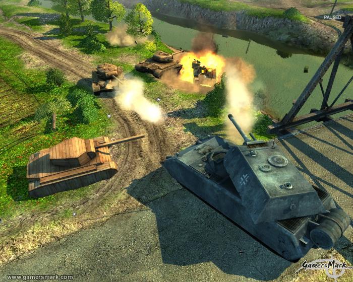
By far the most impressive aspect of Rush for Berlin are the graphics. The maps themselves are enormously detailed – urban areas really show the best of what Rush for Berlin has to offer in this aspect. All the units look about as realistic as they can be –vehicles more so than humans. Everything looks incredibly akin to what it would have looked like in World War II, which should be applauded. There is also a 3D camera, so you can get all sides of the action. Unfortunately, they assigned the scroll wheel click to changing the camera rather than the right click, which can make it difficult to be as precise as you might want to be.

Sound effects and music are another couple strong points, but the voice acting is awful. The sound effects are cool, and they really help in making you feel like you’re in the middle of a battlefield. The music is empowering as well, and usually has a “march to war” feeling attached – possibly offering motivation to do what you need to do. Voice acting, however, is on the completely different side of the spectrum. The actors sound like Europeans trying to imitate an American accent, which end up sounding like they’re a bunch of pricks at the gym with surly voices – it doesn’t really cut it for what the game is trying to accomplish.

Rush for Berlin ends up being just another lackluster World War II game. Perhaps if the same gameplay mechanics were exploited better, and there were a multiplayer community to interact with, Rush for Berlin would have been a solid game, but unfortunately that was not what came to fruition.

Hearts of Iron II: Doomsday (PC) Review

Developer/Publisher: Paradox Interactive || Overall: 8.4/10

If anyone has played Hearts of Iron II for the PC, Hearts of Iron II: Doomsday will feel all too familiar. Heck, it’s pretty much exactly the same game except with a couple new layers of situations to play through and a few more options. As a stand-alone expansion, it’s all that’s to be expected really, but if you are yearning for more Hearts of Iron II challenges, it could be worth a look. One thing is for sure though, if you are contested between having to chose Hearts of Iron II or Hearts of Iron II: Doomsday, go with the latter.

Hearts of Iron II: Doomsday is one of the most fleshed out strategy games that I’ve ever seen. Such a massive amount of information is presented to you, all of which you are able to manipulate. The game almost inadvertently creates a very overwhelming feeling when you first start to play. The tutorial mode will help in that respect, but even after that, you’ll have to think fast as you have to deal with military, political, and developmental needs of your country. Taking place on such a large scale, it’ll be a definite challenge to keep up with all the things that are happening even if you put the speed of the game on slow.

The gameplay screen is exactly like a tactical map from a war documentary, as you can see the paths of your units with large arrows. The color of the arrows show what a unit is doing. The world is split up into provinces, and practically every province can be taken over if you play your cards correctly, but it’s easier said than done. You can fight through the whole of World War II exactly as it played out, with the Axis powers losing, or the complete opposite, with the Axis powers winning. You can use your imagination here, I’m sure. What can be a turn-off to some people is that you don’t really see the action unfolding all that excitingly. There are animations of units showing that they are in battle, but you’re not going to be right in the action seeing how units die and stuff like that, so it can be a little boring at times.

However, you’ll be so preoccupied with so many of the other things happening, it’d be trivial to even have something like that included. Your units are also not all displayed on the screen at the same time, so it might seem like you only have two or three units when you really have something like twenty or thirty, just because they all stack on top of each other as long as they’re in the same province. Units like airplanes and naval craft are in ports, so you have to click on the port itself to activate that particular unit. You can view the map in different ways, through terrain, political boundaries, wealth, and others, to help you plan out how you go about moving your military. There wasn’t really anything that was noticeably improved from Hearts of Iron II in the expansion, but either way the user interface is about as good as it can be for what is accomplished.

History only sets up the platform from which you will take control of the game… depending on what year you start out in. This brings us to the main scenario that has been added to the game: Doomsday. I suppose you can call it science-fiction, but Doomsday takes place in 1945, directly after the end of World War II. The Soviet Union decides it’s a good idea to go ahead and start to take over the world, especially when they feel threatened by a couple of US-owned atomic bombs sitting in airplanes in Turkey. So when the Soviet Union starts advancing into the war-weary Western Europe, the US drops those atomic bombs on Moscow and another city in Russia and completely destroys them. Boy is Russia mad now. They’ve already got practically half of the world’s provinces under their control, especially with taking back many of the provinces that had been taken over by Nazi Germany. So now Europe, the United States, and the rest of its allies have a heck of a task ahead of them in defeating the Soviet Union when they’ve exerted so much of their power on defeating the Axis powers. The Doomsday scenario is a lot more fast-paced than others included, since so many things are happening at the same time. One could even say that the Doomsday scenario was what the Cold War could have been if things had heated up right after the war had ended.

Since Hearts of Iron II: Doomsday is an expansion, a couple of gameplay features had been added to influence how the game can be played. Nuclear weaponry being the most apparent, there is also intelligence, and more technology to be researched. Intelligence will help in being able to steal technology from other countries, or cause some trouble in another country you don’t exactly like. The additions are welcomed, but they’re not nearly enough of a change from Hearts of Iron II to really worry too much about.

Graphics and sound are still the same as Hearts of Iron II. The graphics are nothing special at all — you’ll be looking at a very plain, but colorful, world and of course unique-looking units, but that’s about it. The music is nice to listen to, as it is a bit empowering in your military struggle against your foes. However, a good PC is a must for playing the game. I experienced a little bit of lag while playing the game and it isn’t even that bad of a computer. The processing power required running the complexity of the world and its huge amount of provinces and military movements across the whole thing is quite certainly a lot. Multiplayer modes are also included.

With plenty of dedication on your part, you can uncover a rewarding experience in Hearts of Iron II: Doomsday. Being able to play as so many different countries for the same scenario results in a large amount of replay time if you get so inclined to play the game for all its worth in that respect. Hearts of Iron II: Doomsday is one of the most advanced strategy games to date, and hardcore strategy gamers will find a great challenge in it.

Take Command 2nd Manassas (PC) Review

Developer: MadMinute Games / Publisher: Paradox Interactive || Overall: 7.9/10

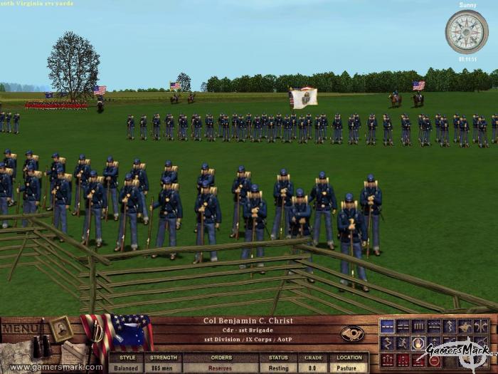
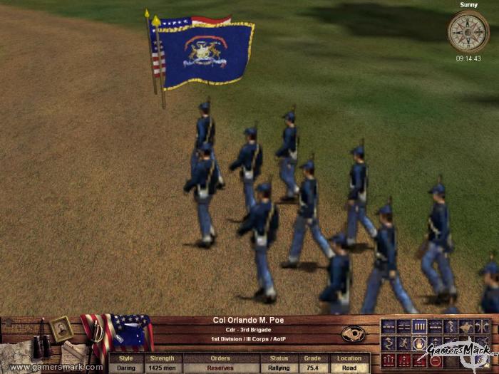
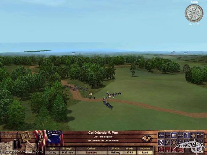
Take Command 2nd Manassas is an interesting strategy game. Set during the American Civil War, It takes a middle ground between a real time strategy and a regular strategy game by allowing you to control your units as part of large groups rather than single individuals — all in real time. Through the use of different formations, you have to control your division effectively to overtake the Union or Confederacy in a battle in an open field. Take Command 2nd Manassas visually portrays the Civil War very accurately — it is a unique way to see how the battles in the Civil War had taken place, especially with a 3D camera, allowing you to see the fighting from all sides. History Channel, eat your heart out.

Take Command 2nd Manassas focuses more on a particular part of the Civil War, rather than the whole thing. Quite obviously, it’s the Second Manassas battle, otherwise known as Second Battle of Bull Run. During the time, Manassas was a strategic railroad crossing that lead to Richmond and Washington, DC. The battle itself is broken down into days, and further into multiple commanders for both sides of the battle. The battles before and after Second Manassas are also available for play.

You can manage your troops from the brigade level all the way up to the division level. Depending on the particular scenario you’re involved in, of course, it could vary how much command you have, with other soldiers on your side being controlled by the AI only. The AI assists you tremendously as well, automatically adjusting your soldiers in a fashion that they will line up facing the correct way to shoot at oncoming foes. You can control multiple brigades under a leader by selecting a leader and telling the troops to rally behind it in a certain formation. Rallying your troops behind a leader is a very effective way to move all of the troops connected to that leader as they march toward the battle.

Positioning is the key to winning a battle or skirmish. By placing your units in a line, your units will be able to fire on the enemy. Placing them in a double line or a column makes for some cool-looking marches down the battlefield, but you’ll end up having to revert back to the simple line to fire on the enemy. Once you position your troops, you just watch as they either become victorious or run away in fear because their morale is broken. One thing about the action that takes place is that you’re not as involved with what is going on as much as you might want to be. By restricting how much you’re able to control your soldiers, you’re forced to fight battles the same way they were done during the Civil War. The victor of the battle is basically the one who takes the least casualties.

Morale of your troops is important because it dictates how long a brigade will stay and fight as their buddies die next to them. As a unit’s morale drops lower and lower, you can see the brigade scattering out a little more, falling back. Once their morale reaches the “broken” status, that particular brigade will go into a full retreat and literally run away from the battle as they are still being shot at by the enemy. They don’t leave the battle entirely, as they will regroup, and once their morale gets back up will be usable for battle again. Positioning leaders behind your troops will give the brigades morale boosts as to divert the drop of morale just a bit longer. Though not every single individual person in a brigade is shown, a counter is displayed in the information bar when you click on one of them. The number can be anywhere from a hundred to a thousand, though it’ll usually be around three hundred. If a brigade gets tired, their morale will tend to get lower faster as well as not being able to move as fast. If they’re given time to rest, outside of any enemy fire, they’ll be able to get back to a rested state.

The graphics are okay. The cool visuals you can get with the full 3D camera are quite interesting as your troops are fighting. You can see it from a bird’s-eye view all the way to an almost-first-person view. The units themselves are low-resolution 2D sprites slapped on top of a large 3D terrain, which can make them seem a little bit out of place at times, just because of how flat they look, and even a little bit cartoony. The terrain could have done with looking a bit more realistic – same with the sparse buildings that are sprinkled here and there. Explosions don’t look anything more than flashes with smoke, and don’t leave any marks on the terrain as if there had been some. Sound is pretty good — there’s nothing that can be pointed out as really out of place or annoying as all the sounds of war are there in realistic proportions. There’s no speech at all, not even in tutorials, and all communications with other officers are done by courier, so there aren’t any briefing scenes where you talk with General Lee about the status of the battle or whatnot.

Take Command 2nd Manassas is the most accurate representation of a Civil War battle I’ve seen in a video game. Though it might not represent the battle of 2nd Manassas completely or even have a 100% realistic tone to it, the battles alone make the Civil War come alive in front of you. One thing is for certain, though: if you’re looking for a Civil War strategy game, give Take Command 2nd Manassas a whirl.

Horse and Musket 2: Prussia’s Glory (PC) Review

Developer: Boku Strategy Games / Publisher: Shrapnel Games || Overall: 5.5/10

Does anyone remember Prussia? Well, besides the fact they’re not a country anymore, Prussia was a really powerful nation back in the 1700s, the era in which Prussia’s Glory takes place. Prussia’s Glory focuses on five important battles of Frederick the Great, a “military genius” who came to power in Prussia in 1740 and fought battles such as one against an Austrian army that outnumbered him severely, but still came up as the victor. Okay, so enough of the history lesson, time to talk about the game.

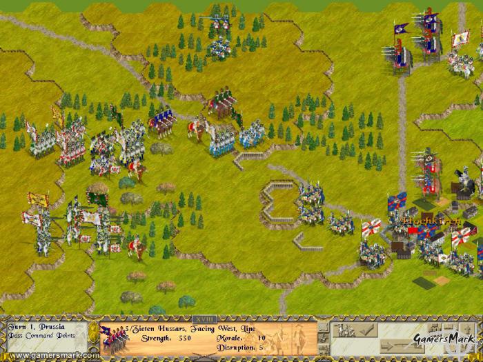
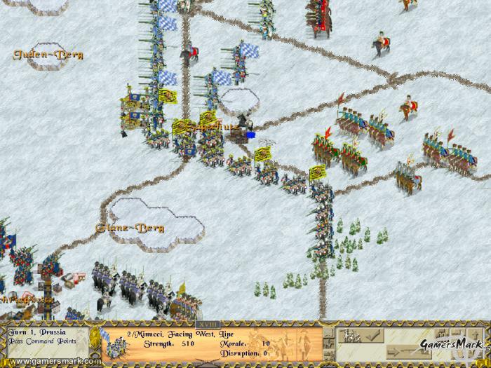
Upon first booting up Prussia’s Glory, the first thing I said was “ew.” To put it simply, the presentation of the game is horrid. The game just comes off as looking way too archaic for its own good; its in-game graphics aren’t pleasant to look at by any means. The game’s visuals give you this cluttered feel, especially when one unit is actually like nine-or-so indistinct people with flags and drums. Additionally, the font used to display various pieces of information is difficult to read. However, it should be noted that games like Prussia’s Glory don’t rely on their graphics to sell themselves to strategy fans as much as they do on gameplay… as for the gameplay itself, you may find out that it’s not up to snuff either.

It would’ve been a lot more fun if the game wasn’t so slow-paced, but it’s something to be expected in a strategy game that isn’t in real-time. The game moves in “phases,” starting with the bombardment phase in which you use artillery units to hit your enemy. The command turn phase, which occurs every four turns (which translates into an hour of game time), a command phase, and an activation phase among others. The last three phases basically boil down to this: you attempt to “activate” a group of units that are attached to a particular leader so you can move them. Sometimes the activation will fail, resulting in you not being able to move the units at all until the next turn where you can attempt to activate them again. This sort of methodology for moving units just seems to be kind of ridiculous, especially when it takes so long to even move your units into position in the first place to attack.

There are a lot of menial gameplay factors in Prussia’s Glory that aren’t too clear in how they affect any of its battles significantly, such as terrain, morale of the troops, leaders, cavalry, and stacking. Learning how to use all of them effectively will probably be the greatest time absorber, but if only the game made you feel compelled to truly understand them. Terrain will either limit or dictate the kind of moves and attacks your units can do. Cavalry can charge, morale of troops affects their performance — it’s all pretty complicated if you choose to really go into it.

Where the game really suffers is in its all around archaic-feel within the genre of strategy gaming. Mostly attributed to the user interface not being all that friendly, the game forces you to really have to look through the accompanied manual to learn how everything basically works. Instead of being able to attack with a unit in a traditional strategy-game way, you have to wait until the game allows you to use your units to attack where they stand (if they’re able to, to begin with). Seemingly unnecessary things like that bring the game lower.

There are a couple of multiplayer options, including play by e-mail to get some more longevity out of the investment in the game. For those who don’t know what play by e-mail is, it’s a gameplay mode which allows for two players to play a round of the game little by little, with the game sending an e-mail to your opponent after every move so that you don’t have to spend a large amount of time playing a round in one go. However, in the end, the gameplay just wasn’t fun enough for me to really want to put this mode to use. In fact, the game as a whole isn’t the type that will be redeemed by its multiplayer modes.

My experience with the Prussia’s Glory wasn’t very delightful. It didn’t appeal to me on any level, not in concept, gameplay, visuals, or really even sound. Prussia’s Glory is a very underwhelming strategy game, and most people would be ill-advised if they’re told this was a worthwhile game to sink their time into. Although, those interested in recreating history of Prussia in videogame form may want to give this game a chance.