Tag Archives: GamersMark

Warhawk (PS3) E3 2006 Preview

Developer: Incognito Entertainment/SCE Santa Monica | Publisher: Sony Computer Entertainment

Warhawk has created a tremendous buzz at this E3, especially since it was the only game on the floor to use Sony’s newest feature in the PS3 controller — the motion sensitivity. Regardless of what preconceptions you might have about Warhawk and the motion sensing, it ends up being a mixed bag when it comes to its actual execution.

The game itself looks pretty spectacular. I was impressed with the visuals at their current stage, especially seeing it on a full 1080p HDTV. There weren’t very many “jaggies” at all. Basically the whole demo encompassed you destroying tons of planes and a couple of cruisers allowing you to see how the game basically worked.

Of course, the biggest focus in this game at the show was how well it utilized the motion sensing. There were rumblings online about how the developers at Incognito only had about two weeks to integrate the motion sensing use and only used two of the axis’ – even so the motion sensing was very intuitive. Some people say there was a lag between your hand moving and the plane, but I felt like it was pretty much how it should have been. You can’t expect a huge metal plane to maneuver as fast as two hands with a plastic controller – there should be some sort of realism, right?

The demo offered either Hover Mode or Flight Mode and used the motion sensing to fly around and target enemies – pressing Square to shoot at them. The targeting was alright, but it was the weak point of the demo. Hopefully it will be improved by the final version, but it was definitely playable as it was. To do a barrel roll, you would press one of the shoulder buttons and tip the controller all the way to that direction. Otherwise you’ll just make a very sharp turn if you don’t press the button.

I had fun with the Warhawk demo, and it was definitely a great way to show off the motion controlling even though it wasn’t perfect and needed to be tweaked a little bit more. This resurrected franchise from the PSOne days should definitely come to be an excellent revival.


Motorstorm (PS3) E3 2006 Preview

Developer: Evolution Studios | Publisher: Sony Computer Entertainment

To my surprise, Motorstorm was on the show floor at Sony’s booth. The problem was it was sort of hidden, which is a shame because it was awesome. Can’t-possibly-be-legal dirt battle racing doesn’t get much better than Motorstorm. Racing to the finish is the obvious goal of the game, but how you get there is different from anything I’ve ever seen or experienced. As you race through the course, you leave tracks in the dirt, degrading its quality and making it that much slippier – more than it may already be. Coupled with some amazing A.I., Motorstorm is quite literally a blast.

Each vehicle has its own strengths when it comes to the kind of track and what route you decide to take. In the demo, I played as the buggy and its strength was leaned towards dry land racing as opposed to wet terrain or mud. Unfortunately for me, I didn’t know that until after and ended up losing pretty badly. The opponent A.I. is very impressive as well, as they will try everything in their power to exploit your weakness — nothing short of ramming into you or making you slam into a wall or a huge rock. As you make your way through the track, your car becomes dirtier and dirtier, and you even see the mud fly out from beneath the wheels. Attention to detail like this made Motorstorm look really cool. As for the motion blur, it’s integrated nicely, even though it might be happening at speeds that shouldn’t really have it. The blur increases as you go faster. When you crash, your vehicle might break apart, allowing you to watch the parts fly off in slow motion. These effects add to the immersion and make the game more fun; especially on the huge HDTV they had it hooked up on.

I had the opportunity to ask the producer how he thought they might be able to use the recently added motion sensing capabilities in the PS3 controller to the game, and he said they might make it so if you flick the controller in a certain direction, your driver would lash out at a vehicle next to you, which sounds pretty cool, but as of E3 it wasn’t in the game. I am personally excited for Motorstorm. I think it’ll turn out to be a great game when all is said and done.

Full Auto 2: Battlelines (PS3) E3 2006 Preview

Developer: Pseudo Interactive | Publisher: SEGA ||

Virtua Fighter 5 isn’t the only Sega game to get excited about for the PS3. Full Auto 2 is coming exclusively to the PS3. Strap on your excitement helmet and get ready for some good old fashioned cars-retrofitted-with-machine-guns-and-rockets action! With potentially fantastic elements, Full Auto 2 look like it’ll end up being quite fun. The game has interactive environments and super glossy (not to mention expensive) civilian-type cars with weaponry, so it’s up to you to be Mr. Full Auto and kill everyone and everything you can.

The E3 demo was just the multiplayer battle mode, so after you died, you respawned, and proceeded to rack up as many points as you can by blowing up your opponents. It was pretty fun; I ended up playing a few games in about half an hour, completely oblivious to the Virtua Fighter 5 action going on in the same booth. I had the opportunity to ask one of the level designers about what they might use the motion control for. He said he wasn’t sure about it being used for steering (since people would lay down while playing sometimes) but rather for aiming with the weaponry. As it was right now, the aiming requires you to move the car because the crosshairs are right in the middle of the screen.

Regardless, Full Auto 2 is a pretty fun multiplayer game as it stands now, and should be better by the time the game is ready to ship.

SingStar (PS2) E3 2006 Preview

Developer: SCE London Studio | Publisher: Sony Computer Entertainment

While at E3 this year, I was able to try out Sony’s Singstar for the PS2. At first I was a little hesitant to pick up the surprisingly well-made microphone, and just stood by watching other people sing. But when nobody was playing anymore, I decided to give it a try. While I played, one of the representatives from Sony that was demonstrating the game played with me the whole time. SingStar has been a very popular game in Europe, so its surprising that it took so long for the game to come over – it was instantly apparent to me why it’s so popular as soon as I started playing.

The most impressive thing about the game is the user interface. It’s very clean and very intuitive, and I actually like shuffling through album covers while looking for songs to sing. There is a very generous mix of rock and pop music, and it was interesting to see Nirvana, The Darkness, and Franz Ferdinand (to name a few) in the song list. Just as Guitar Hero helps you better appreciate what a guitarist can do, SingStar will make you appreciate how well someone can sing or perform certain lyrics. The “do do do” and “lucky lucky” interludes Franz Ferdinand’s “Do You Want To” come to mind as being very tricky to get the words right. The high notes in “I Believe In a Thing Called Love” by the Darkness also come to mind as being incredibly challenging.

The game shows you the music video while you sing. This gives players something to watch during solos and other non-singing parts, so you’re not completely bored. When you are supposed to sing, the lyrics show up at the bottom of the screen with the word you’re singing highlighted. Depending on how close you are to getting the correct note/pitch, you get points. Playing alone probably won’t be as fun as it would be playing with someone else, just because it’s fun being able to compete and see who sings better. Lines show up on the screen corresponding to how the actual song is sung. As you sing into the microphone, another line will appear, graphically depicting if you are higher or lower than the note you should be at. The closer you are to the song’s own line, the more points you get. If you hit notes correctly at certain points of a song’s line that are sparkling, you’ll get a “Golden Note” which counts for bonus points. It’s a very simple game – one that can teach you how to sing your favorite songs.

I had fun playing SingStar on PS2. A version is coming to the PS3 that will allow players to download songs, but the multiple PS2 versions will be pre-chosen packages. Even though the PS3 version was on the floor, I wasn’t able to try that one out because there were a lot more people packed into the PS3 section cracking jokes about “600 dollars” than I would have cared to show off my singing abilities to.


Guitar Hero II (PS2) E3 2006 Preview

Developer: Harmonix Music Studios | Publisher: RedOctane

Guitar Hero II, you say? New songs, you say? Sold! Guitar Hero II is basically Guitar Hero with different songs. So far the game seems better, but how? Well, the multiplayer mode has become more worthwhile – much more worthwhile. The single player mode’s highlights are basically being able to play the new songs, so multiplayer is a different kind of special.

As opposed to the first Guitar Hero, songs in the sequel are recorded with two “tracks” – one for the lead guitar and one for rhythm guitar. If there is only one guitar, bass will be used for the second track. Needless to say this an improvement over the first game since it made you share the same track. However, that doesn’t mean they removed the previous mode — both the new and the old style of play are here. There is nothing gameplay-wise that was in the first game that isn’t in Guitar Hero II.

I played the game at E3, and was able to experience a new song first hand. For some reason I wasn’t doing all that good, maybe because I was really close to the screen or maybe because my timing was off that day. There looked to be new venues and new characters, which is good if only just to show more of a change between the two Guitar Hero games, but the main addition will be new songs that are going to be included.

As it is, Guitar Hero is a great game and getting a new set of songs to play is exciting to wait for. There’s nothing new about the guitar for Guitar Hero II, so you’ll be able to use your guitar controller already. Fifty songs or so are said to be in the new Guitar Hero, so it’ll be exciting to see more of the songs revealed as the game comes closer to shipping.

The list of songs that have been revealed so far is as follows:

Drist – Arterial Black (original track)
Primus – John The Fisherman (original track)
The Reverend Horton Heat – Psychobilly Freakout
KISS – Strutter
Black Sabbath – War Pigs
The Butthole Surfers – Who Was in My Room Last Night
The Kinks, as performed by Van Halen – You Really Got Me
Rush – YYZ

PlayStation 3 Controller Preview

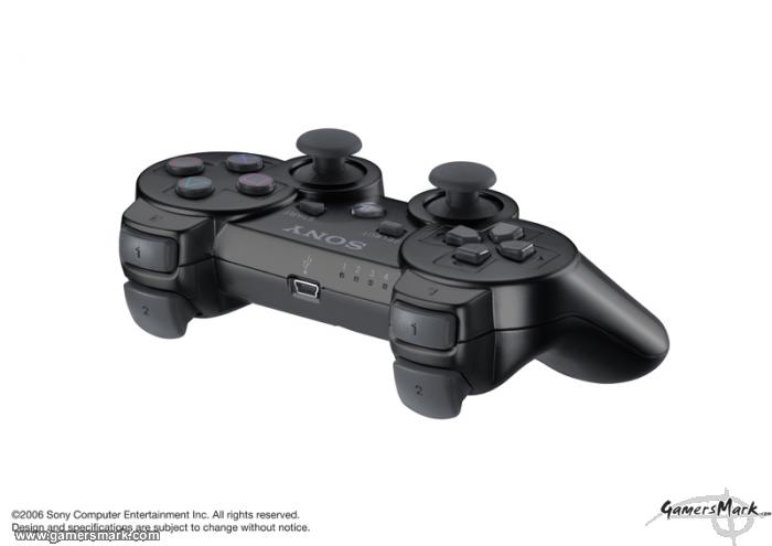
The Playstation 3 controller has changed quite a bit from its Dual Shock and Dual Shock 2 relatives. Whether or not its going to be called Dual Shockless (because of the lack of rumble) or end up being called the Dual Shock 3 (if by some miracle Sony puts rumble back into it), its got a few other changes to point out that are relatively for the better.

The form factor is quite literally the same as the Dual Shock 2, maybe changed a little to fit the palms easier, but all in all the same. It’s lighter, but still feels durable – maybe not as much as the Dual Shock 2, but that’s because of the weight that has been dropped between the two controllers. But this loss of rumble motor weight should help while using the motion sensing and battery life. Speaking of battery life, its supposed to last for about 24 hours on a single charge. The battery will be integrated into the controller, so that it won’t compromise the shape of the Dual Shock, though it probably would be a good idea to make it user replaceable.

All the controllers at E3 were wired, so they obviously were not the final controllers since very controller is to be wireless by Bluetooth. There are four lights on the top part of the controller to indicate which controller is which. As of now, seven controllers are still supposed to be used, but the lack of three extra lights on the controller might be worrisome to a few people. It’s possible to show controllers over four by displaying two lights at the same time, for a total of seven combinations of lights up to two lights on at the same time. There is also a USB port on the top of the controller for the final version which will allow for charging, and who knows, maybe even attachments.
The analog sticks became more sensitive, increasing from 8 bit to 10 bit in resolution. The game that really showed off the enhancement to me was Mobile Suit Gundam, during the aiming of its machine gun. The analog sticks seem like they will be more apologetic towards FPS games than any other PlayStation controller before it, so some people will be happy about that. A “Home” or “Guide” button has been added to the middle with the PS logo on it. The “Analog” button is gone now, so you can always assume that analog is on. Though it was nice to know your controller was working by having that light, the new indicator lights will replace that use, I’m sure.

As far as I could tell, pressure sensitivity is still there in the buttons, as well as the L3 and R3 (clicking sticks) buttons. The only buttons that have really changed are the L2 and R2 buttons. They’re more like true analog triggers, while still keeping their traditional button feel. Some people say they feel a little “spongey,” but I didn’t get that feeling at all. It’ll just take a little getting used to how they work as opposed to the L2/R2 buttons on a Dual Shock 2.

Motion sensing is obviously the biggest new feature in the PS3 controller, and is supposedly responsible for the removal of the rumble feature. The only game to use the motion sensing was Warhawk, and it definitely seems that the motion sensing will be a worthwhile function. It will not get as huge of a focus as the Wii’s motion sensing will get (most likely), but the way I look at it, it shouldn’t be. It will probably only be used for small improvements/functionality not otherwise possible before. The motion sensing itself in Warhawk at E3 felt like a fully spherical analog stick – instead of just using the top part of the sphere that regular analog sticks sit on top of. The motion sensing will probably see its biggest functionality be that of a substitute or third analog stick than anything else. Small flicks and the like might be all that’d happen otherwise, but developers should be able to surprise us down the line.

Though no one had a chance to use the “boomerang” PS3 controller, going with the Dual Shock design again is a good and bad thing. It’s good because we know how it works and how it feels, but it’s also bad because it doesn’t really try to improve too much of the ergonomics of how it feels. Maybe the PS4 will see another design.

Steambot Chronicles (PS2) Review

Developer: Irem / Publisher: Atlus || Overall: 7.5/10

Atlus is known for delivering niche Japanese-developed titles and Steambot Chronicles is no exception. Developed by Irem, Steambot Chronicles is not really any one type of game that you can pinpoint directly – it is one part sandbox, one part mech game, one part music game, and one part RPG all mixed into each other. Combined with its certain type of charm and fantasy, Steambot Chronicles is a great little game that is hampered by control problems, graphical inconsistencies, and a weak story to boot.

The story starts out with the main character losing his memory, as he awakens on a beach. This prompts the main character, Vanilla, to find out whom he is, and what happened. Even though there is a huge ship that has crashed against the shore and smoking because of a fire, there is little to no acknowledgement of it by you or the person who found you, named Connie, which is a little weird to say the least. Given that the story is very simplistic in nature to begin with, its immediately apparent that Steambot Chronicles is really not about its story as you get into some real gameplay with little to no delay.

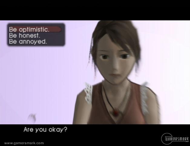
The girl who finds you on the beach, Connie, is a cute brown-haired girl who sings for a very famous band called the Garland Globetrotters., and if you play your cards right a nice relationship can evolve from knowing her. Constantly throughout the game, you are given choices for what Vanilla says or does, and the outcome of certain events will be influenced by such. You can be a bastard or a big softy – it’s really up to you. The very weak story of Steambot Chronicles basically encompasses Vanilla’s search for who he is while going on tour with Connie’s band. Other than that it really isn’t compelling – the world doesn’t have to be saved, there is no impending evil; you get the point. Along the way you’ll meet up with many people and discover new things to do in the world. The game itself is very non-linear and you don’t even have to follow through with the story at all except for a few key parts. An interesting way that the game influences you to try and talk to everyone in towns and cities is that their picture is added to a photo album in the start menu. This is very unique, to say the least, and gives you a feeling of “talk to all the generic characters I can find!” Pictures will be updated as you talk to more and more people, and important characters will get their own picture.

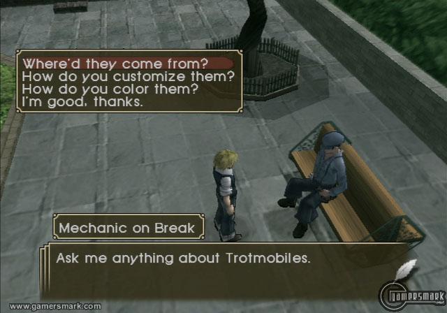
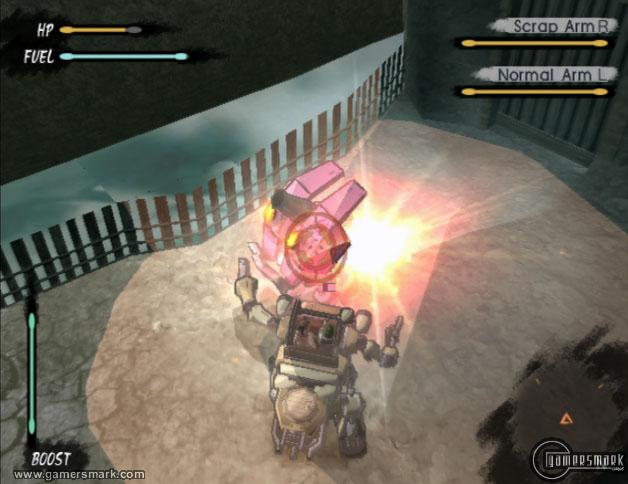
The main form of transportation and gameplay is something called a trotmobile. Think of a car with arms and legs and you have a trotmobile. Anyone who has played through Front Mission 3 or 4 will instantly grasp how to manage it in the backend system. Basically, a trotmobile’s body/legs can hold a certain amount of wight which will contribute to what kind of arms and “backpack” you can equip. Arms are mainly used for combat while the back attachment is more for the extra stuff you can do in the world. Possible types of arms include Sword Arms, Spiked Ball Arms, Cannon Arms and back attachments include a carriage for bussing people around and a flatbed for carrying stuff. This is all fine and dandy except for two very disappointing aspects of the game.

The controls for the trotmobile are very counter-intuitive because they use “Katamari” controls. Both analog sticks are required to move effectively which quite frankly blows because it doesn’t give you a free camera (you’re locked behind your trotmobile at all times) to use. This is very annoying when battling, obviously. Not to mention that movement would have been done just as effectively, if not more, with one stick. The other glaring problem is that there just isn’t that much actual combat to spend time on. Without any random battles, you’re forced to fight the same enemies over and over – they’ll pop out at you from the same place as you travel between towns.

Trotmobiles are also very slow, so you’ll be walking through fields, beating two enemies between each town (effortlessly, I might add) without getting much use of the effort you put into improving your trotmobile to begin with.

Boss battles happen every once in a while and are very fun, but they only last for maybe a minute or two before you’re given a load time to celebrate your win. Each town has their own “Arena” in which you can fight tough trotmobiles 1 on 1, but even these battles go by quickly. There’s almost as much loading as there is playtime (sometimes more if you’re good) during these Arena battles. Other things in the world to do include playing an assortment of instruments for different songs, bussing people from one town to the next, fighting in arenas and dungeons, digging up fossils to fill up a museum, and stuff like that. You’re allowed to do almost anything you please in the world that has been created. You’ll also have to maintain your character by eating whenever he gets hungry, and that’s just plain annoying.

As for sound and graphics, they are about average. The voice actors are alright but they can be annoying at times. General sound effect usage is good, and battle sounds aren’t very irritating even though you hear them over and over. The most bothersome sound effect would be the trotmobile’s walking noise. Music is very cheerful, and goes along with the mood of the game, but isn’t all that memorable. As for the graphics, the game has a cel-shaded look to it which promotes a cartoonish feel to the game – but maintains a more realistic look than most cel-shaded games. There isn’t anything special but nothing is particularly ugly except a few things that stick out like character animation. Load times also avert some of the pleasure that is delivered, which is unfortunate.

What I favored about this game was the open-endedness of it all. The game doesn’t tell you where to go; you tell the game where to go. It shows that GTA-style games don’t always have to be about 100% action or even have a strong storyline; it provides the person playing the game with many things to do at their own leisure with practically no bounds. By giving you choices in what to say or do throughout the game, it can also influence you to replay the game and see how it would be being mean the whole way through or being nice all the time.

Steambot Chronicles is a fun game that rides on you being interested enough to take part in the activities the world offers through its non-linearity. Besides the flawed controls and graphical discrepancies here and there, Steambot Chronicles is a light-hearted adventure game that isn’t hard to get into.

Mobile Suit Gundam: Crossfire (PS3) E3 2006 Preview

Developer/Publisher: Bandai Namco Entertainment

Mobile Suit Gundam made its way to Sony’s show floor in a barebones sort of way. This game in particular allowed for more than just testing the short demo itself, but seeing what parts of the controller had been improved. As you may or may not know, the controller’s regular two analog sticks’ resolution had been increased from 8 bit to 10 bit. Basically, meaning they are more sensitive — the extra sensitivity helped out tremendously in the demo.

Mobile Suit Gundam’s camera is placed in an over-the-shoulder view. Though the Gundam takes up a little bit more of the screen than it probably should (about half), the Gundam model looks very nice. Even the enemy Mobile Suits looked cool; the only thing that really sucked about the game in terms of graphics was everything else. They plop you down in a desolate mountain desert and let you blow up six enemy Leos and a couple of guard towers. Hoorayyyy… however, I did enjoy the little bit that was offered. Regular movement was a bit slower than it probably should have been, and made it harder to actually put your laser sword to any good use.

The main weapons I used were the machine gun and the head Vulcans (machine guns in the head). It didn’t take too long to defeat enemies. If you happen to actually get damaged enough during the demo (aka you suck at games and probably life) body parts will start to fall off, disallowing use of certain weaponry or abilities. I hadn’t figured it out until my last play-through of the demo, but you can boost while on the ground, allowing you to move a lot faster and not rely solely on sprinting on foot towards your enemies. The boost also allows you to jump to get to higher places but when you land it takes a second or two for your Gundam to recover.

To me, it was weird to see such a barebones demo for Mobile Suit Gundam out on the show floor when there was the Xbox 360 counterpart Mobile Ops: One Year War practically finished already. For what its worth, though, the PS3 version did look noticeably better.


Silent Hill Experience, The (PSP) Review

Developer/Publisher: Konami || Overall: 8.5/10

If you’re looking to get into the Silent Hill series, why not start with an animated comic book? That’s exactly what the Silent Hill Experience is; two hours of digital comic books, music from the games, and a few extra videos. Even with the additional media, the main feature of the title itself is quite obviously the digital comic books, and with good reason.

In basically what can be described as a movie you read with an awesome soundtrack, the comics included on the UMD are very interesting. If you are new to the Silent Hill series, like I am, the comics can seem a little “out there” in terms of understanding what is going on story-wise. After a while, however, you can understand the world Silent Hill creates in itself and what happens to the people that interact with it. The art style is very unique, and if you appreciate that kind of thing, it’s worth the price tag in itself. The drawings hold nothing back in terms of graphicness – you’ll see lots of blood, gore, and everything in between. The colors really make the comics come to life and once you get into it, you feel like you’re actually immersed with what is happening. And obviously being all about horror, Silent Hill can be quite scary in terms of what’s happening rather than you being actually scared.

There are two comics included in The Silent Hill Experience. One was made specifically for this release, “The Hunger,” and the other is named “Silent Hill: Dying Inside.” “Dying Inside” is a comic translated into a digital comic by Konami, and separated into four parts. The way you would watch one of these comics, is simply by selecting which part you wanted to watch from the menu and letting it go from there. The comic panels will fade in, zoom in, zoom out, and fade away into the next panel for you to look at. There is no interactivity with the comics themselves, there’s a limited amount of time for you to read and watch each panel. Altogether, these comics are as long as a feature-length film.

The music that accompanies the comics as they play helps in the immersion of the story as it unfolds. The music changes at just the right moments to help in the immersion of the whole experience. What would have improved the whole thing, would have actually been a featuring of voice-overs to help with the immersion even more.

The comics can also move a bit faster than you might like if you’re not a fast reader – I usually have to Pause the video every time a new speech bubble comes along. As for the other stuff, it’s not too much to get excited about. There are music 20 music tracks from the series, a video interview, and other video content from the Silent Hill games.

The video interface can be a little confusing, as it’s presented in a way in which you’re flying through an abandoned and severely damaged school. Different rooms contain different pieces of content. How you move around almost simulates how a first person view board game would be; you press up and you go in a pre-determined direction. Sometimes you have to figure out exactly which way to go to get to certain pieces of content, sometimes resulting in you accidentally going back the way you came and losing track of where you were before.

The Silent Hill Experience uses the PSP in a unique way by exploiting its multimedia strengths. The Silent Hill Experience is a perfect example of how a UMD Video that is marketed and produced directly for PSP users can do something more than a DVD. Seeing more of this kind of product on the PSP would definitely be cool. All in all, $20 isn’t too shabby for what you get in this package, and fans are sure to enjoy it.

.hack//G.U. Conference Call

I had the opportunity to participate in a conference call for .hack//GU Part 1 this past week. Some new information as well as old information about the game was talked about during the conference. Much of the information presented was random.

The information I was able to get out of the conference is as follows:

• Fall release date on the PS2, developed by the same developer.
• The game takes place several years after Part 4. CC Corporation has built a new version of The World after the events from the first quadrilogy. The World is not the same – there are similar/familiar areas, but they’re not exactly the same. Someone who has played through the previous games should feel comfortable in the settings, however.
• The game goes for a much darker and grittier feeling than the previous games. It is very anime-styled with a cross between cg and cel-shaded.
• The story starts out with two people helping the main character with starting out in The World, not unlike Part 1. He gets into trouble and then gets rescued. He turns into an anti-hero sort of guy. Later on, he finds out about a legendary Player Killer, and after their first encounter, the main character’s level is dropped back down to 1. He tries to find out what is going on, only to find out that not everything has been fixed from the previous version of The World.
• While the core mechanics of the game is similar to the previous installments, the battle system is much more action oriented with combos. The higher the level you are, the more special attacks you can learn, which obviously give you a better advantage. The main character can change his weapons depending on the level he’s at, as well.
• Guilds are also introduced in the .hack//GU Part 1. Depending on how big your guild becomes, you can get a guild hall (which is like your own house), and it’ll have important items and the like for you to use.
• As opposed to the first four games, there will not be a dual audio option (meaning Japanese and English audio tracks) because there isn’t enough space on the disc. The space on the disc is filled up with all the new content they’ve added for the game.
• A class called the Multiblade can use multiple weapons. A player can learn different types of weapons as they increase their levels. They start out with the twin-blades.
• .hack//GU will be three parts instead of four. No separate DVD where there is an elaboration is going to be included, but there will be content that is separate.
• There will be some sort of memory card activity with the previous games, but it was not elaborated on in the call.
• The keyword system will make a comeback, but it will be easier to use.
• There are no online plans for the game, as the whole point of the .hack series is to simulate an MMORPG.
• All the characters in the game will be new, but they will look very familiar. What this means is that each class has its own “look” that anyone who played the previous .hack games will recognize as they played through the games.
• There will be voice-overs. The soundtrack is composed and directed by the same people as the previous four, but it won’t be as happy-go-lucky – it’ll have a much darker tone. However, the key change for this “darker” aspect is in the art.
• The game is going to be completely original, but people from previous games will still appreciate it.
• You don’t need to have played the original series to understand what is going on in the .hack//GU series. They want newcomers to feel welcomed.
• Email and OS interaction will be included, similar to the last games.
• Since the main complaint of the original games was the lack of new content, they’re going to pack .hack//GU with as much content that would be equivalent to all four of the previous games. There’s going to be a lot of new content, and it’ll take much more than 20 hours to beat each part of .hack//GU.
• Player Killing takes a part in the game, but you can’t just go into towns and kill people. You can’t go out actively and kill other players either, but you will be able to prevent others from hurting others if you chose to.
• There will be guild vs. guild matches.
• If people die in the game, it will take a negative impact on the game itself.
• The game is aiming to be a darker version of the original series, but its not going to be G rated. There will be mature themes, but it will stay within the same rating. They’re not going for a GTA-esque level, but they’re not going to be cartoons. It’ll be a middleground of sorts, aiming for the same people who bought the preious games.
• The World is more violent in general, since there is player vs. player interaction. There will be a lot more interaction with the game, battle and non-battle-wise. More character development is also an aim.
• A level-cap is still being determined. There is a class change cap.

A playable demo is still unconfirmed. There might be something at E3 this week, however. Keep watch for more information about .hack//GU at Gamersmark.com!

Hearts of Iron II: Doomsday (PC) Review

Developer/Publisher: Paradox Interactive || Overall: 8.4/10

If anyone has played Hearts of Iron II for the PC, Hearts of Iron II: Doomsday will feel all too familiar. Heck, it’s pretty much exactly the same game except with a couple new layers of situations to play through and a few more options. As a stand-alone expansion, it’s all that’s to be expected really, but if you are yearning for more Hearts of Iron II challenges, it could be worth a look. One thing is for sure though, if you are contested between having to chose Hearts of Iron II or Hearts of Iron II: Doomsday, go with the latter.

Hearts of Iron II: Doomsday is one of the most fleshed out strategy games that I’ve ever seen. Such a massive amount of information is presented to you, all of which you are able to manipulate. The game almost inadvertently creates a very overwhelming feeling when you first start to play. The tutorial mode will help in that respect, but even after that, you’ll have to think fast as you have to deal with military, political, and developmental needs of your country. Taking place on such a large scale, it’ll be a definite challenge to keep up with all the things that are happening even if you put the speed of the game on slow.

The gameplay screen is exactly like a tactical map from a war documentary, as you can see the paths of your units with large arrows. The color of the arrows show what a unit is doing. The world is split up into provinces, and practically every province can be taken over if you play your cards correctly, but it’s easier said than done. You can fight through the whole of World War II exactly as it played out, with the Axis powers losing, or the complete opposite, with the Axis powers winning. You can use your imagination here, I’m sure. What can be a turn-off to some people is that you don’t really see the action unfolding all that excitingly. There are animations of units showing that they are in battle, but you’re not going to be right in the action seeing how units die and stuff like that, so it can be a little boring at times.

However, you’ll be so preoccupied with so many of the other things happening, it’d be trivial to even have something like that included. Your units are also not all displayed on the screen at the same time, so it might seem like you only have two or three units when you really have something like twenty or thirty, just because they all stack on top of each other as long as they’re in the same province. Units like airplanes and naval craft are in ports, so you have to click on the port itself to activate that particular unit. You can view the map in different ways, through terrain, political boundaries, wealth, and others, to help you plan out how you go about moving your military. There wasn’t really anything that was noticeably improved from Hearts of Iron II in the expansion, but either way the user interface is about as good as it can be for what is accomplished.

History only sets up the platform from which you will take control of the game… depending on what year you start out in. This brings us to the main scenario that has been added to the game: Doomsday. I suppose you can call it science-fiction, but Doomsday takes place in 1945, directly after the end of World War II. The Soviet Union decides it’s a good idea to go ahead and start to take over the world, especially when they feel threatened by a couple of US-owned atomic bombs sitting in airplanes in Turkey. So when the Soviet Union starts advancing into the war-weary Western Europe, the US drops those atomic bombs on Moscow and another city in Russia and completely destroys them. Boy is Russia mad now. They’ve already got practically half of the world’s provinces under their control, especially with taking back many of the provinces that had been taken over by Nazi Germany. So now Europe, the United States, and the rest of its allies have a heck of a task ahead of them in defeating the Soviet Union when they’ve exerted so much of their power on defeating the Axis powers. The Doomsday scenario is a lot more fast-paced than others included, since so many things are happening at the same time. One could even say that the Doomsday scenario was what the Cold War could have been if things had heated up right after the war had ended.

Since Hearts of Iron II: Doomsday is an expansion, a couple of gameplay features had been added to influence how the game can be played. Nuclear weaponry being the most apparent, there is also intelligence, and more technology to be researched. Intelligence will help in being able to steal technology from other countries, or cause some trouble in another country you don’t exactly like. The additions are welcomed, but they’re not nearly enough of a change from Hearts of Iron II to really worry too much about.

Graphics and sound are still the same as Hearts of Iron II. The graphics are nothing special at all — you’ll be looking at a very plain, but colorful, world and of course unique-looking units, but that’s about it. The music is nice to listen to, as it is a bit empowering in your military struggle against your foes. However, a good PC is a must for playing the game. I experienced a little bit of lag while playing the game and it isn’t even that bad of a computer. The processing power required running the complexity of the world and its huge amount of provinces and military movements across the whole thing is quite certainly a lot. Multiplayer modes are also included.

With plenty of dedication on your part, you can uncover a rewarding experience in Hearts of Iron II: Doomsday. Being able to play as so many different countries for the same scenario results in a large amount of replay time if you get so inclined to play the game for all its worth in that respect. Hearts of Iron II: Doomsday is one of the most advanced strategy games to date, and hardcore strategy gamers will find a great challenge in it.

Take Command 2nd Manassas (PC) Review

Developer: MadMinute Games / Publisher: Paradox Interactive || Overall: 7.9/10

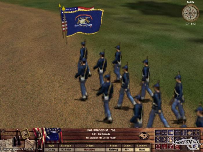
Take Command 2nd Manassas is an interesting strategy game. Set during the American Civil War, It takes a middle ground between a real time strategy and a regular strategy game by allowing you to control your units as part of large groups rather than single individuals — all in real time. Through the use of different formations, you have to control your division effectively to overtake the Union or Confederacy in a battle in an open field. Take Command 2nd Manassas visually portrays the Civil War very accurately — it is a unique way to see how the battles in the Civil War had taken place, especially with a 3D camera, allowing you to see the fighting from all sides. History Channel, eat your heart out.

Take Command 2nd Manassas focuses more on a particular part of the Civil War, rather than the whole thing. Quite obviously, it’s the Second Manassas battle, otherwise known as Second Battle of Bull Run. During the time, Manassas was a strategic railroad crossing that lead to Richmond and Washington, DC. The battle itself is broken down into days, and further into multiple commanders for both sides of the battle. The battles before and after Second Manassas are also available for play.

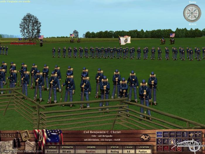
You can manage your troops from the brigade level all the way up to the division level. Depending on the particular scenario you’re involved in, of course, it could vary how much command you have, with other soldiers on your side being controlled by the AI only. The AI assists you tremendously as well, automatically adjusting your soldiers in a fashion that they will line up facing the correct way to shoot at oncoming foes. You can control multiple brigades under a leader by selecting a leader and telling the troops to rally behind it in a certain formation. Rallying your troops behind a leader is a very effective way to move all of the troops connected to that leader as they march toward the battle.

Positioning is the key to winning a battle or skirmish. By placing your units in a line, your units will be able to fire on the enemy. Placing them in a double line or a column makes for some cool-looking marches down the battlefield, but you’ll end up having to revert back to the simple line to fire on the enemy. Once you position your troops, you just watch as they either become victorious or run away in fear because their morale is broken. One thing about the action that takes place is that you’re not as involved with what is going on as much as you might want to be. By restricting how much you’re able to control your soldiers, you’re forced to fight battles the same way they were done during the Civil War. The victor of the battle is basically the one who takes the least casualties.

Morale of your troops is important because it dictates how long a brigade will stay and fight as their buddies die next to them. As a unit’s morale drops lower and lower, you can see the brigade scattering out a little more, falling back. Once their morale reaches the “broken” status, that particular brigade will go into a full retreat and literally run away from the battle as they are still being shot at by the enemy. They don’t leave the battle entirely, as they will regroup, and once their morale gets back up will be usable for battle again. Positioning leaders behind your troops will give the brigades morale boosts as to divert the drop of morale just a bit longer. Though not every single individual person in a brigade is shown, a counter is displayed in the information bar when you click on one of them. The number can be anywhere from a hundred to a thousand, though it’ll usually be around three hundred. If a brigade gets tired, their morale will tend to get lower faster as well as not being able to move as fast. If they’re given time to rest, outside of any enemy fire, they’ll be able to get back to a rested state.

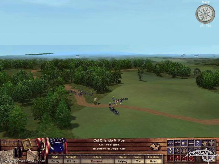
The graphics are okay. The cool visuals you can get with the full 3D camera are quite interesting as your troops are fighting. You can see it from a bird’s-eye view all the way to an almost-first-person view. The units themselves are low-resolution 2D sprites slapped on top of a large 3D terrain, which can make them seem a little bit out of place at times, just because of how flat they look, and even a little bit cartoony. The terrain could have done with looking a bit more realistic – same with the sparse buildings that are sprinkled here and there. Explosions don’t look anything more than flashes with smoke, and don’t leave any marks on the terrain as if there had been some. Sound is pretty good — there’s nothing that can be pointed out as really out of place or annoying as all the sounds of war are there in realistic proportions. There’s no speech at all, not even in tutorials, and all communications with other officers are done by courier, so there aren’t any briefing scenes where you talk with General Lee about the status of the battle or whatnot.

Take Command 2nd Manassas is the most accurate representation of a Civil War battle I’ve seen in a video game. Though it might not represent the battle of 2nd Manassas completely or even have a 100% realistic tone to it, the battles alone make the Civil War come alive in front of you. One thing is for certain, though: if you’re looking for a Civil War strategy game, give Take Command 2nd Manassas a whirl.

Horse and Musket 2: Prussia’s Glory (PC) Review

Developer: Boku Strategy Games / Publisher: Shrapnel Games || Overall: 5.5/10

Does anyone remember Prussia? Well, besides the fact they’re not a country anymore, Prussia was a really powerful nation back in the 1700s, the era in which Prussia’s Glory takes place. Prussia’s Glory focuses on five important battles of Frederick the Great, a “military genius” who came to power in Prussia in 1740 and fought battles such as one against an Austrian army that outnumbered him severely, but still came up as the victor. Okay, so enough of the history lesson, time to talk about the game.

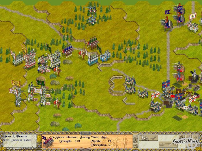
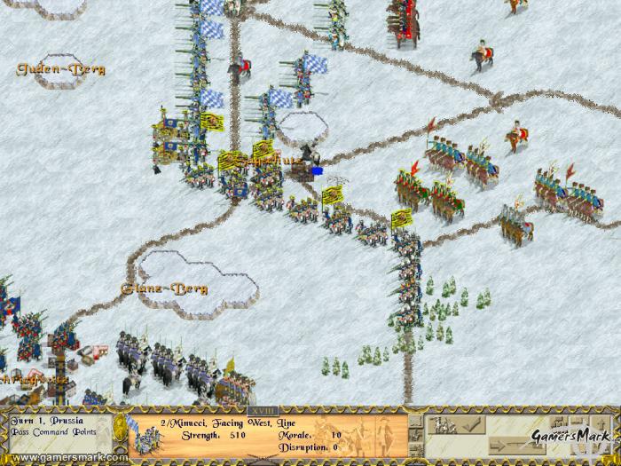
Upon first booting up Prussia’s Glory, the first thing I said was “ew.” To put it simply, the presentation of the game is horrid. The game just comes off as looking way too archaic for its own good; its in-game graphics aren’t pleasant to look at by any means. The game’s visuals give you this cluttered feel, especially when one unit is actually like nine-or-so indistinct people with flags and drums. Additionally, the font used to display various pieces of information is difficult to read. However, it should be noted that games like Prussia’s Glory don’t rely on their graphics to sell themselves to strategy fans as much as they do on gameplay… as for the gameplay itself, you may find out that it’s not up to snuff either.

It would’ve been a lot more fun if the game wasn’t so slow-paced, but it’s something to be expected in a strategy game that isn’t in real-time. The game moves in “phases,” starting with the bombardment phase in which you use artillery units to hit your enemy. The command turn phase, which occurs every four turns (which translates into an hour of game time), a command phase, and an activation phase among others. The last three phases basically boil down to this: you attempt to “activate” a group of units that are attached to a particular leader so you can move them. Sometimes the activation will fail, resulting in you not being able to move the units at all until the next turn where you can attempt to activate them again. This sort of methodology for moving units just seems to be kind of ridiculous, especially when it takes so long to even move your units into position in the first place to attack.

There are a lot of menial gameplay factors in Prussia’s Glory that aren’t too clear in how they affect any of its battles significantly, such as terrain, morale of the troops, leaders, cavalry, and stacking. Learning how to use all of them effectively will probably be the greatest time absorber, but if only the game made you feel compelled to truly understand them. Terrain will either limit or dictate the kind of moves and attacks your units can do. Cavalry can charge, morale of troops affects their performance — it’s all pretty complicated if you choose to really go into it.

Where the game really suffers is in its all around archaic-feel within the genre of strategy gaming. Mostly attributed to the user interface not being all that friendly, the game forces you to really have to look through the accompanied manual to learn how everything basically works. Instead of being able to attack with a unit in a traditional strategy-game way, you have to wait until the game allows you to use your units to attack where they stand (if they’re able to, to begin with). Seemingly unnecessary things like that bring the game lower.

There are a couple of multiplayer options, including play by e-mail to get some more longevity out of the investment in the game. For those who don’t know what play by e-mail is, it’s a gameplay mode which allows for two players to play a round of the game little by little, with the game sending an e-mail to your opponent after every move so that you don’t have to spend a large amount of time playing a round in one go. However, in the end, the gameplay just wasn’t fun enough for me to really want to put this mode to use. In fact, the game as a whole isn’t the type that will be redeemed by its multiplayer modes.

My experience with the Prussia’s Glory wasn’t very delightful. It didn’t appeal to me on any level, not in concept, gameplay, visuals, or really even sound. Prussia’s Glory is a very underwhelming strategy game, and most people would be ill-advised if they’re told this was a worthwhile game to sink their time into. Although, those interested in recreating history of Prussia in videogame form may want to give this game a chance.

Metal Gear Acid 2 (PSP) Review

Developer: Kojima Productions / Publisher: Konami || Overall: 9.3/10

The strategy genre is one in which I’ve had the opportunity to delve into more as of late. Just the luck of the draw I suppose, but ever since finishing the first Metal Gear Acid, I’ve been excited for more action from the series, and little less than a year it has come with Metal Gear Acid 2 (MGA2). Metal Gear Acid 2 is a vast improvement over its predecessor; a more refined formula of what had been initially introduced with the series.

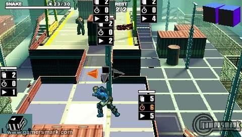
The gameplay mechanics of MGA2 are essentially the same as those in the original Metal Gear Acid, just with improvements, but these improvements don’t change the basic game. If you’ve played through the first, then MGA2 will feel very familiar. Movement on the map has changed just a little bit; instead of watching an arrow come out of the player to plan a move out thoroughly, the player’s character will actually move in a “real-time” fashion. Other enhancements make basic movements much more streamlined. One thing that might be annoying is that instead of immediately having you chose the direction to face after you move, you have to remember to press the triangle button and then press the X button (as opposed to the circle button, which is the confirm button). The visual interface has also been enhanced to show what moves are available when picking an action. The basic strategies you have to manipulate have stayed relatively the same and are generally in line with the usual strategy game. The speed in which a mission progresses is a major aspect, as it helps to keep the game interesting.

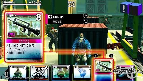
The amount of available cards to acquire has been more than doubled. Approximately 550 cards are in Acid 2’s library, up from the 200 to collect in the first. Obviously a number of new cards had been added, but the main bulk of new cards come from being able to upgrade cards – a new feature that remedies the deterioration of lower-leveled cards through the game’s progression. Having so many cards also makes it a challenge to complete the collection. The concept of “Interference” has also been carried over, and MGA2 puts more stress on using it correctly over than the original had. Interference is the concept of an equipped item influencing a certain stat that another equipped item has. Used effectively, it could make things a little easier. It can also make things a little harder. There are a couple of new types of cards, most significant of which being automatically triggering cards that can help quite a bit during a mission, such as a hit % increase or an attack increase.

The biggest improvement over the first MGA is the sheer amount of opportunities of extra missions to earn extra points and cards and more varied game design. Once you complete an area in Metal Gear Acid 2, you can replay the area in several different ways, including Eliminate, Sneaking, and Special Mission. In Eliminate, you basically just kill all the enemies on the map. Sneaking, you have to get through the level without being detected at all. Special Missions are a lot more like puzzles, making you devise a way to complete an objective within the constraints of the challenge, whether it is allowing only a limited amount of cost to complete the objective, using a pre-made deck of cards, or completing something in one turn. There are special clear bonuses if you get an S rank after completing any story mission or extra mission given in the form of cards, so it is definitely worth your while to do your best in everything you do.

As for the visuals and sound, MGA2 has definitely been enhanced over the first. The biggest being the visual style, the game looks more like a comic book with outlined characters, as well as being vibrantly colored. It’s a nice change from a “regularly” colored game, even if it is funky to see Snake wearing blue shin guards. Sound is used in a better way overall, with most guns sounding unique from each other. What could be seen as a lacking aspect in the sound, however, is the absence of any voice-overs. It’s unfortunate that another game in the series has a lack of a vital aspect to sound in games nowadays. The story is pretty interesting, and completely independent from the first. For much of the game, Snake is dealing with amnesia and not knowing who he is other than a mercenary. Not that the story that is included was a bad choice to use, but I had become personally interested in the way the story of the first MGA could have been continued, but alas, a new story is what is given, and its delivered (yet again) in drawn stills. The inclusion of quite a few more bosses through the game breaks up the monotony of killing regular guards, and definitely solves the biggest qualm I had with the first MGA.

A big extra part of the game is the ability to watch movies in actual 3D with the accompanied Solid Eye plastic-coated cardboard “glasses” that slide over the PSP. As you collect more cards, more movies are available to watch in 3D. The movies to watch are basically every movie from Metal Gear Solid 3. And some movies of extremely hot chicks not usually wearing all that much or getting squirted with water or something like that. The music that plays over those movies made me feel kind of weird, just because all you were basically doing was looking at this girl smiling in the camera seeming like she didn’t really know what to do. I wasn’t too crazy about the movies they put in there, but the 3D was quite effective. The only unfortunate thing is that you can see the pixels of the PSP pretty well, so it looks like you’re actually watching a “bricked” image, if you can understand that.

Metal Gear Acid 2 is an awesome sequel, definitely one of the games that define the PSP for its visual quality, capabilities, and possibility of having add-on things, like the Solid Eye, for specific games. A lot more excitement is to be had with the second Metal Gear Acid, and more bosses integrated into the overall gameplay stresses that point. If you liked the first Metal Gear Acid, you’ll find enjoyment with Metal Gear Acid 2.

winSPMBT (PC) Review

Developer: The Camo Workshop / Publisher: Shrapnel Games || Overall: 7.0/10

WinSPMBT, otherwise known as “Windows, Steel Panthers, Main Battle Tank” is a PC turn-based strategy game with a simple premise: capture points on the map, and beat the crap out of your enemy… strategically, of course. WinSPMBT isn’t necessarily a bad game, but it has a horribly outdated feel through and through. Everything, including the user interface, the gameplay mechanics, all the way down to the graphics feel this way.

WinSPMBT feels like a trip taken in a time machine set to 1995. The game looks on par with the first Command & Conquer. There is a reason behind this, as winSPMBT is the Windows version of a mod for a game called Steel Panthers 2: Modern Battles. SPMBT was originally a DOS game, but it has been ported to Windows for compatibility’s sake and resolution. Fans of the original SPMBT would certainly appreciate this, since they can now play the game on modern-day operating systems. What’s even better is that people can download the game for free from the Shrapnel Games site, so it’s not like you’d lose anything by giving it a shot, but you can also buy the enhanced CD version for $39.95. Both versions are the same, but the CD comes with a printed quick start guide, higher resolutions and a map editor.

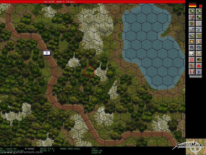
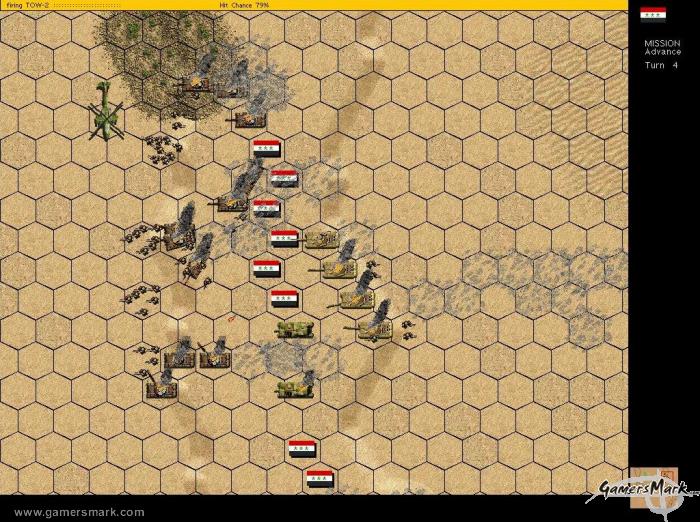
Gameplay is a bit less than enthralling, to say the least. When you’re not directing units around on the hexagonal map, you’re watching units attempt to destroy each other with tiny animations of flying lines, little orbs, smoke, and sparks all from a top-down aspect. Sad to say, but that’s about it. There are more advanced commands and different ways to go about it, but you’ll have to play out your strategy without any exciting explosions or things of that sort. There are many different types of tanks, infantry, artillery, and the like to use during the game, and each is accompanied by low-res picture to represent it. To win a battle you need to occupy as many “V points” as possible while eliminating your opponent’s units and keeping your units intact. V points are basically points of interest on the map that help your side if you hold, or at least occupy them at some point. At the end of eight turns, the battle is over and the results are shown to you.

The sound is boring and can even be annoying. All that’s heard are the gun and explosion sound effects with absolutely no music to accompany them. It gets irritating when you hear the same sound effects over and over. One of the worst cases was fifty seconds worth of air strike sounds in one mission. There’s also no music. The graphics follow the sound — as I said before the game looks like it’s from 1995 (in truth, it’s from 1996). Still imagery far outweighs any animations or any real noticeable movement, and really promotes the idea of the game being just another boring strategy game. The maps you play on can look quite complex in texture, like one level in Germany, but the map’s graphics can collide with the sprites of your actual units, making it hard to see where or what your units are, making you wish for a desert level with no textures at all.

WinSPMBT will really only appeal to nostalgic gamers, fans of the original game, and hardcore strategy gamers. I’d be hard-pressed to believe that anyone who isn’t in one of those niche crowds would have an interest in the game, but the possibility is greater since it is available for free. WinSPMBT really would have done well with a major overhaul, but in its current form it’s in the awkward position of being an outdated game made available again. But because it’s obvious that they wanted to keep the integrity of the original game intact as much as possible, winSPMBT is all it is and nothing more.